L&DI
Membership website
Problem statement
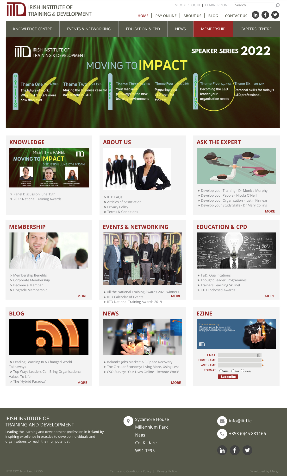
The Irish Institute of Training and Development (IITD) rebranded to the Learning and Development Institute (L&DI) to stay relevant and serve its members better. Designing and building a new membership website was critical to the rebrand project. The client had a tech stack with multiple suppliers. They wanted to consolidate this into one platform. The website was old, hard to use and incredibly difficult to update. Therefore the business used several disparate WordPress websites to house content that should have been part of the original website. Users were not able to purchase event tickets or courses on the website. Users could sign up to become a member and pay online, although the membership sign-up process was a whopping nine steps long!
I redesigned the entire website and improved the membership sign-up process. I brought all the disparate courses into one centralised platform and created a booking flow that enabled users to book courses for a reduced price if they qualified for a Skillnet grant. I also improved the membership administration section by creating role-specific views and ensuring that details are easy to update.
I led the user experience research, site architecture, prototyping and created a design system with components based on key screens provided by the branding agency. My developer colleagues implemented the code.
Users & audience
Female 60% Male 40%
35-45 age range
L&D professionals or aspiring professionals in Ireland,
entry-level up to Director level
Scope & constraints
Due to the project budget constraints, we had to fully implement the complete sign-up process and refine the booking flow after launch. Similarly, testing and refining the corporate service blueprint in time was challenging due to a close launch date. In addition, user testing on the prototype was not feasible due to budget. 'Pay by invoice' option on the course booking flow had to be modified due to competing priorities, this was implemented by development.
Process
I used quantitative and qualitative data to understand the current system better. The following research methods were used:
- User interviews
- Customer Satisfaction Surveys
- Usability tests
- Stakeholder interviews
- Website statistics
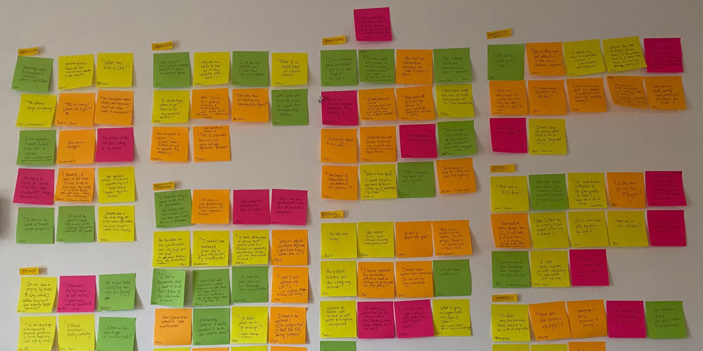
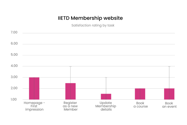
Satisfaction ratings obtained in the user interviews
provided quantitive data.
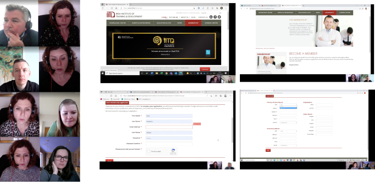
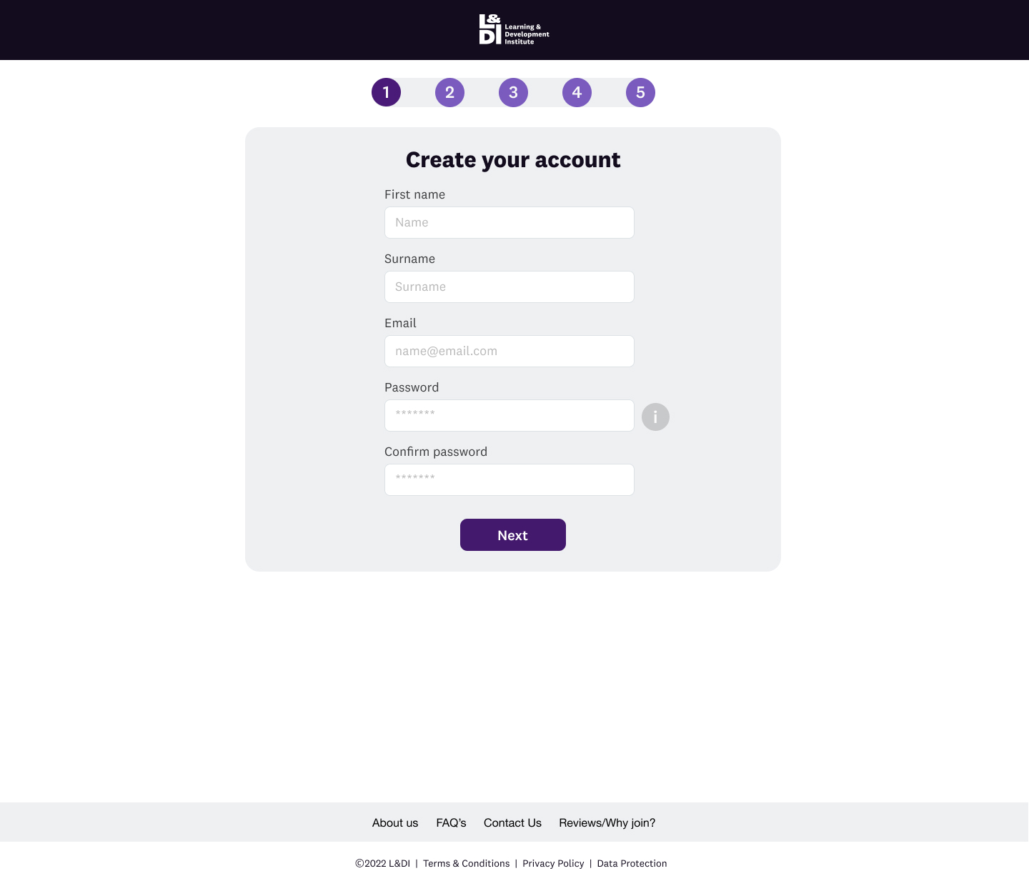
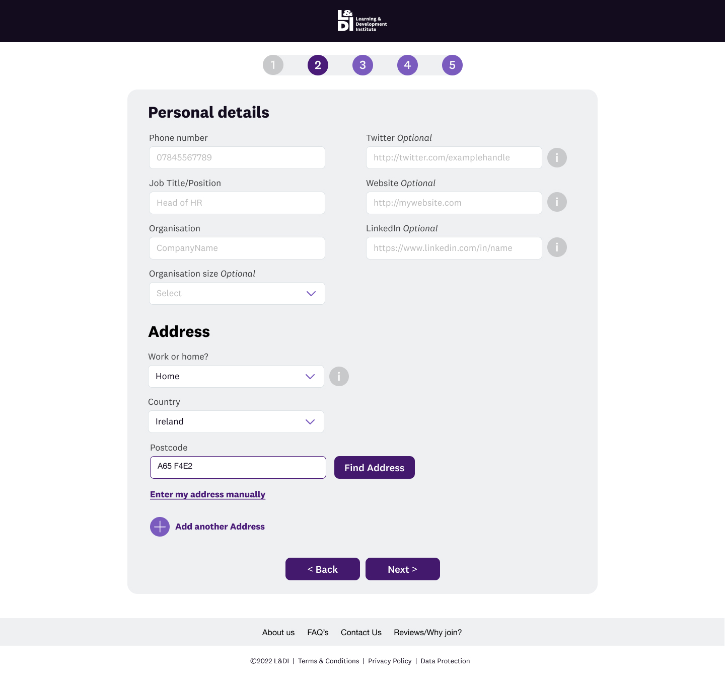
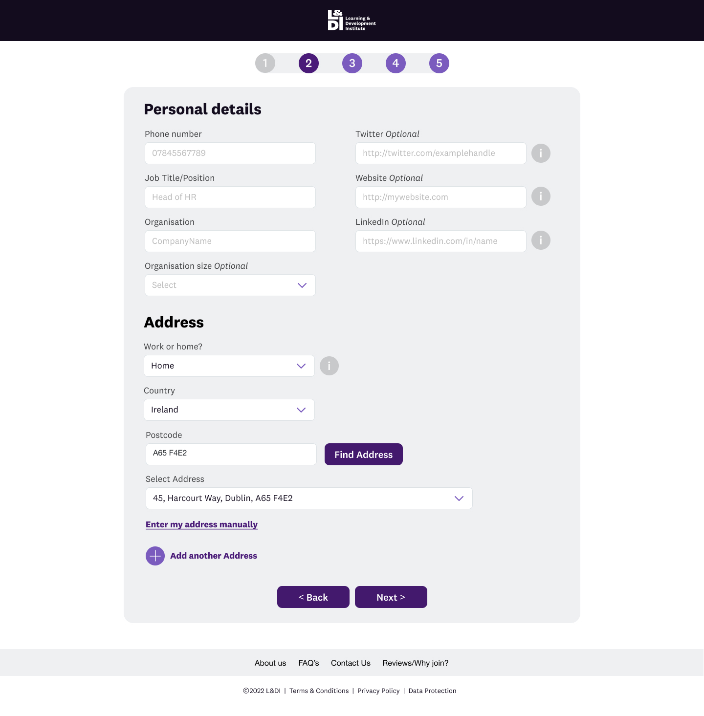
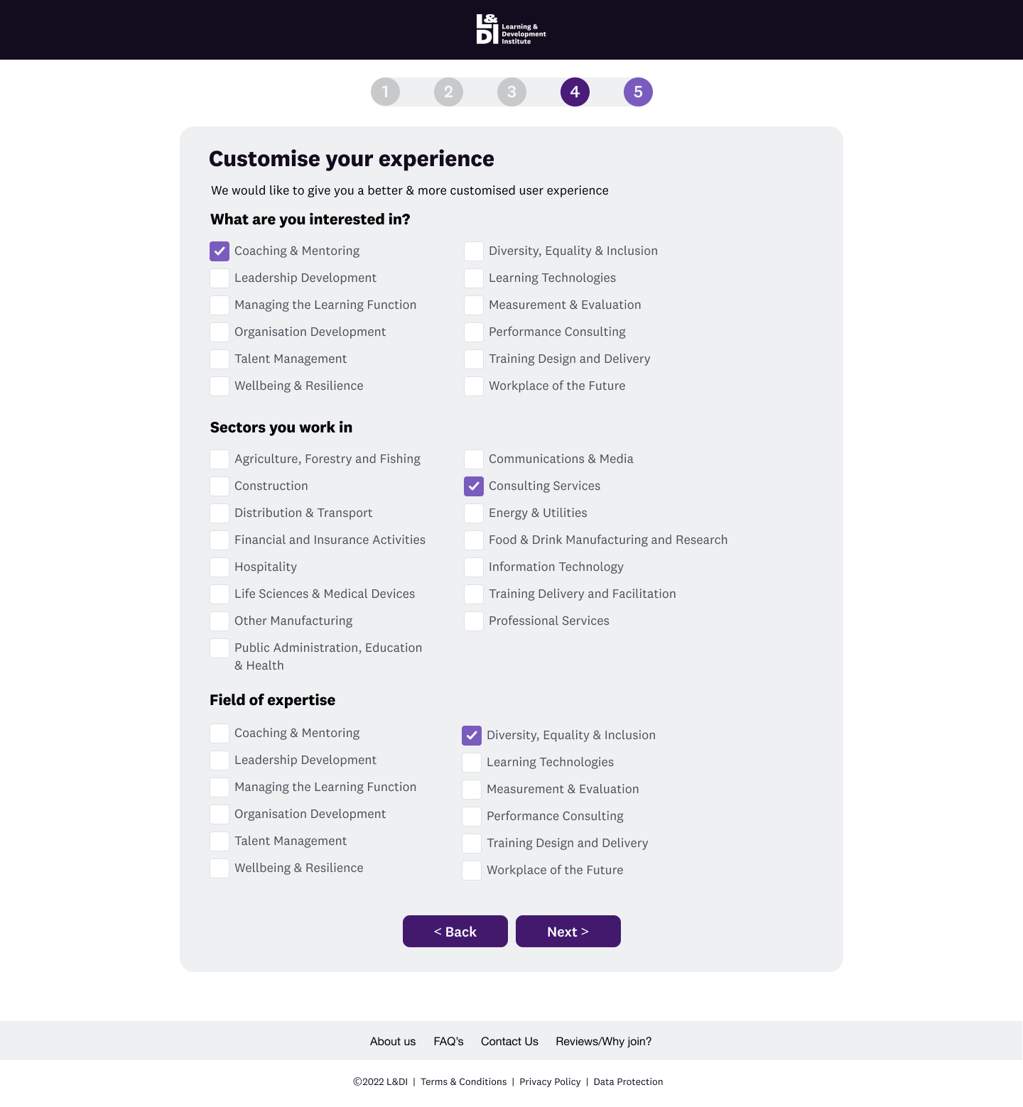
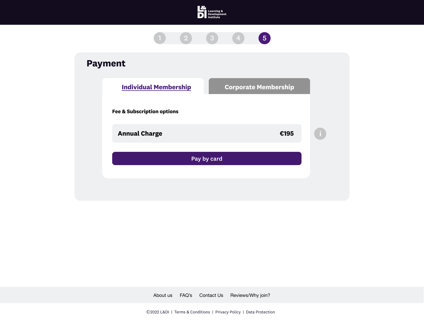
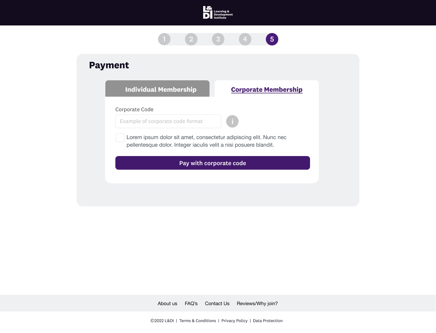
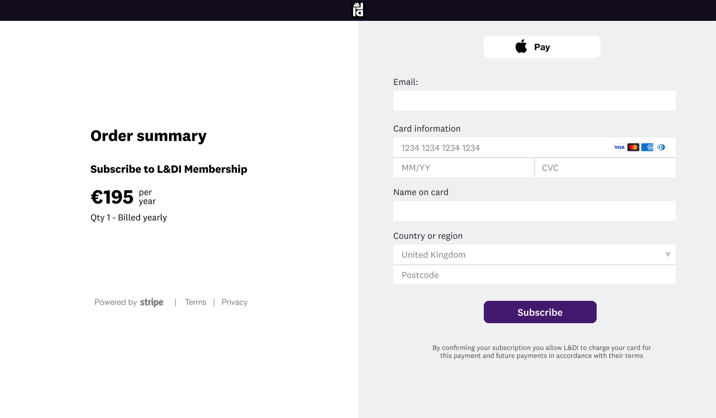
Become a member
Research Findings
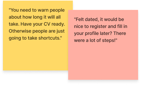
- The hero section took up most of the screen, and membership sign-up was underneath; users repeatedly had to scroll down to get to the form.
- They were very frustrated at the number of steps needed to complete the process (nine in total).
- They were also taken aback at the fact that they needed to upload their qualifications to achieve membership. In addition, they weren't sure what the different membership levels meant and if there was another price point.
- There also needed to be more clarity about the pay-by-invoice option at the end of the process.
Impact of research on the product
- I added a pricing screen with benefits of membership. This information was lacking on the previous website.
- I removed all superfluous elements on the membership sign-up page so the user could focus on the primary task.
- My design reduced the steps from 9 to 5 by chunking relevant information together.
- I recommended the implementation of a postcode lookup field to enable users to add their addresses quickly.
- Ensured that users had the option to skip adding qualifications and experience but made sure they understood that it meant joining as an affiliate member and added a tick box with a popup window informing them what the different levels were.
- Added tooltips to help guide users and inform them of why we were asking specific questions.
- Removed the pay-by-invoice option as this didn't make sense for the individual use case.
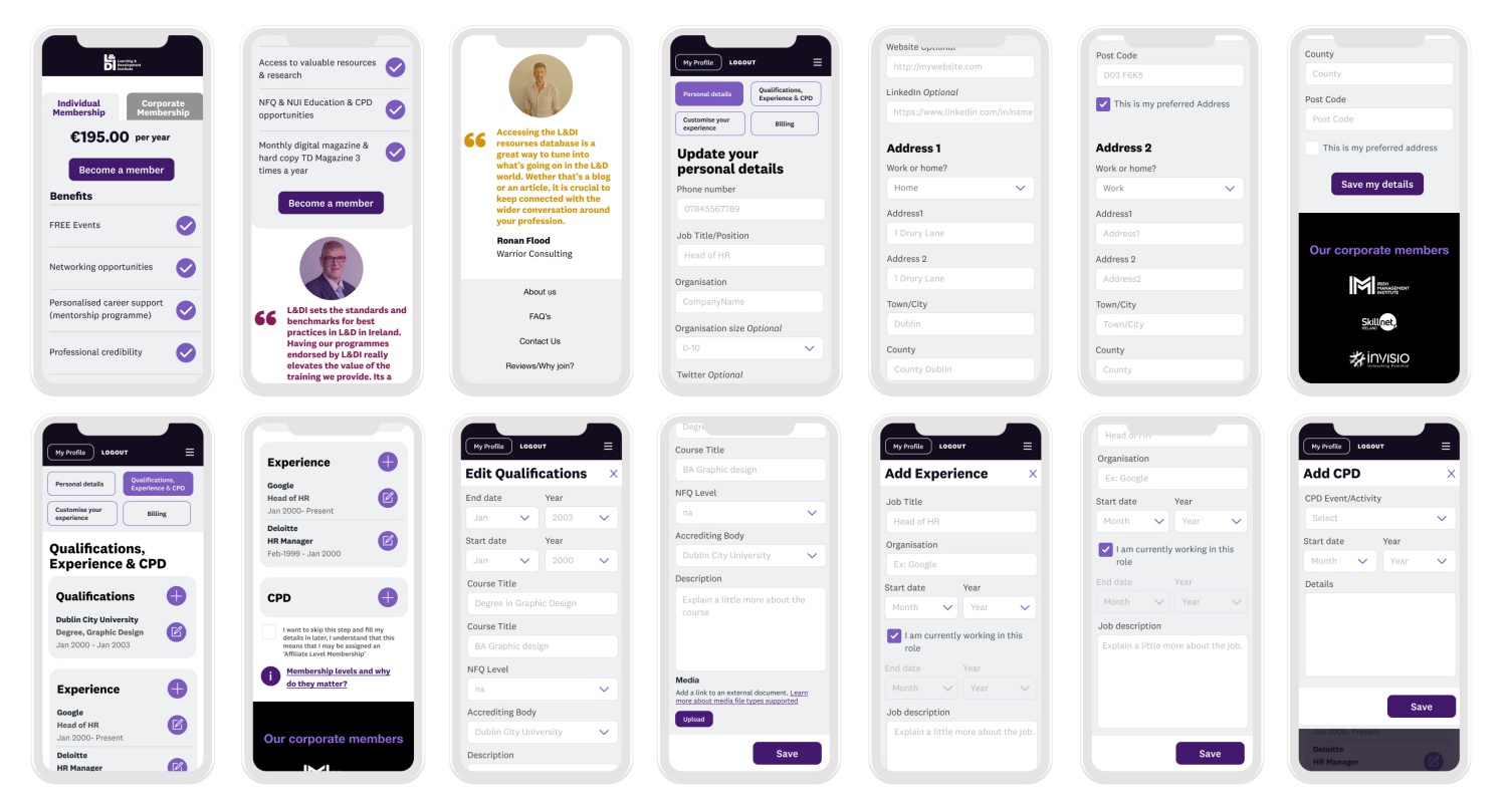
Mobile Membership Sign-Up Flow
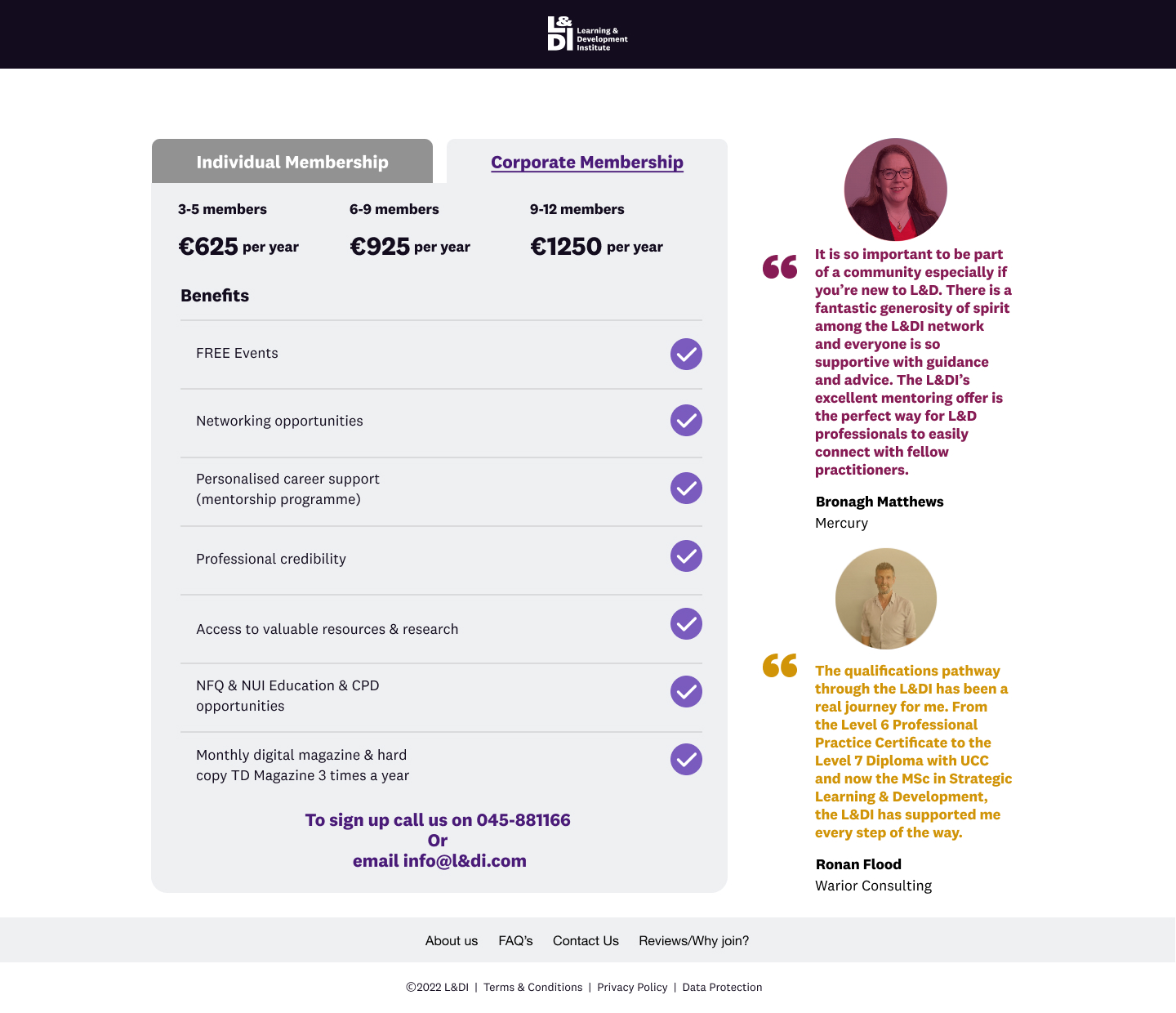
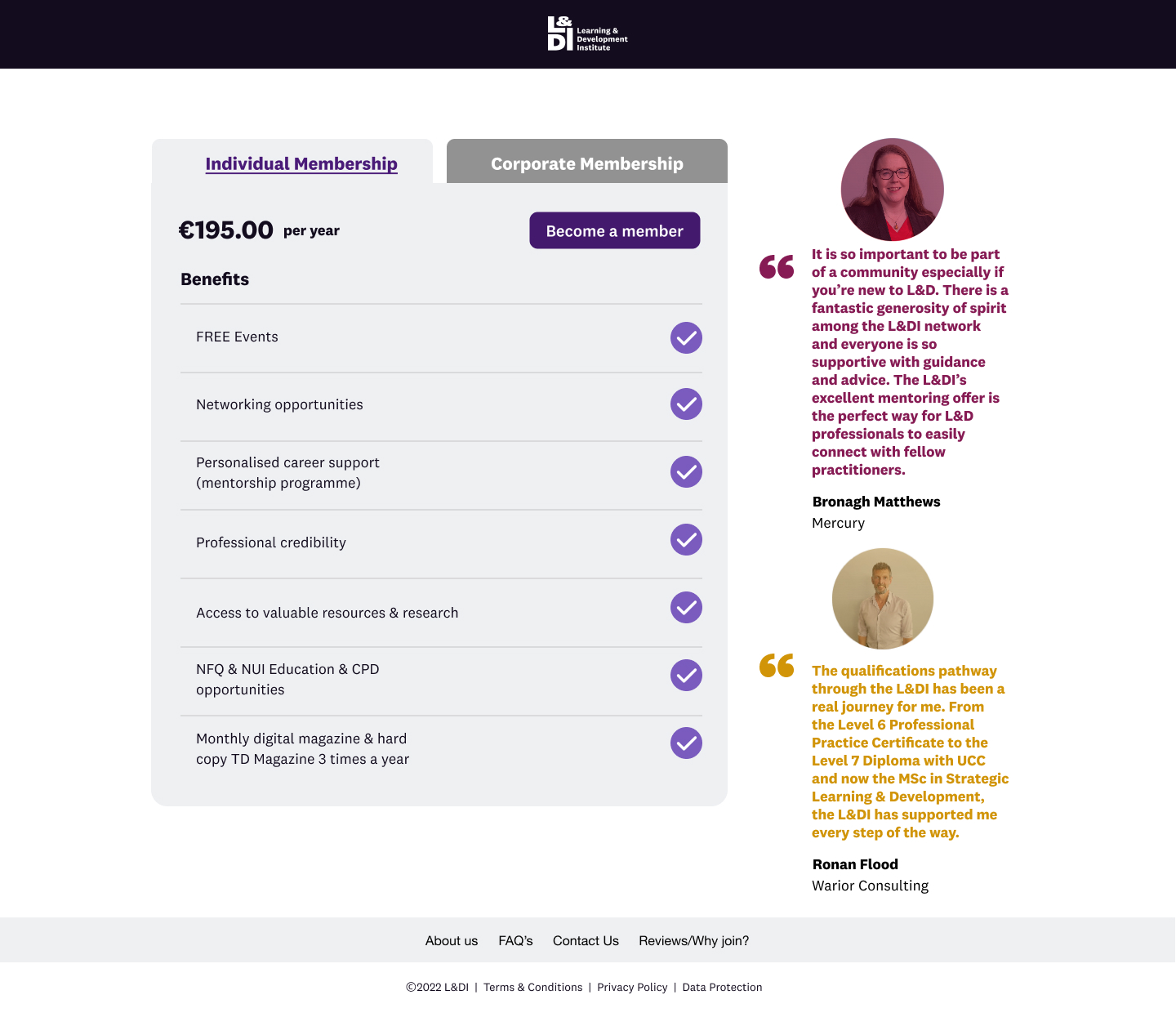
Desktop - Membership Sign-Up Flow
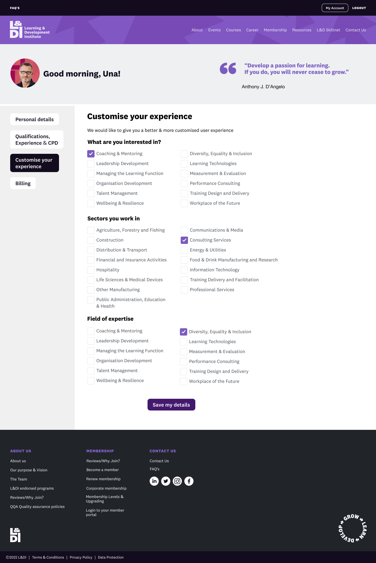
Membership Area
Research findings
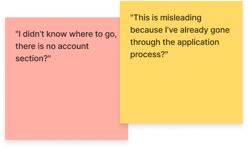
- Users couldn't find the membership area; they kept clicking on various buttons in the top navigation to try and locate it.
- Once they could get into the membership area, they were utterly confused because the website seemed to take them back to the membership sign-up process.
- The account section was, in fact, a simple clone of the sign-up process without the payment step, so many of them thought they were starting to apply for membership again!
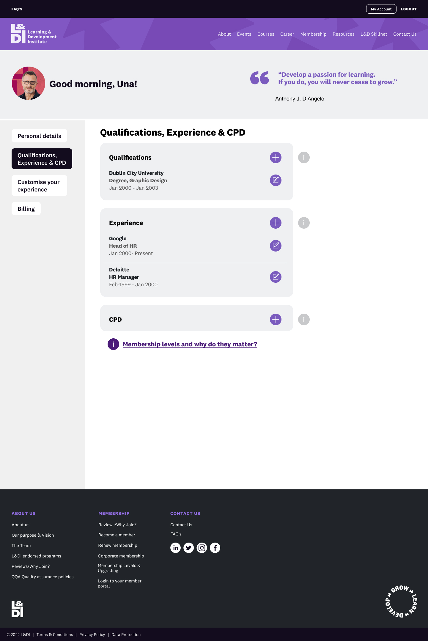
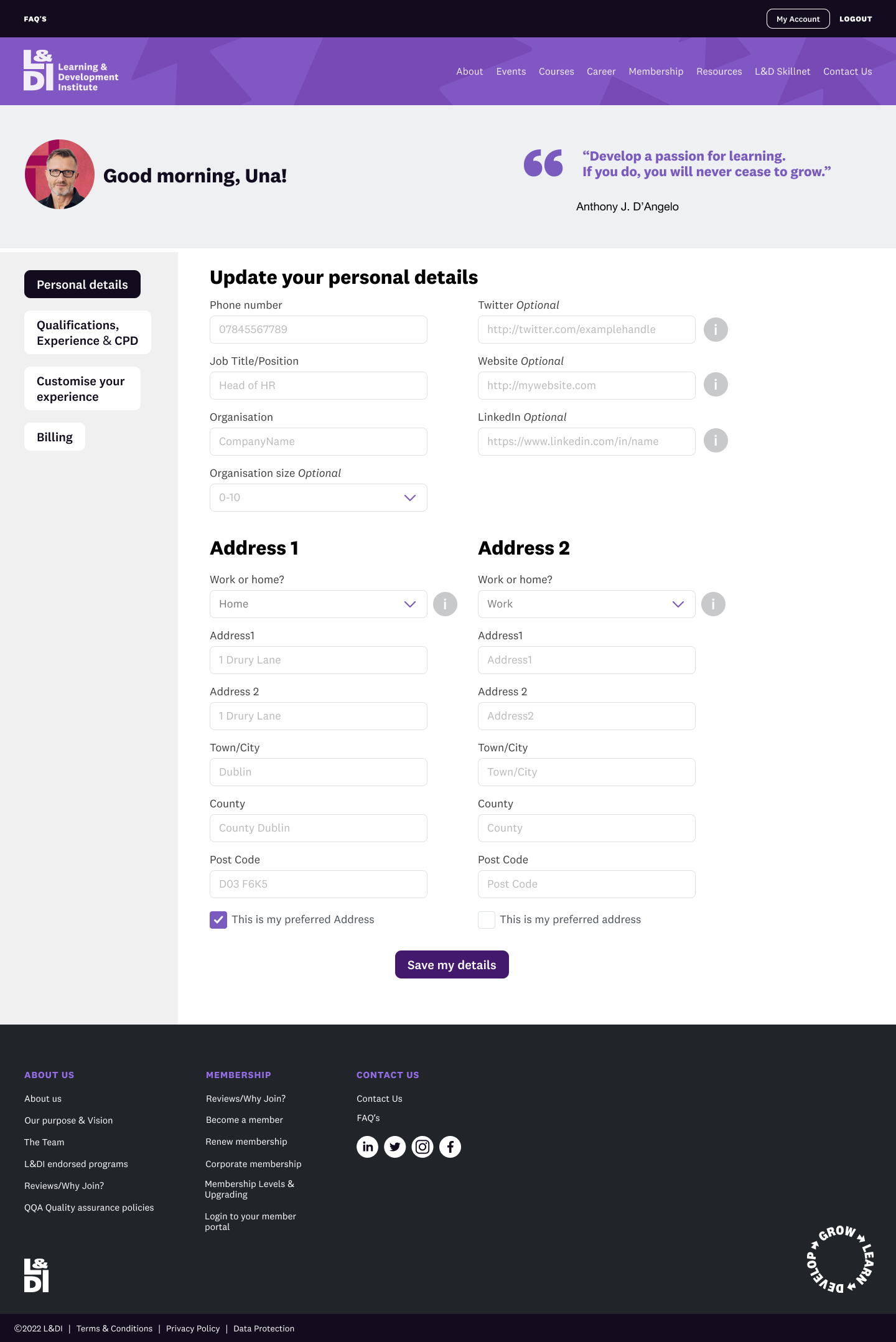
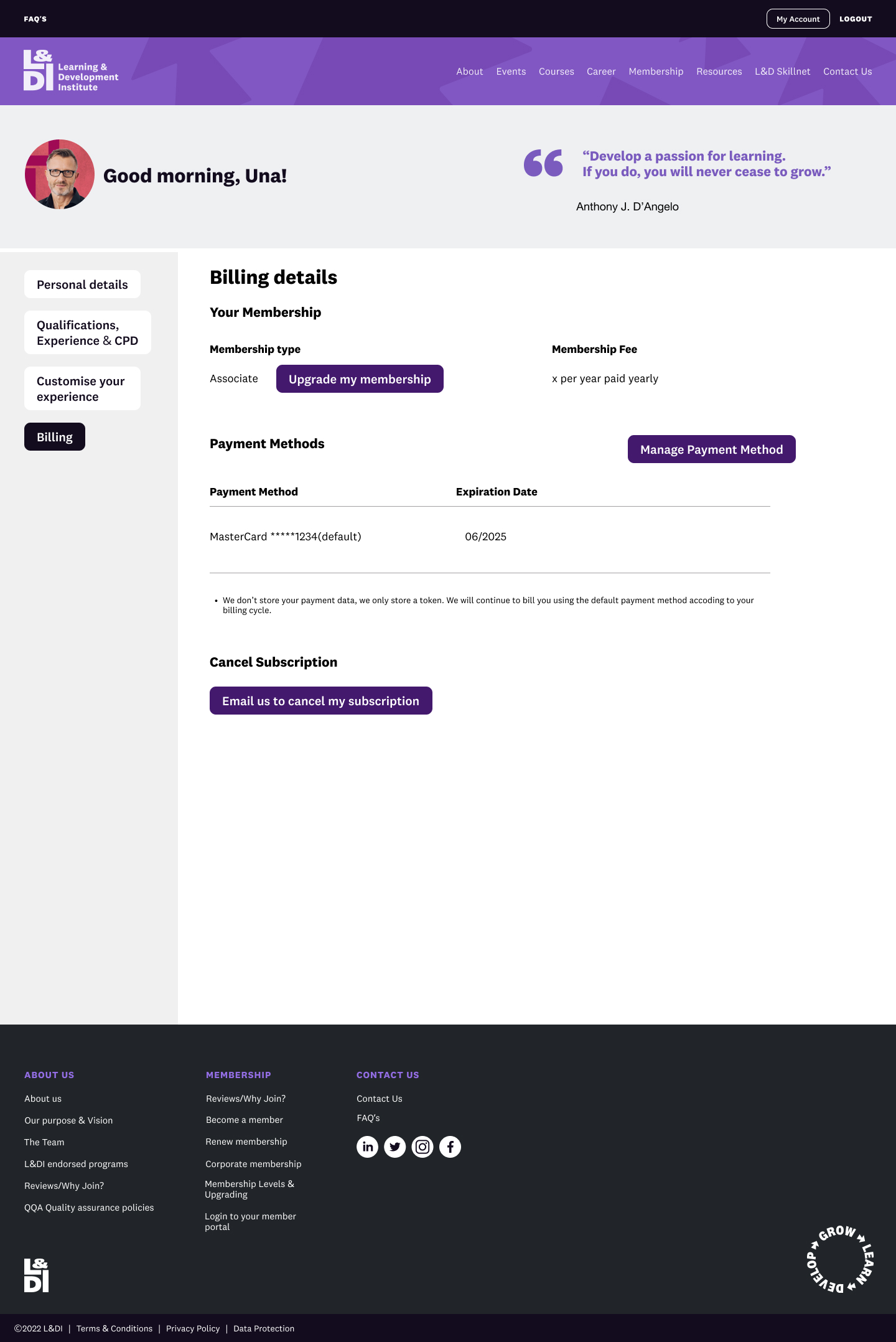
Account - Logged-In View
Impact of research on the product
- Following the standard web convention, I added the "log-in" and "become a member" buttons to the top of the global navigation.
- Once logged in, I designed screens that looked more like an admin section. I chose left-hand navigation to help users navigate through and update all their details.
- Adopting Alan Cooper's idea of 'polite software,' I added the user's name and the time of day to give a personal touch to the admin section.
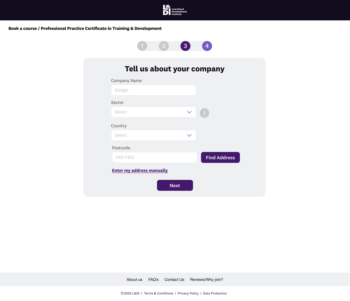
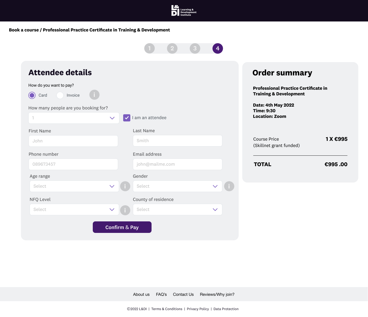
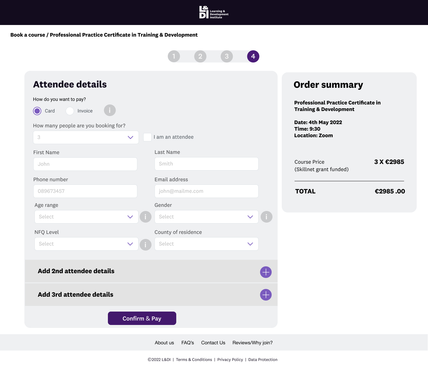
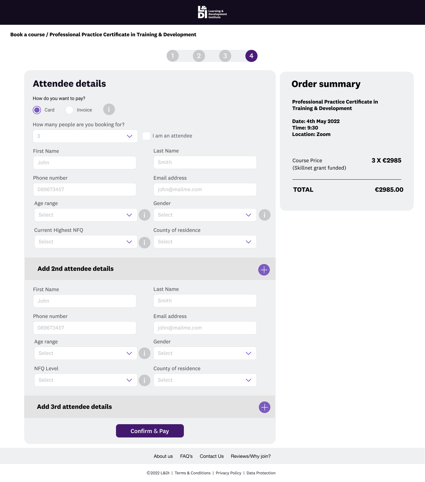
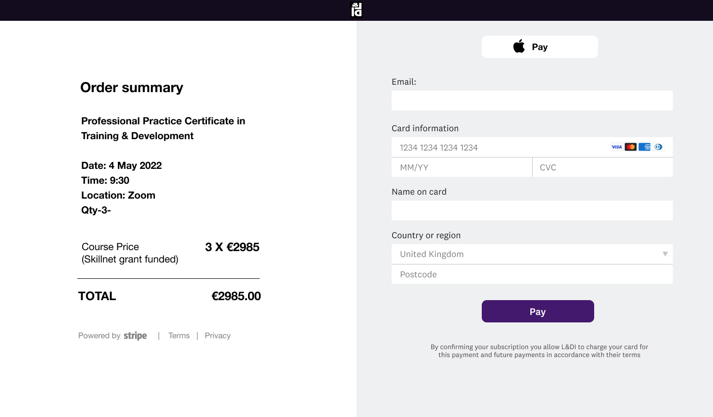
Purchase course or event ticket
Research findings
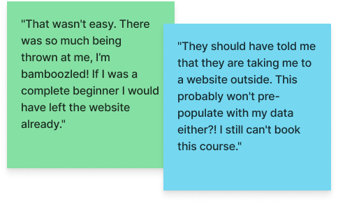
- The old website directed users to various external websites, PDFs and links when viewing and booking courses. Consequently, they found it quite challenging to understand the information because the data was presented in an inconsistent format. One user quipped, "I'm bamboozled" at trying to book a course.
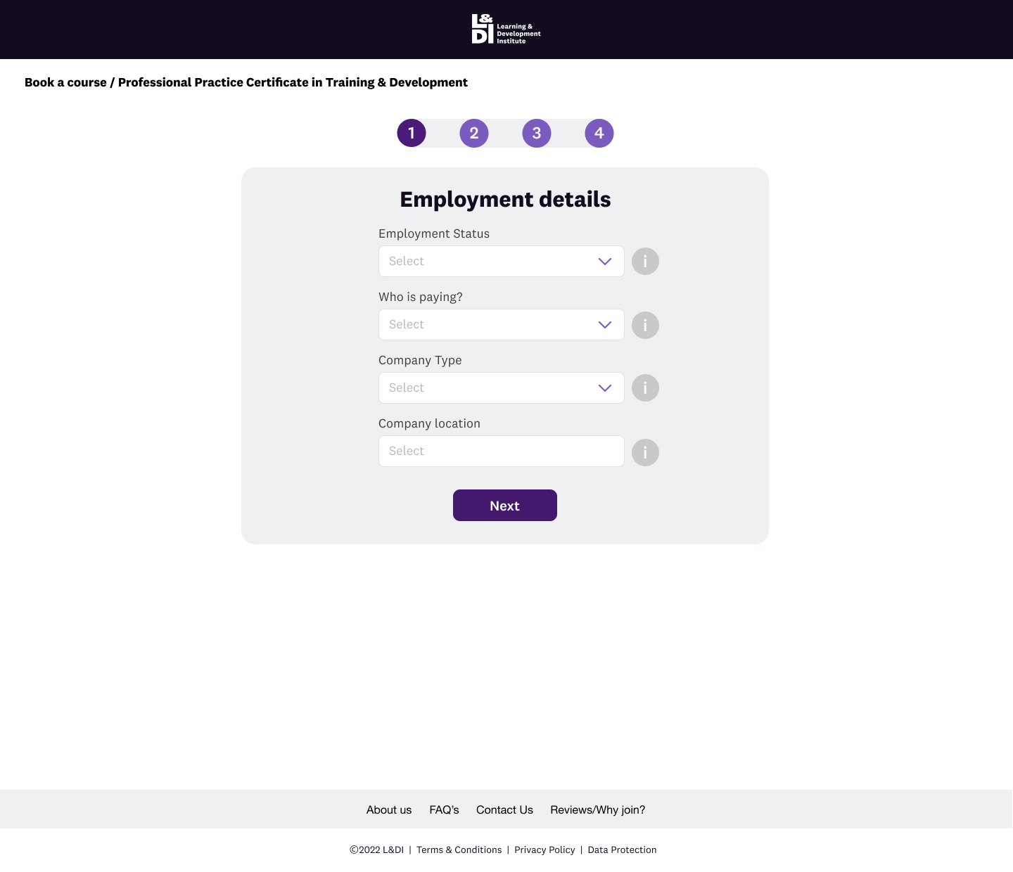
- Stakeholder interviews revealed that users could get a discounted course booking via Skillnet Ireland. The business wanted to qualify the user via a conditional form to ensure they get the correct price. If they met the requirements for a Skillnet grant, they got the course at a reduced price.
- Users needed to be able to book multiple tickets for courses which presented an interesting design challenge as the requirements of the grant dictated that we needed to gather specific information about each attendee.
- Similarly, event tickets are required to be available to purchase in bulk, and members would get a different price point than non-members. The business would set the price of the event in the Hubspot CRM.
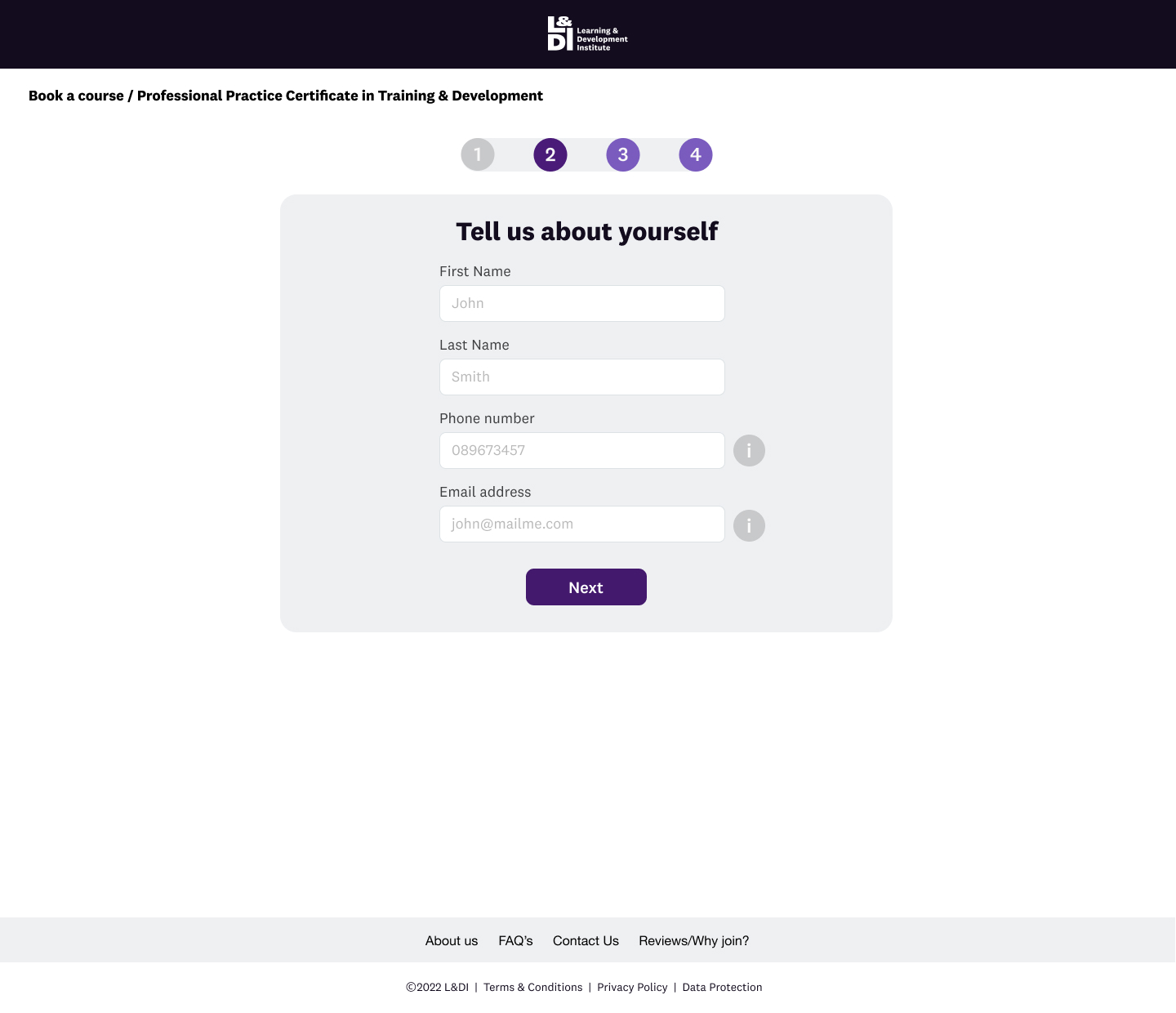
Purchase Course/Event Flow
Impact of research on the product.
- I used progressive disclosure on the booking forms to ensure we broke the questions into manageable chunks.
- Where some questions could feel quite personal, I added an info tooltip to explain why we were asking the question and that they were going through a qualification process to receive a discounted course via the Skillnet grant.
- I added a tick-box where the user could indicate if they were an attendee so that they didn't have to fill all their details out again as they would have given the information in the previous steps.
Corporate membership
Research findings
Corporate member enrolment was a very manual process; this caused enormous administrative work and was prone to error.
In addition, the website had no facility for corporate members to enrol, and the account section had no corporate member management or view whereby the corporate admin could view and manage the members on their account.
Impact of research on the product
I mapped the corporate sign-up flow using a Service Blueprint design which helped me plan and visualise the relationships between different service components — people, props (physical or digital evidence), and processes — that are directly tied to touch-points in the customer journey.
I designed the corporate admin section- Admin users can see the members in the package and edit as needed. However, the corporate member user can't see other members and can only see their details.
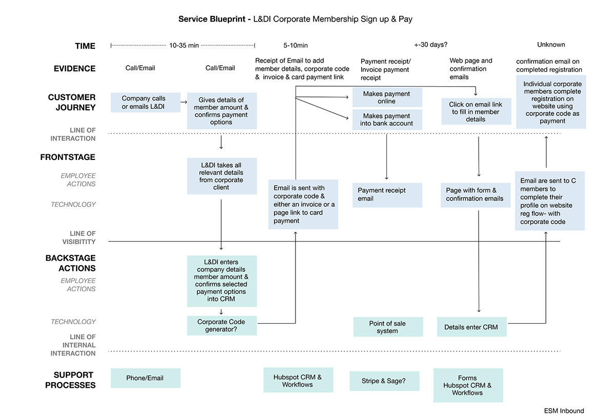
Service Blueprint - L&DI Corporate Membership Sign-Up & Pay
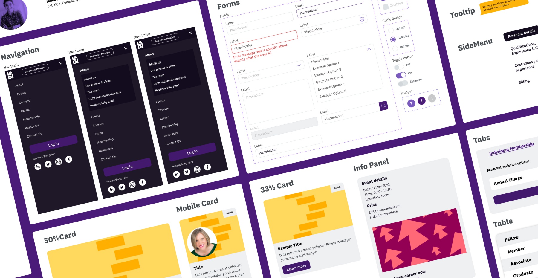
Mobile Components
L&DI Design System
Outcome & lessons
The redesigned website reduced the bounce rate from 60.75 to 51.41% = 9.34 %. and increased individual membership sign up by 33.33%.
This was the first time I led and designed a project of this scale. There were many challenges along the way from techincal feasibility, viability through to creating a brand new corporate flow.
This next stage is to improve on what is there so user testing or recordings on the booking flows as well as the admin section will be vital in ensuring the website is easy to use and increases membership engagement.
"I am really happy with the transition from UX and design to implementation and I think that is down to the level of work put in on your side.
I can see the thought behind the flow and order of the site and I that will make a huge difference to the user experience.
On first viewing, the site looks great"
Bradley Nolan - Head of Strategic Projects at L&DI
Contact
Shoreham-By-Sea
LinkedIn: https://tinyurl.com/5dm8rejh
Email: celestedupreezdesign@outlook.com
Twitter: @celestedupreez
© Celeste du Preez 2023