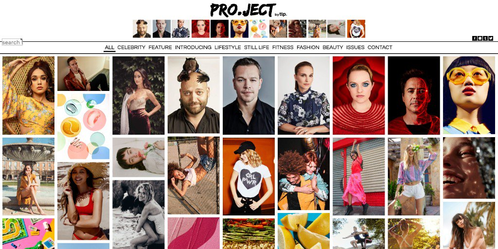
The Licensing Project
Stock Photography Website
Problem statement
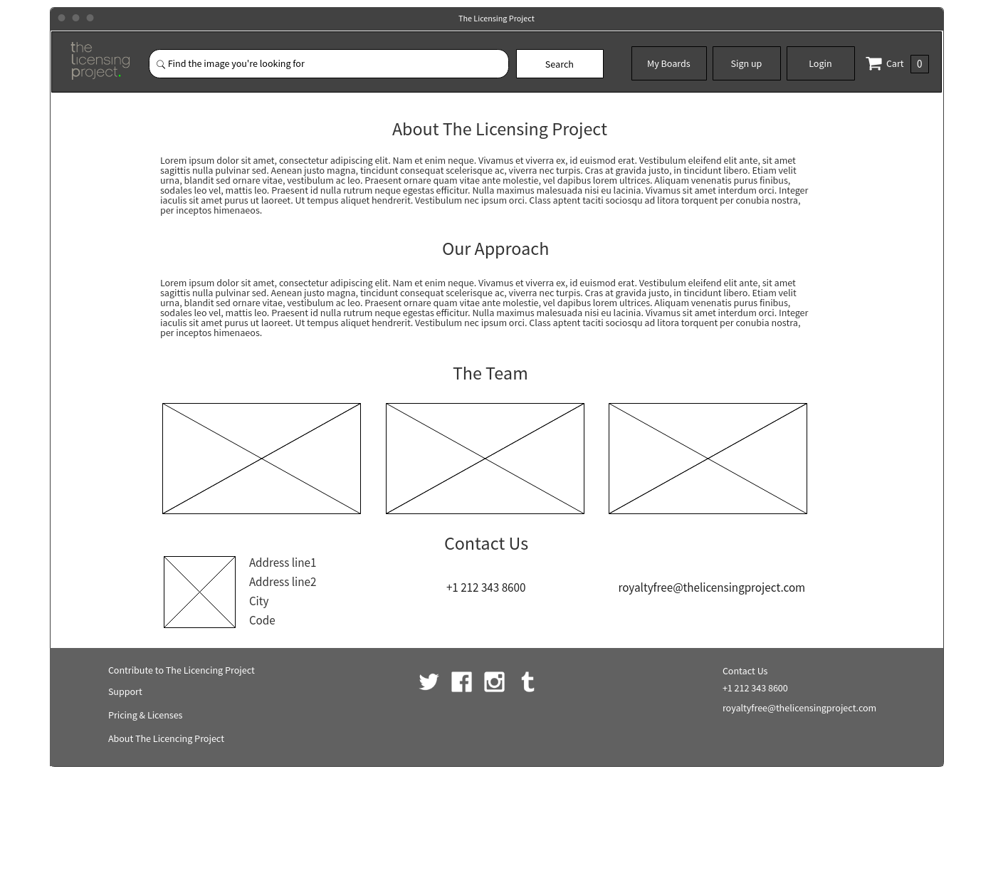
The Licensing Project is a curated, "rights‐managed", full-service Licensing Agency based in New York. They provide high-quality rights-managed photos. They wanted to expand their offering to include royalty-free images but wanted us to create a separate website to ensure a more customised experience for the target marker.
I set out to research and create a prototype making sure the functionality and journey work. Once the prototype was signed off, I created high-fidelity designs.
I conducted the research and design portion of the project; my digital director helped lead the project and kept it on track.
Users & audience
- Designers
- Creative agencies
- Marketing agencies
- Advertising agencies and news organisations
- Bloggers
- DTP operators
- Aspiring photographers
- SME owners
Scope & constraints
I created a proof of concept that included high-fidelity designs. We did internal testing of the prototype, but the budget and timeline didn't allow the recruitment of real users to validate.
Time and budget constraints also limited the amount of research I could do so I relied on benchmarking and secondary online research as my starting point.
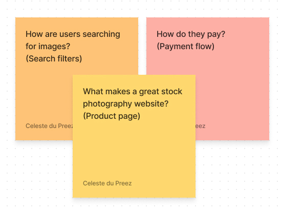
Step 1: Research
Key focus areas
- What makes a great stock photography website?
- How are users searching for images?
- How do they pay?
Method used
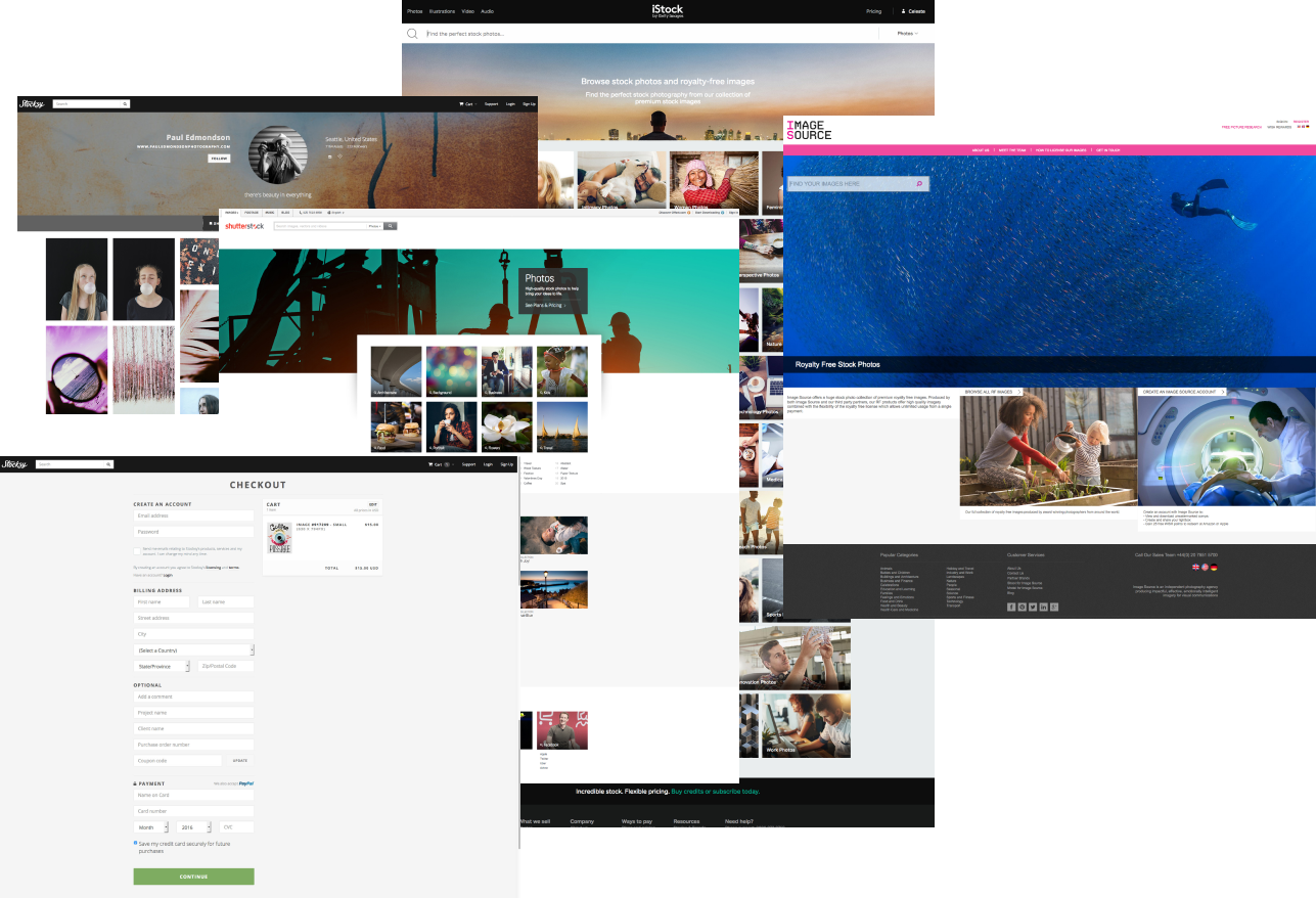
- Competitive benchmarking
- Personas
- Stakeholder interviews
- Prototype testing
Step 2: Findings
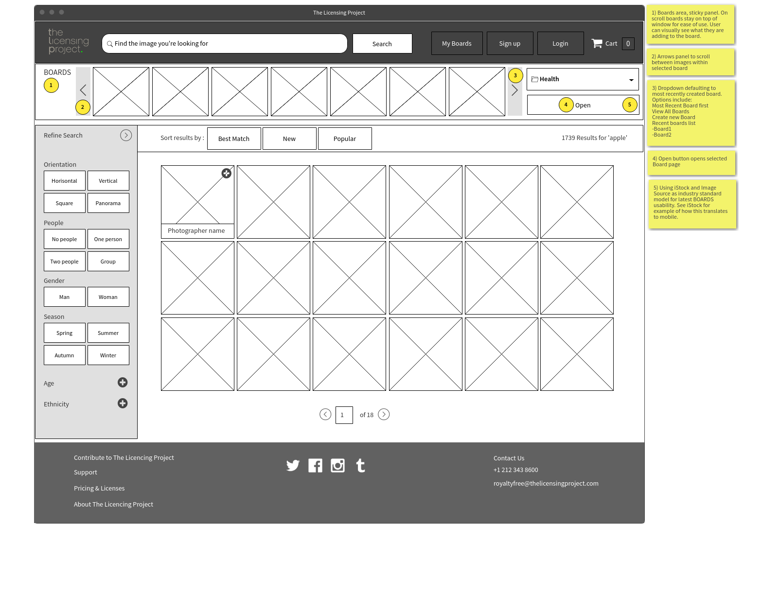
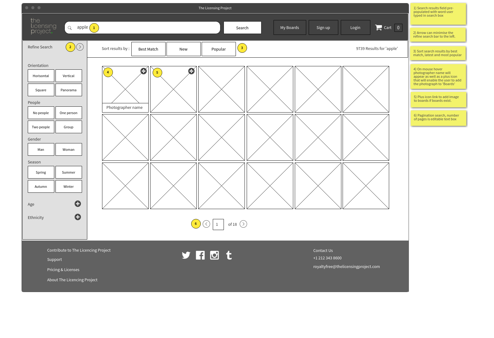
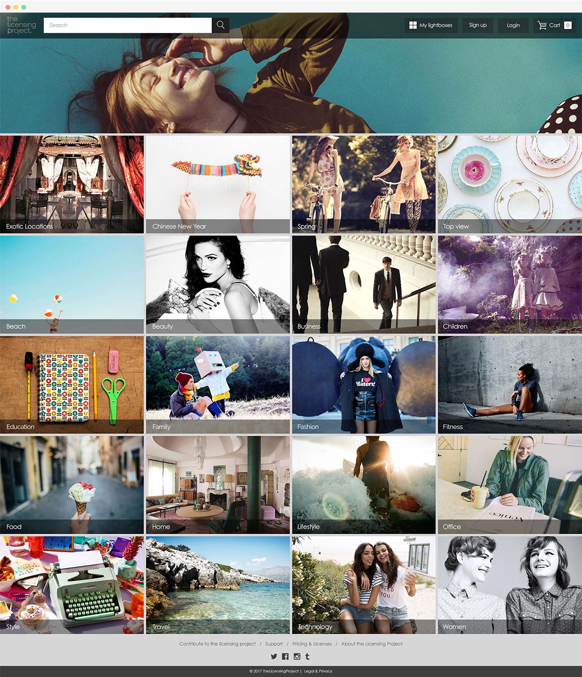
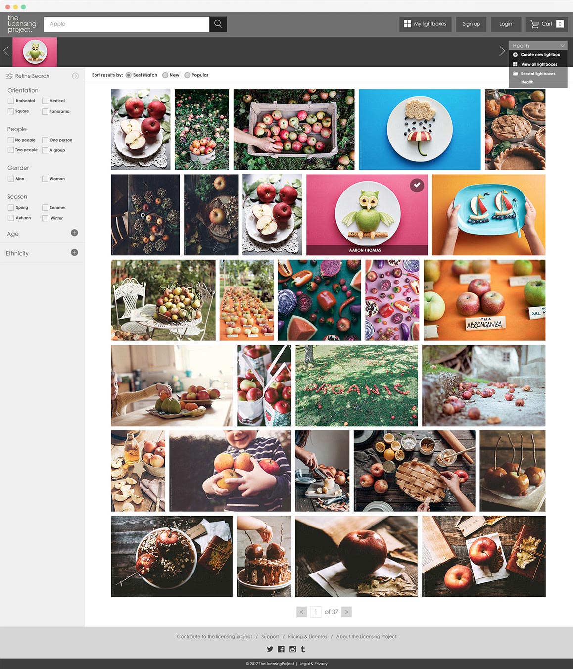
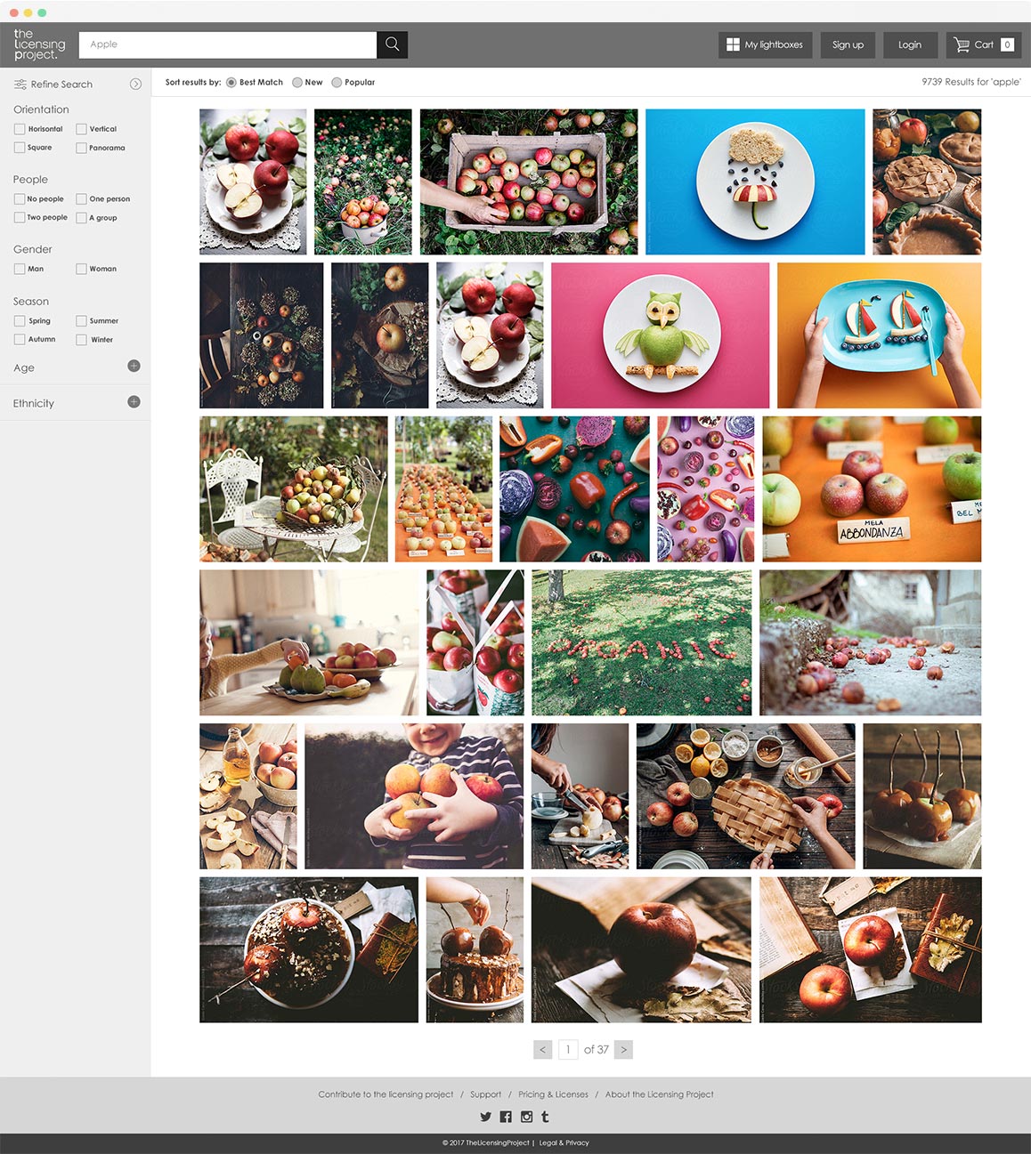
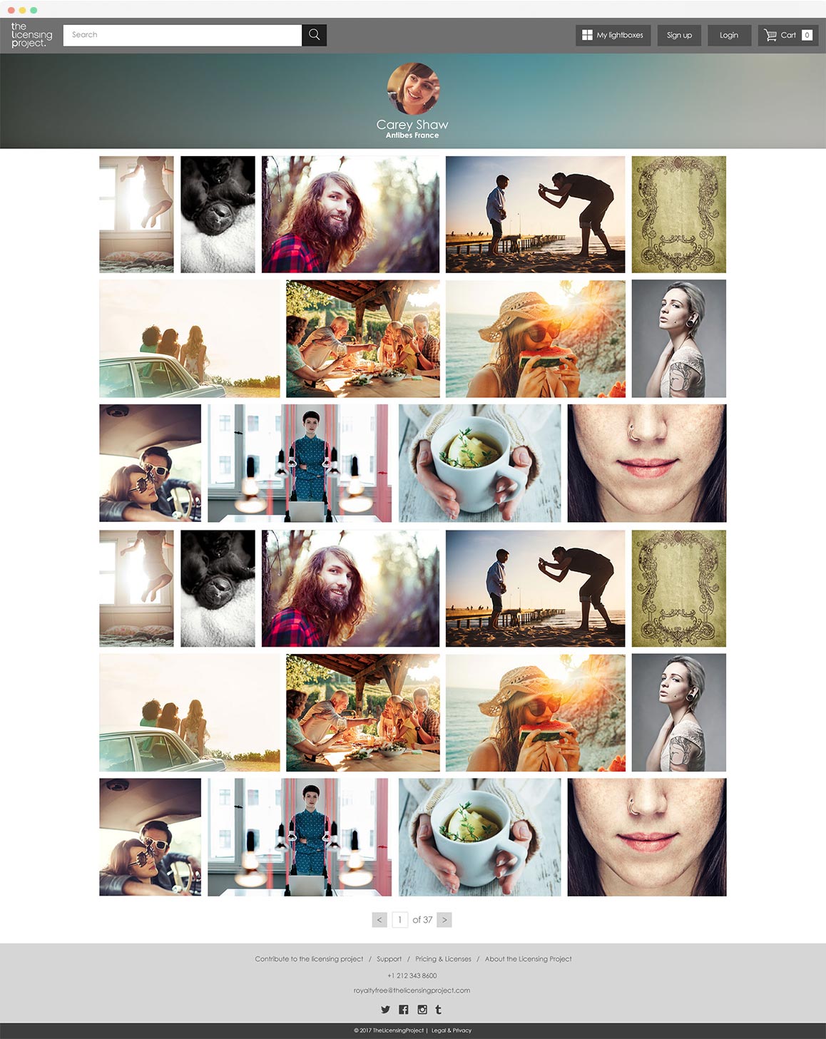
Filters and search
Competitive Benchmarking revealed that best-in-class websites used comprehensive filtering functionality, enabling users to find the image they seek quickly. The best filters were easy to understand and had curated features you could search by. The websites that threw 'everything and the kitchen sink' at the filters turned out to be confusing and hard to use.
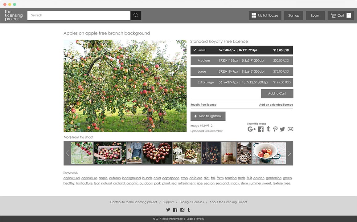
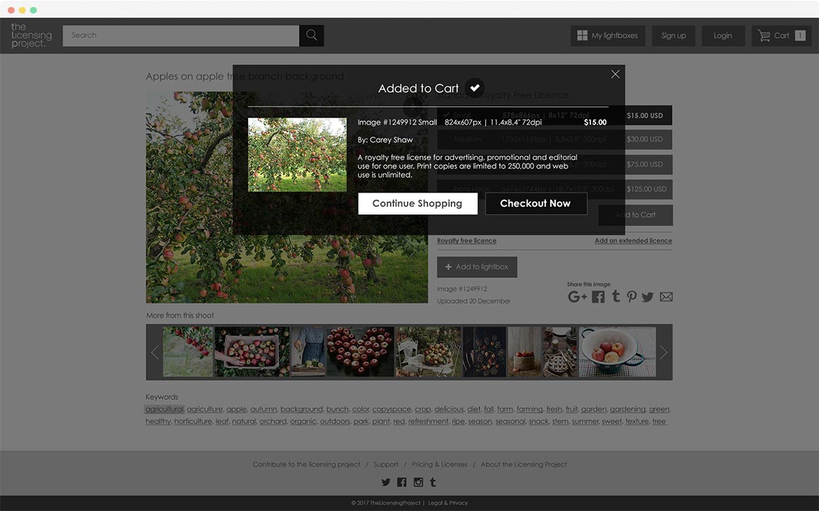
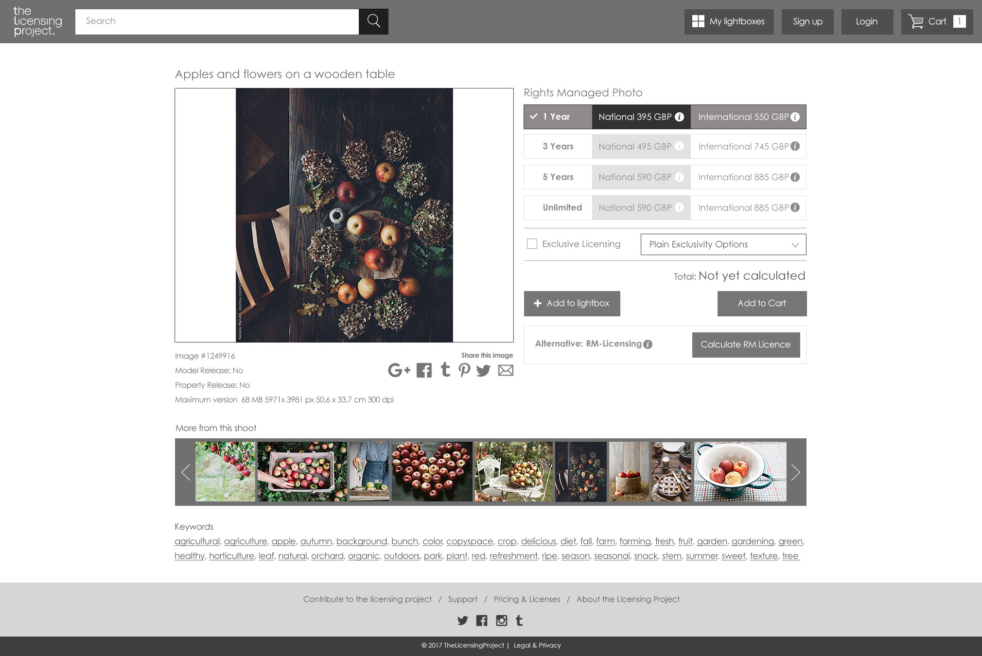
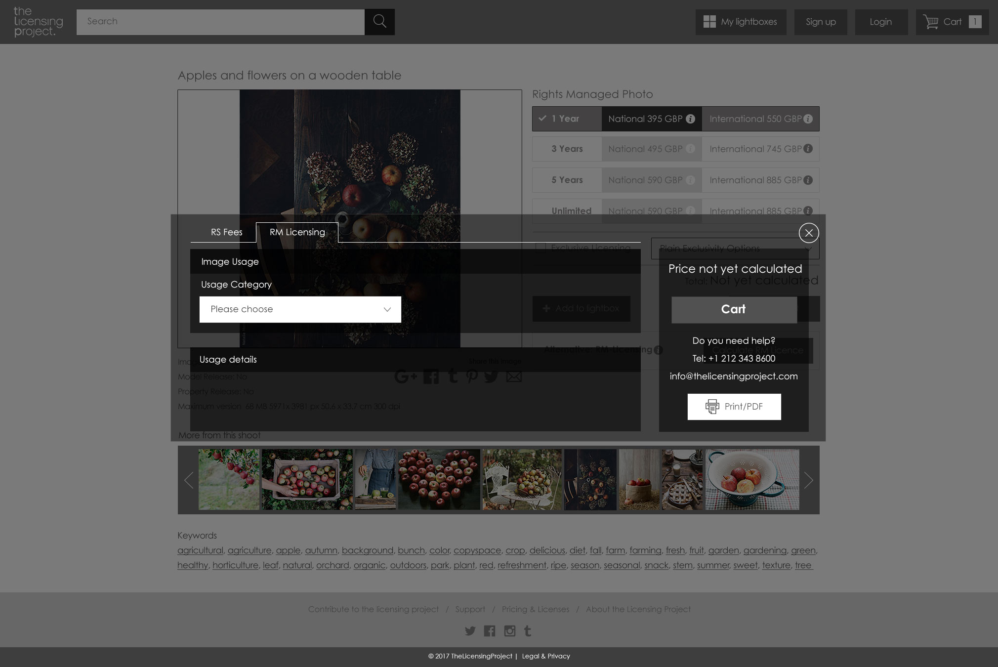
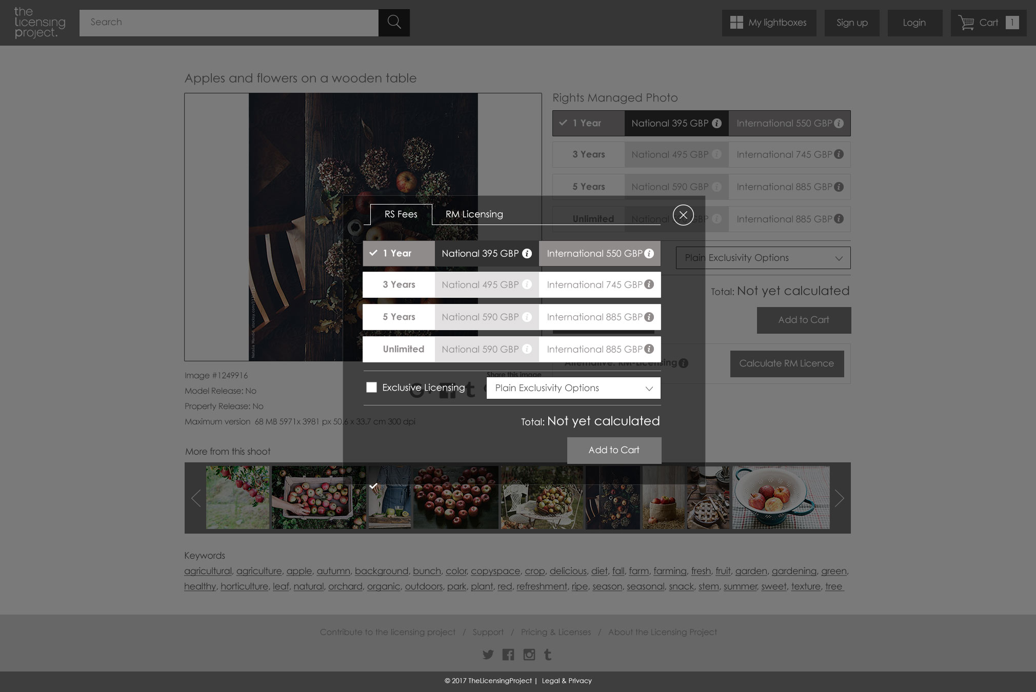
Product page
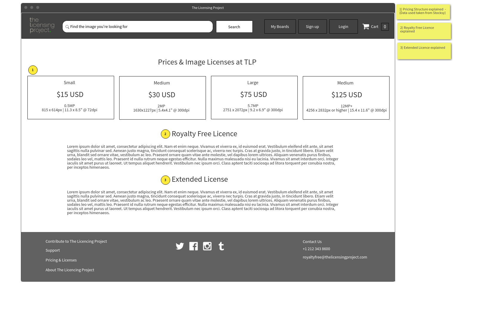
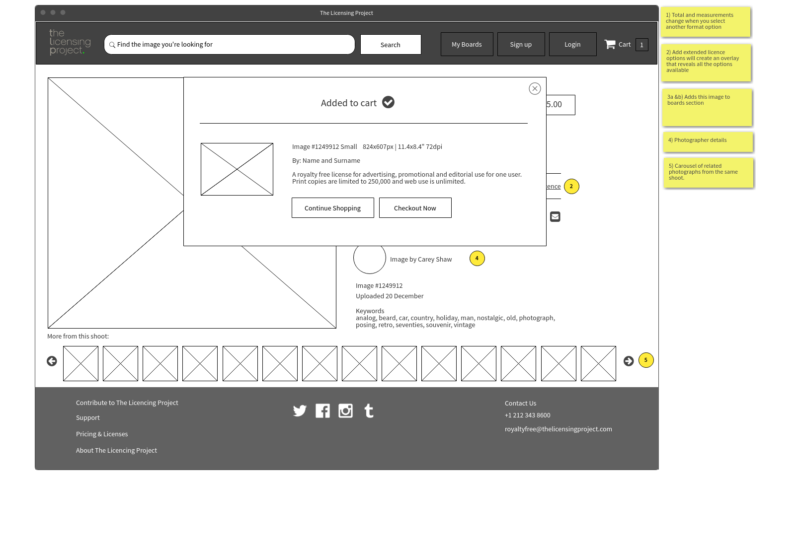
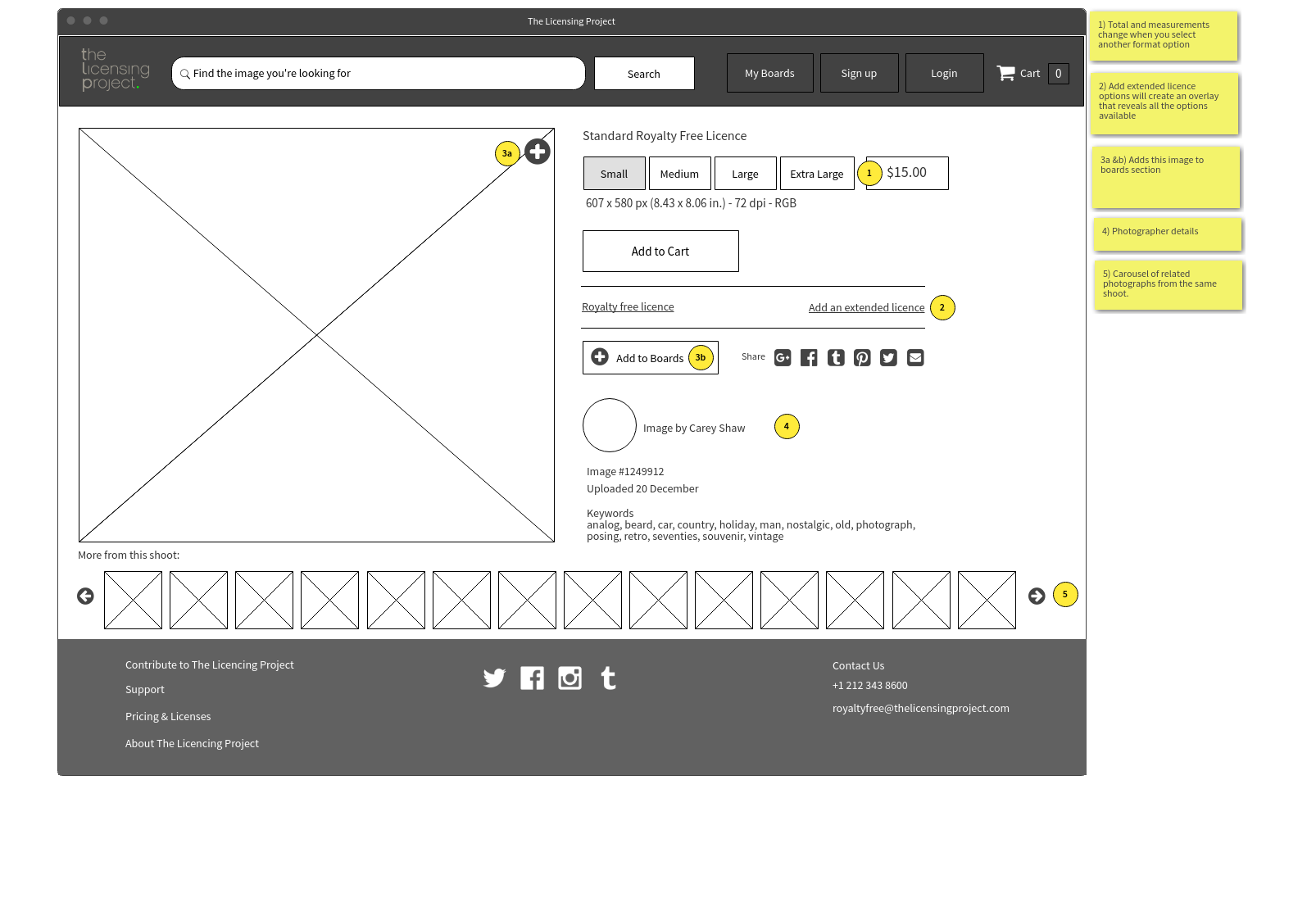
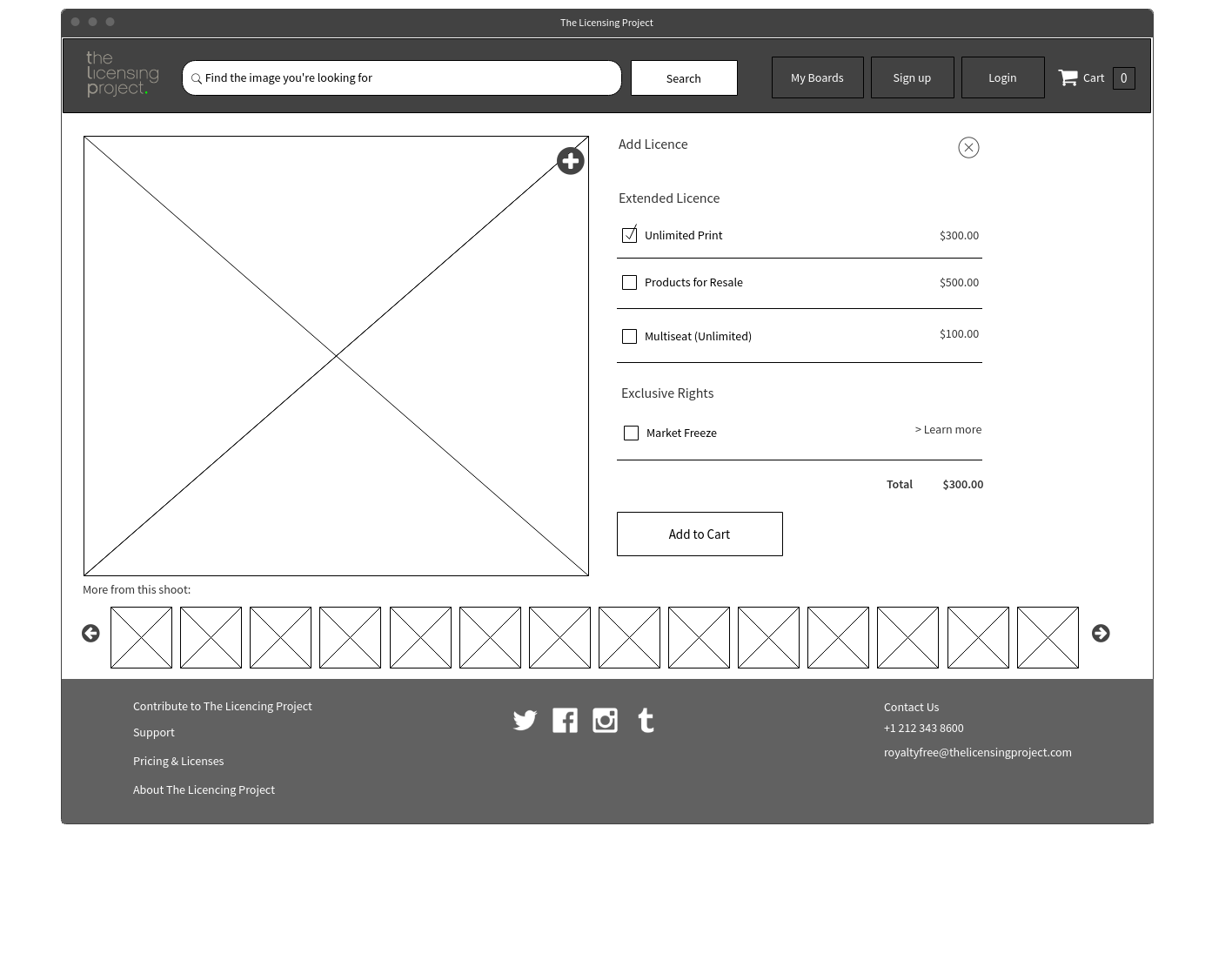
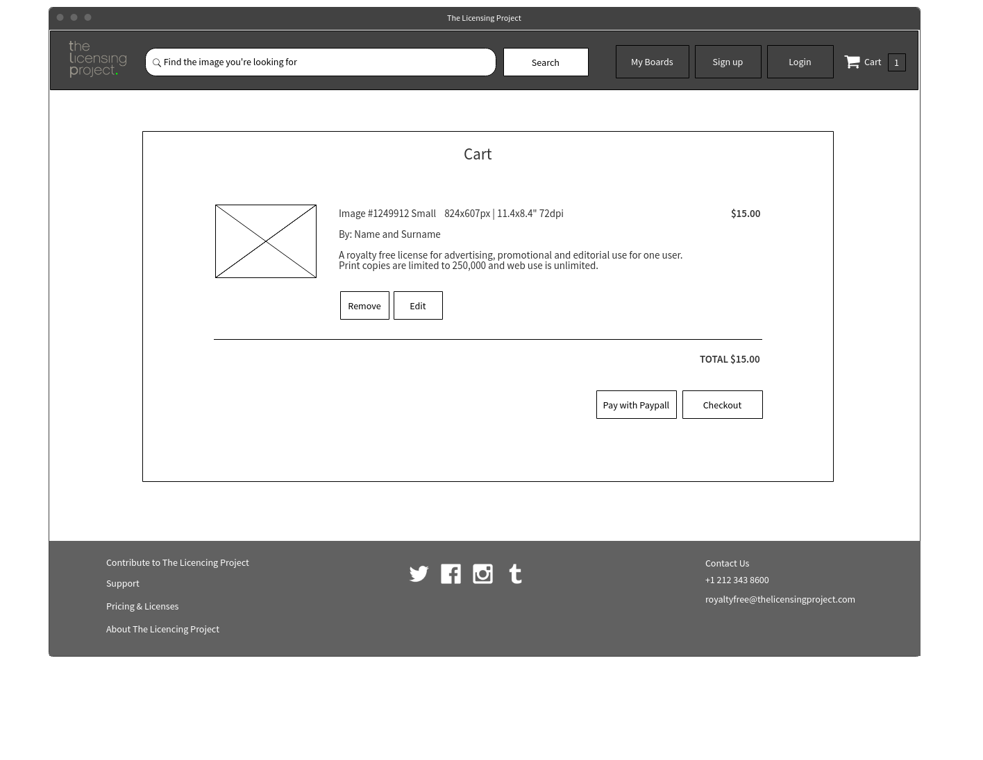
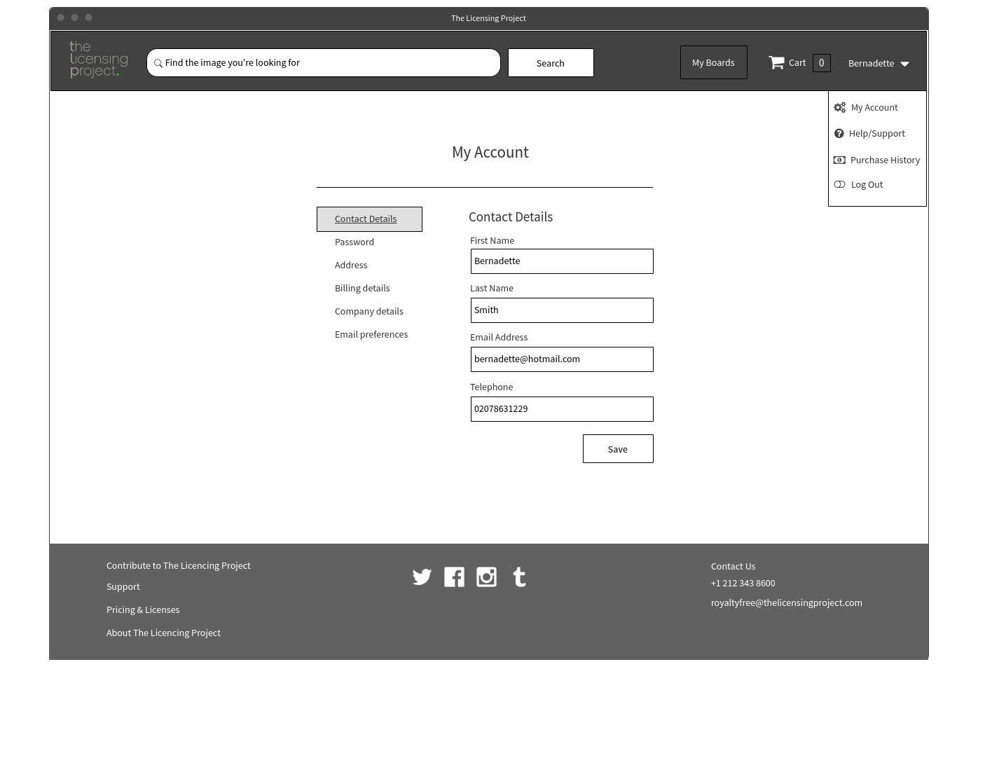
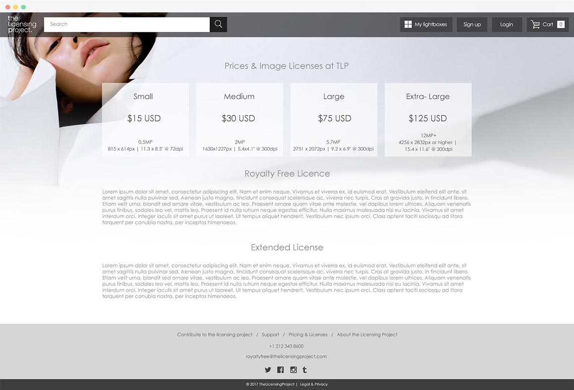
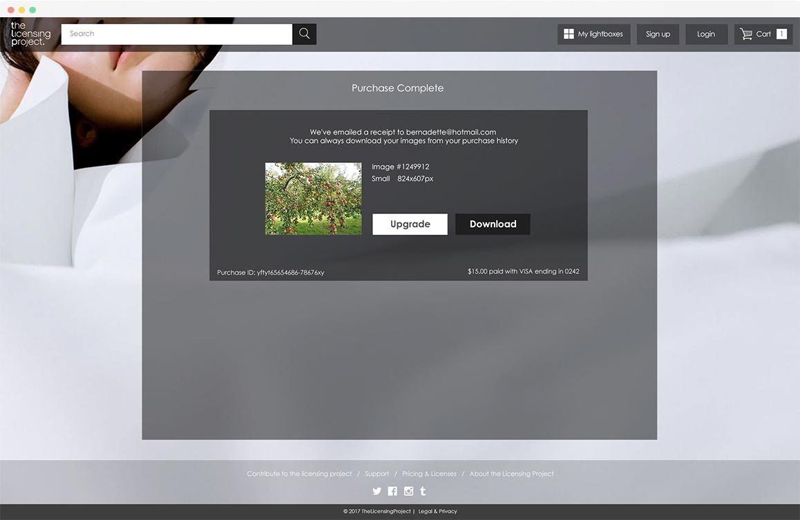
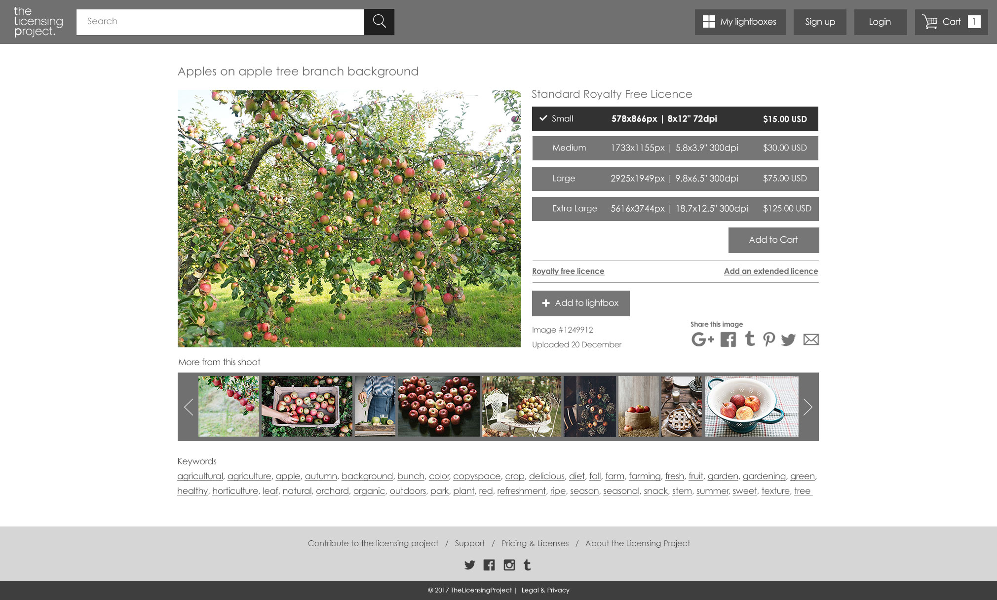
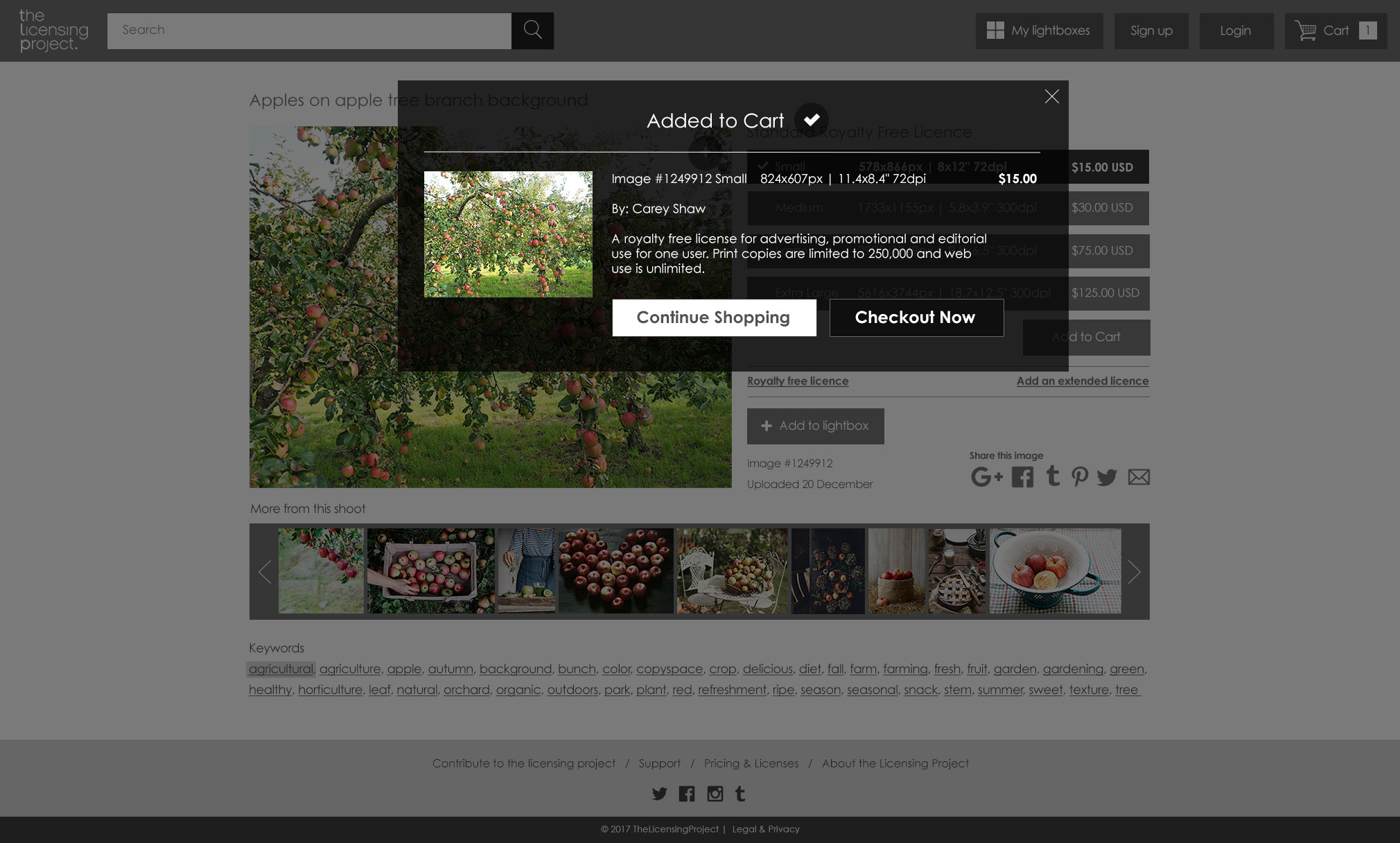
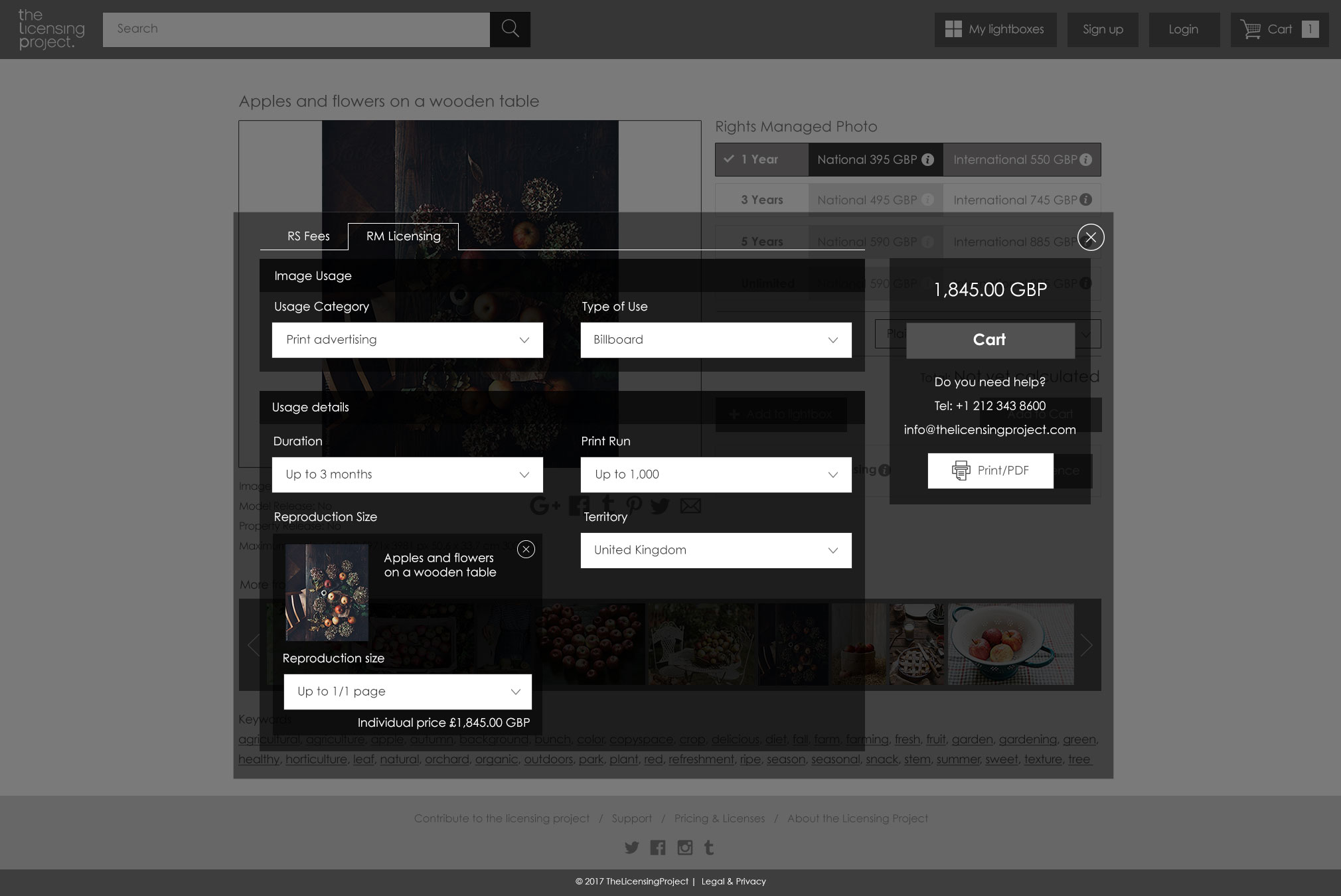
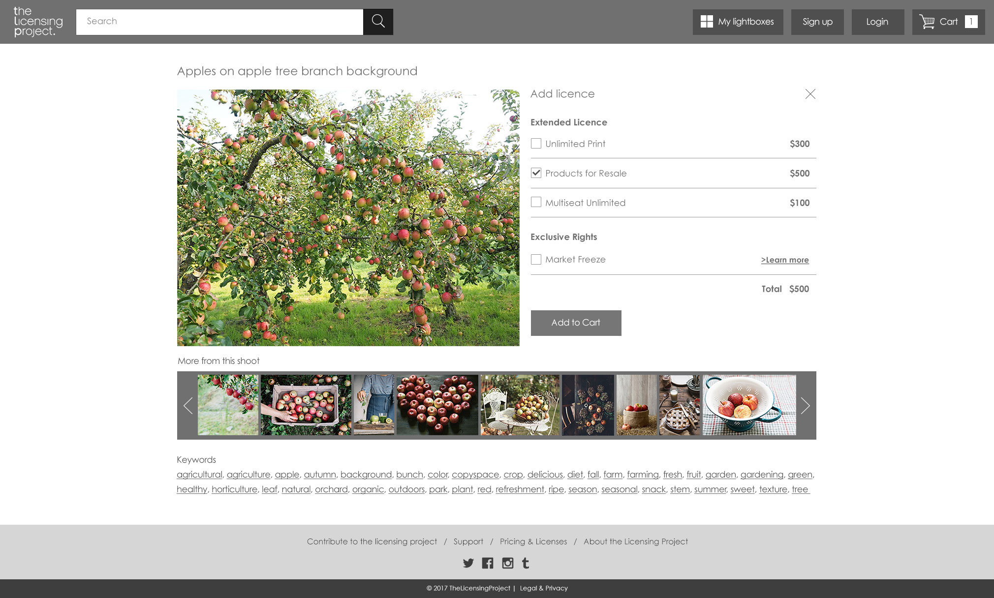
The 'Required Extended Licence' option added some complexity to the product page design. There was a lot of information the user had to be able to see at a glance:
- The size of the image (small, medium large)
- Dimensions and DPI of each option.
- The type of licence Royalty Free or Extended
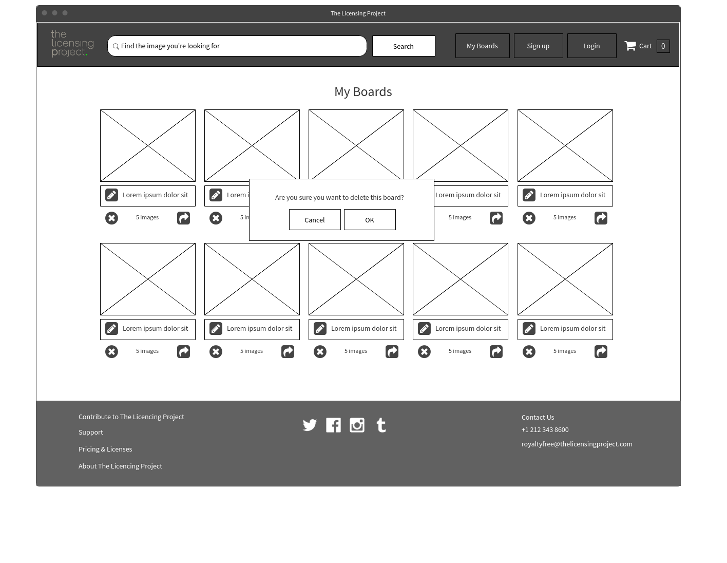
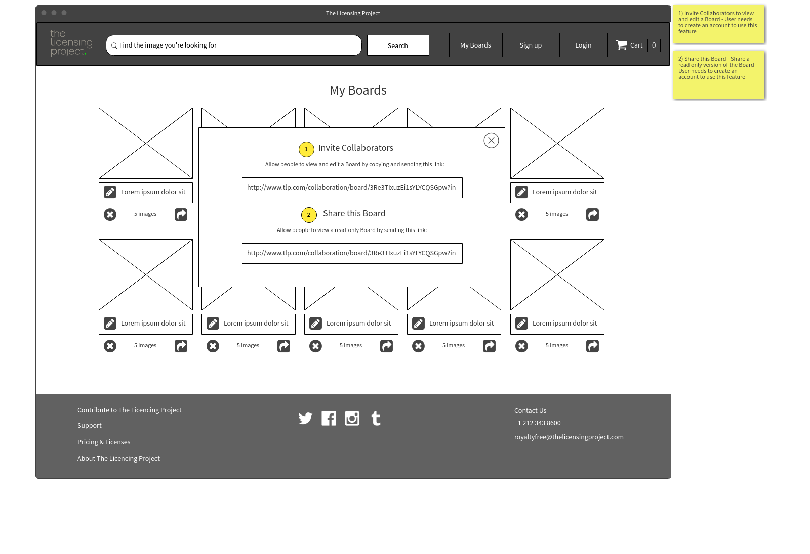
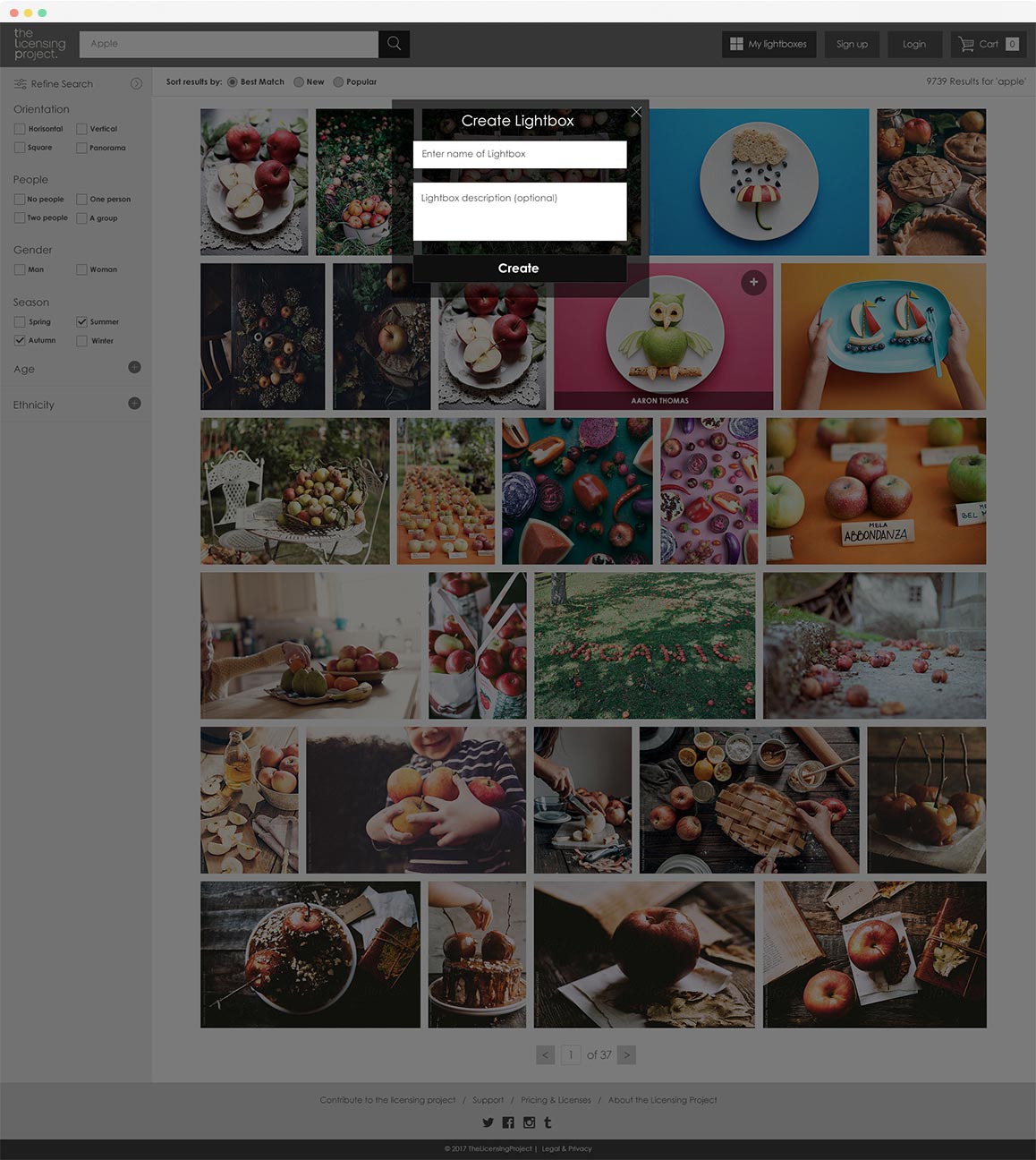
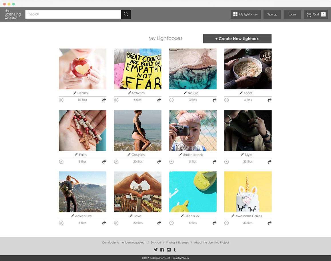
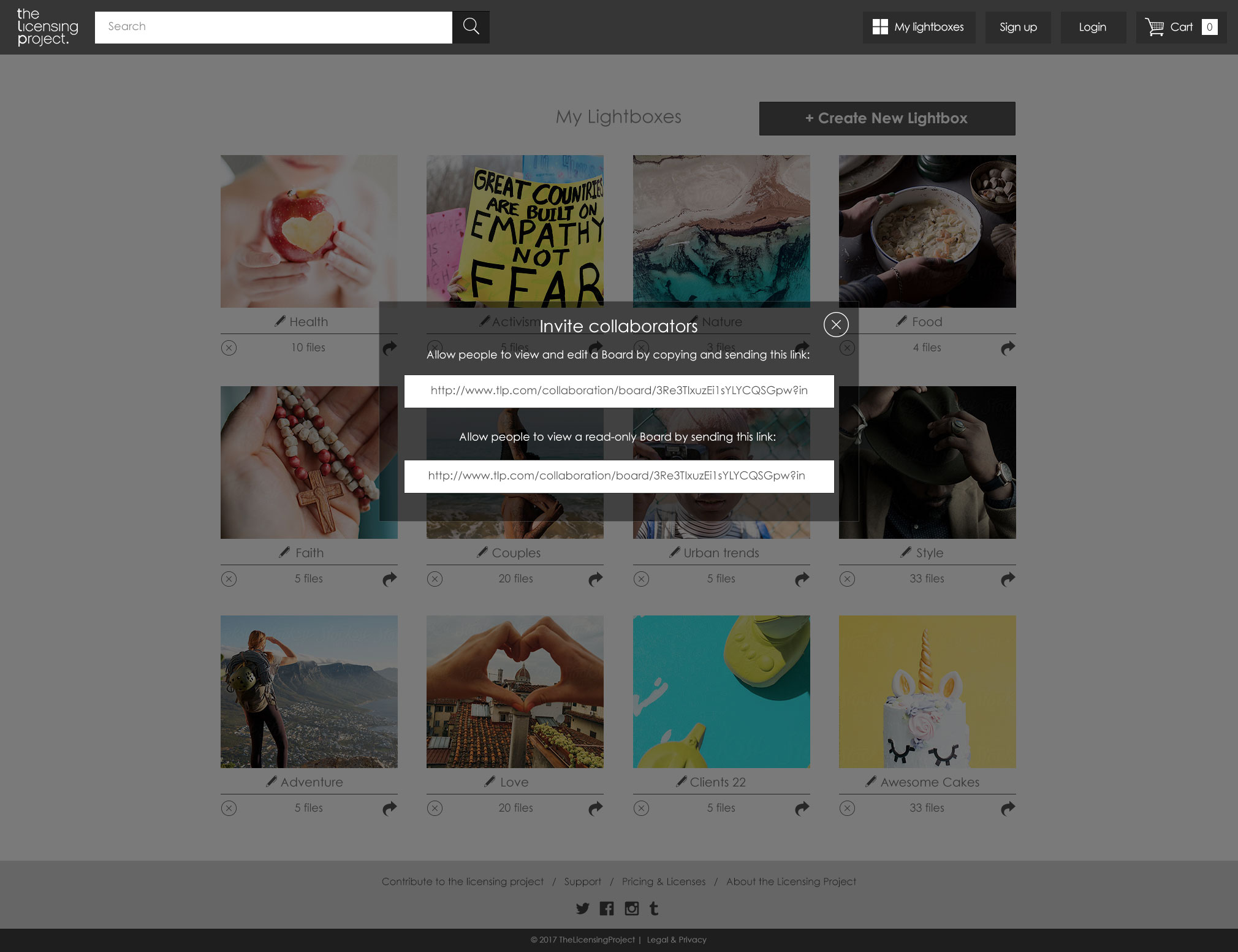
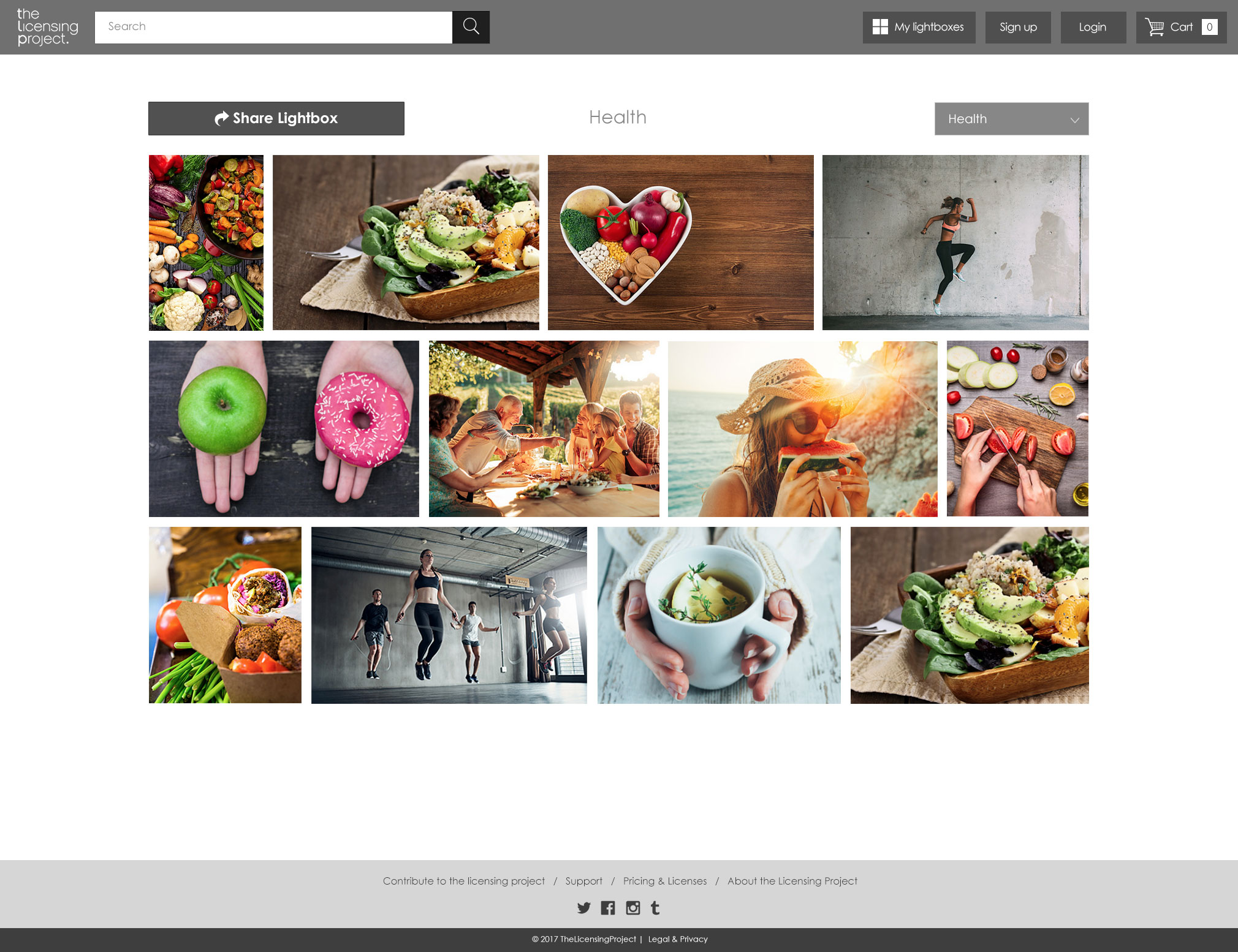
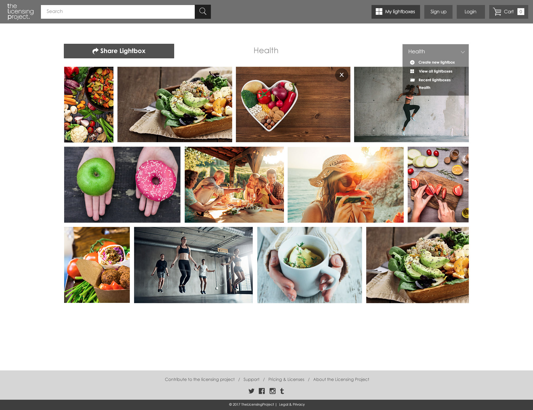
- The user had to be able to add the image to the Boards and see the image ID, upload date, and keywords.
According to the stakeholder interviews, the licence type must default to royalty-free. Therefore, we were designing for the primary use case of Royalty Free.
My secondary research found some frustrating design patterns to avoid.
"Avoid Tiny Scrollable Panes, design for the 'comfortable range' not the maximum amount of filters, provide text input fallback and never auto-scroll users on a single input."
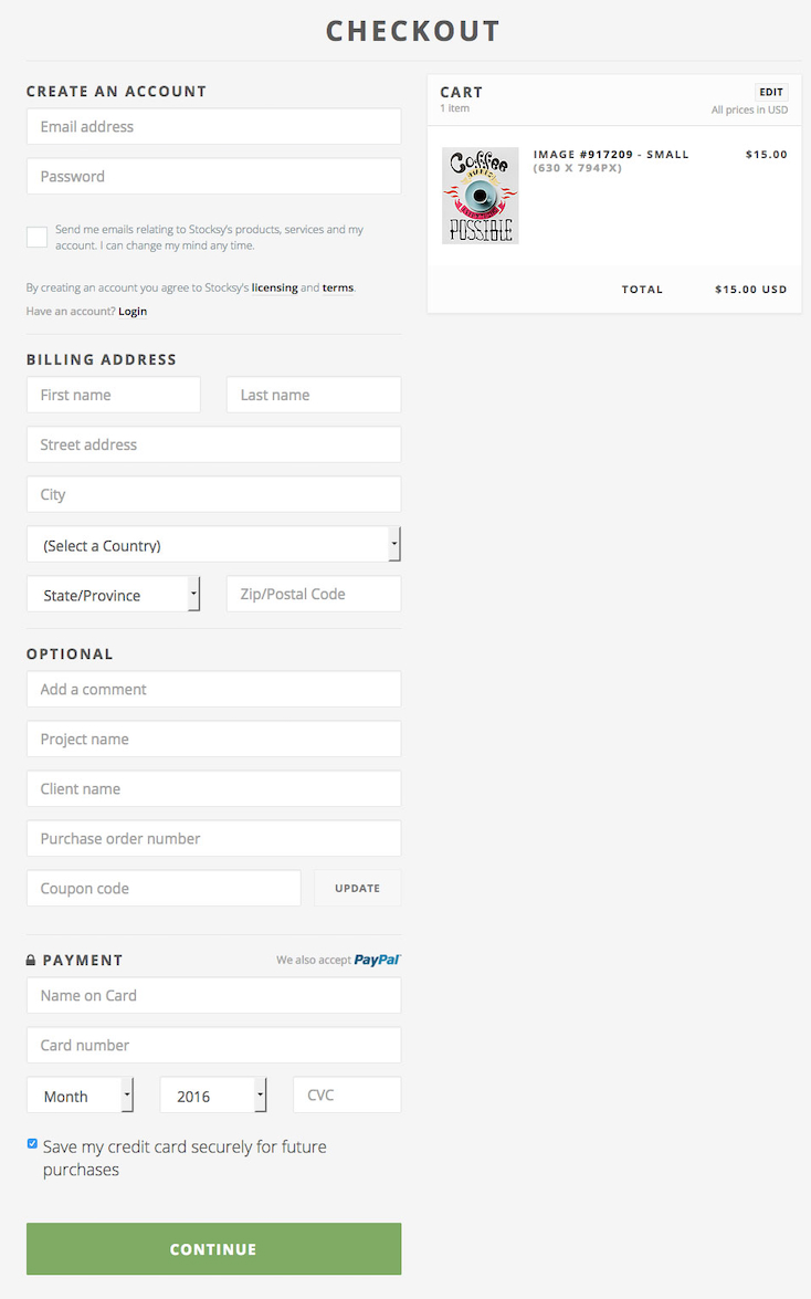
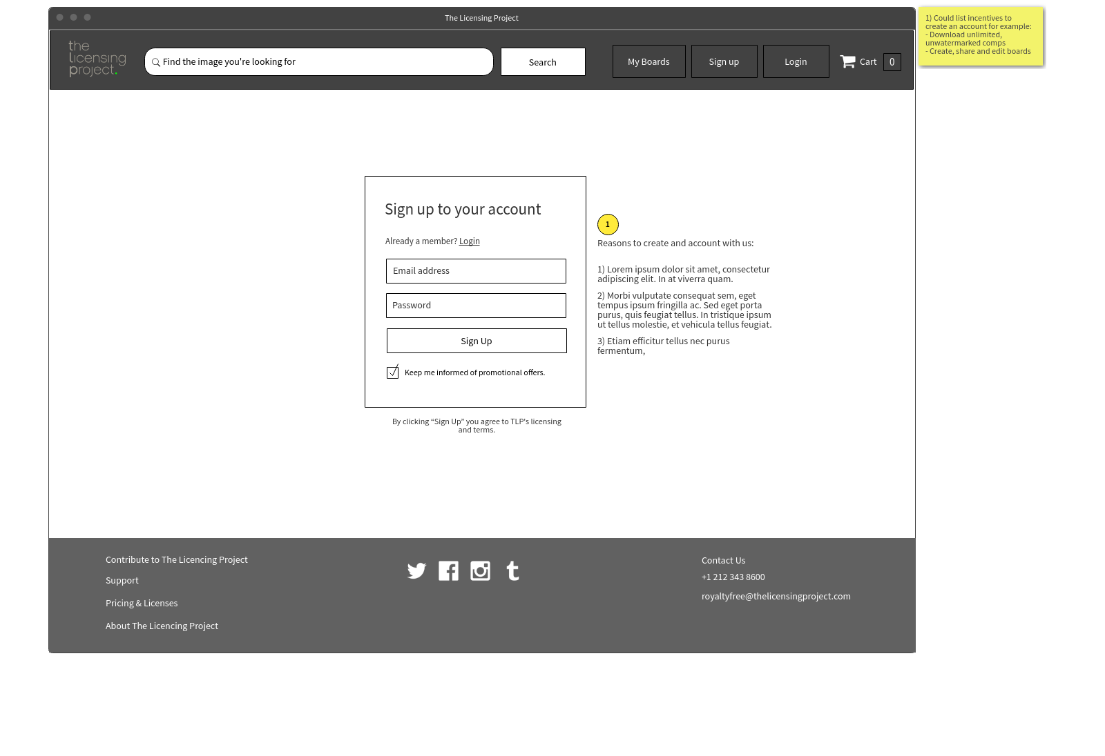
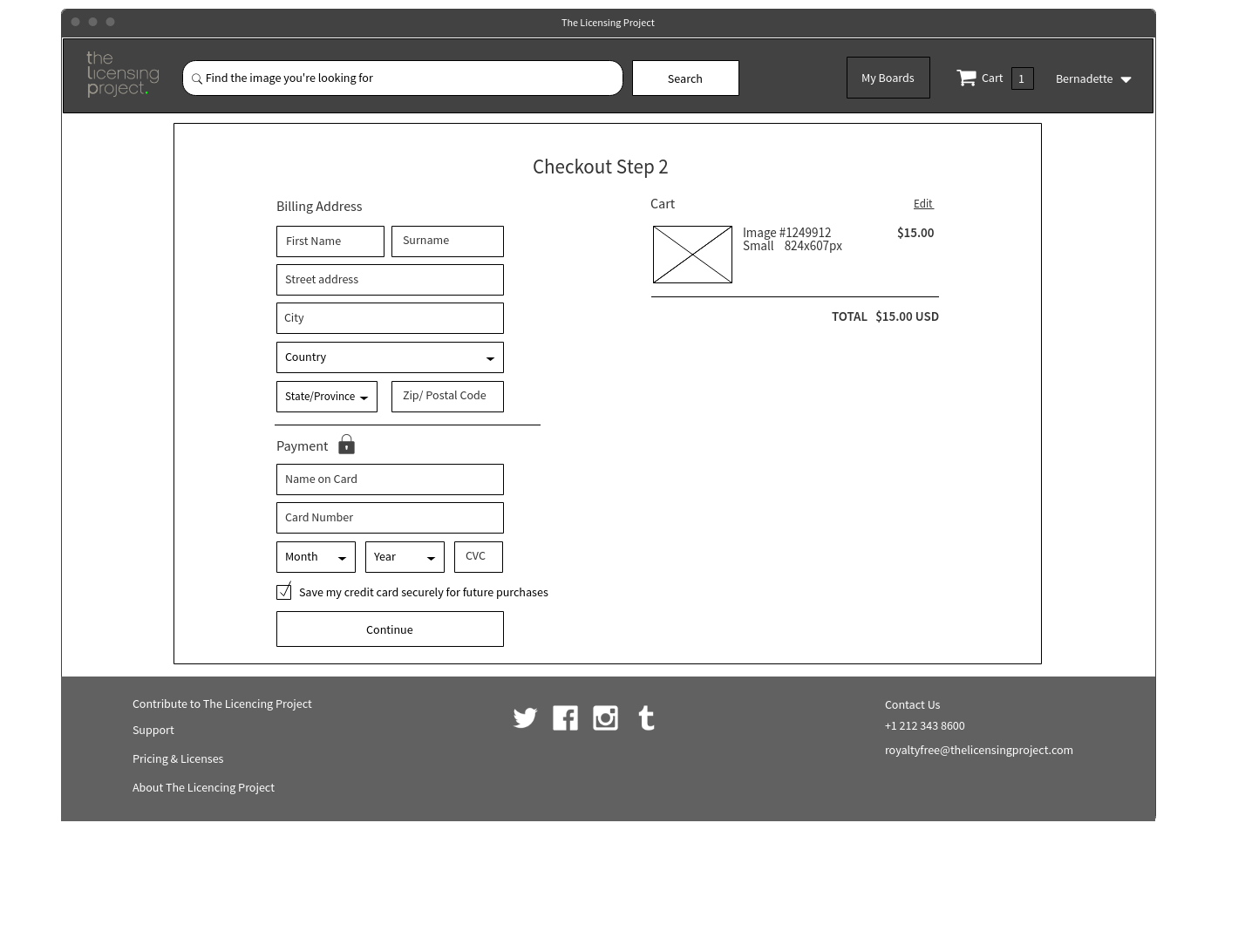
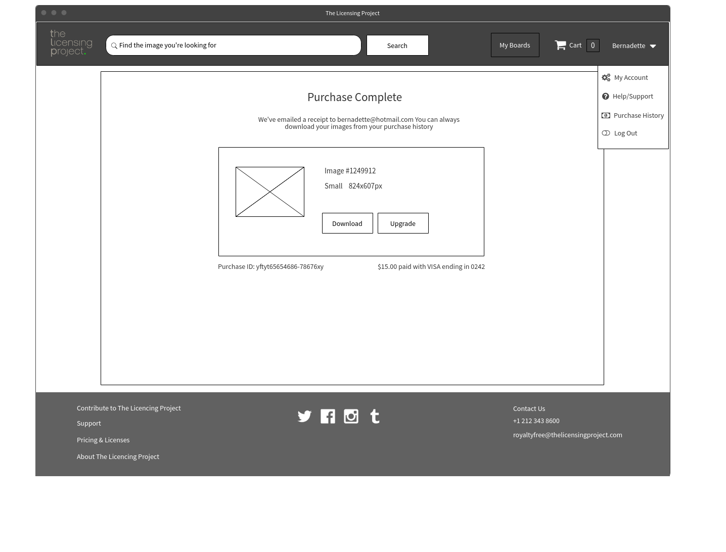
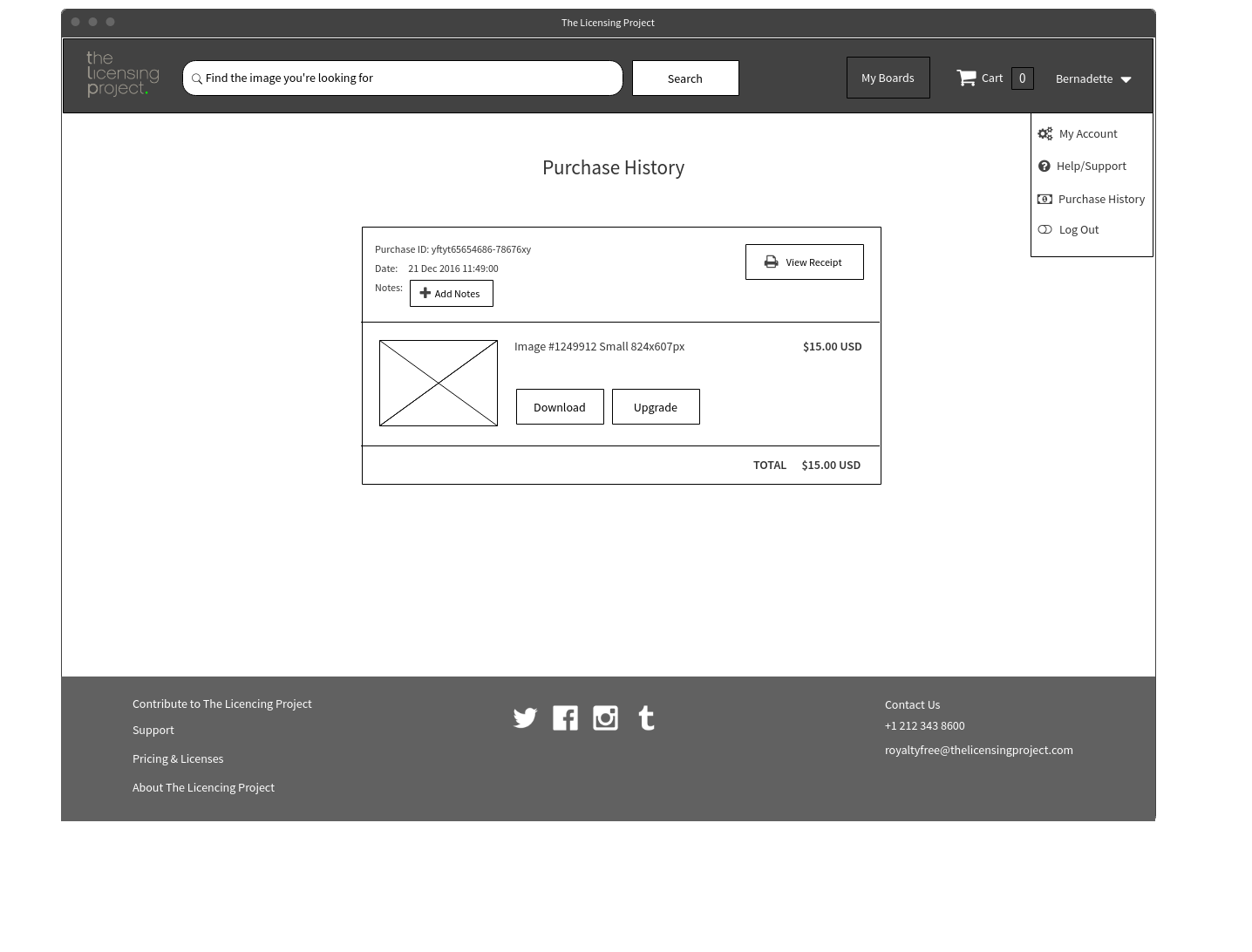
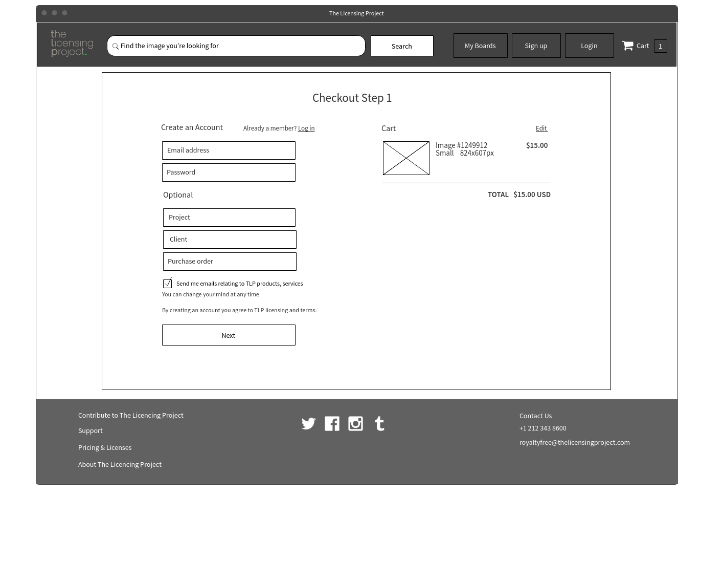
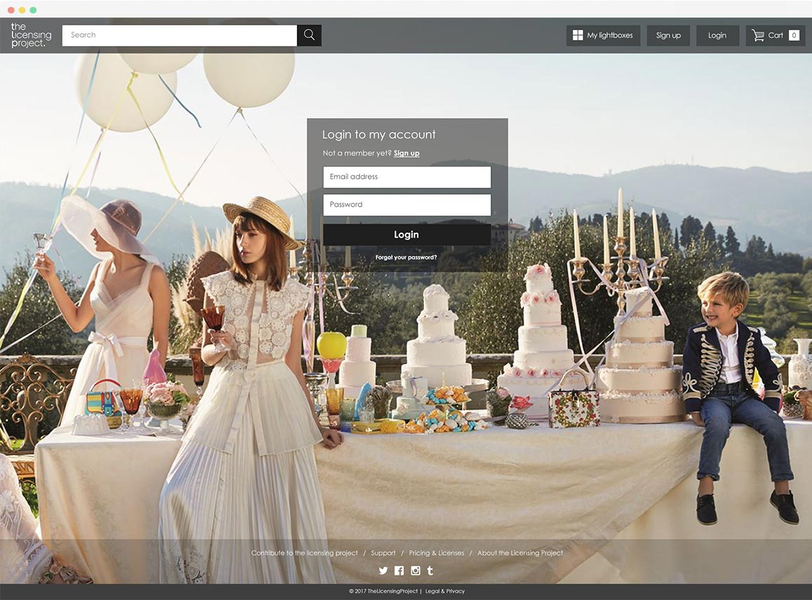
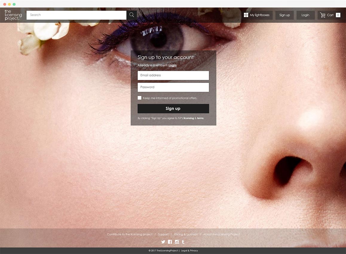
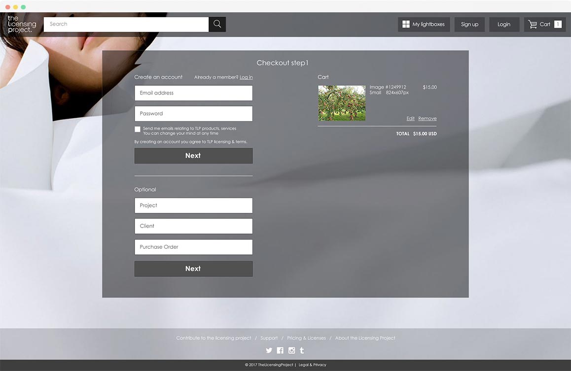
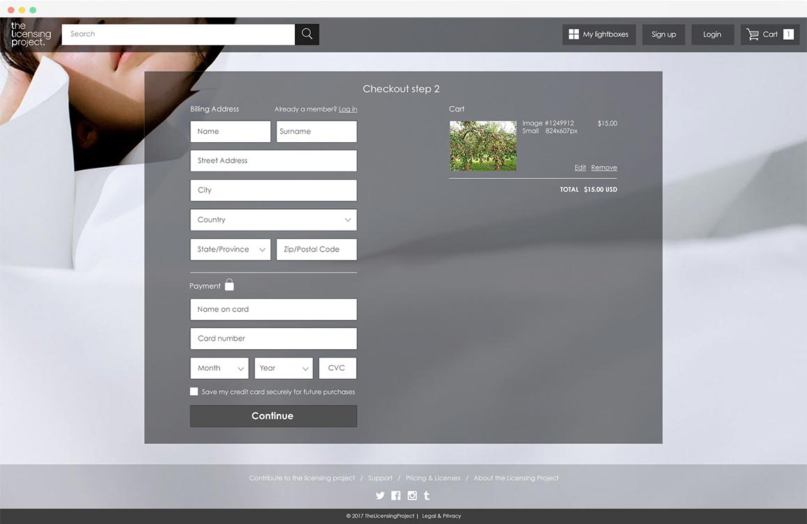
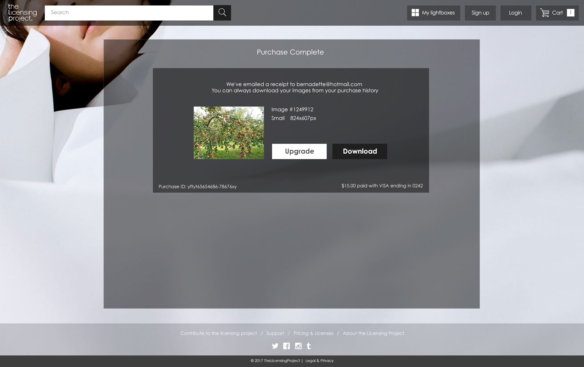
Checkout and payment flow
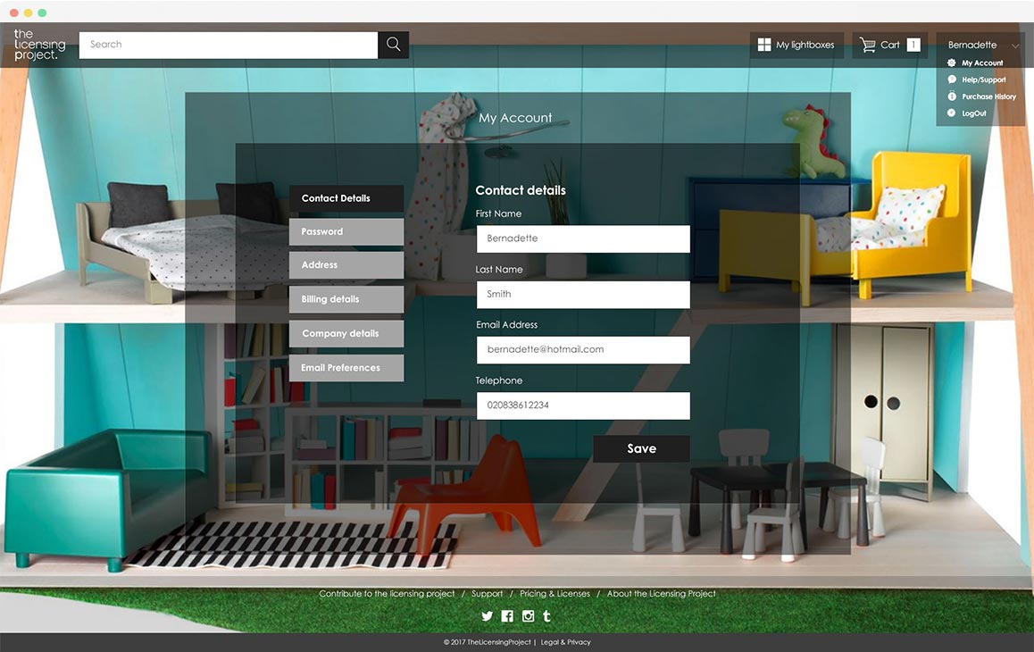
Stakeholder requirements for the payment flow were that users must create an account, see the product and amount they buy, and enter their payment method and address. Optional data requested was project, client and PO, which marketers and admin staff could use.
Competitve bencmarking showed that some competitors had long checkout forms, which could seem intimidating to users.
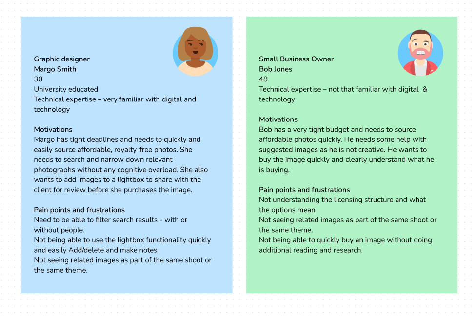
Persona's based on secondary research
Impact of research on the product
Filters and search
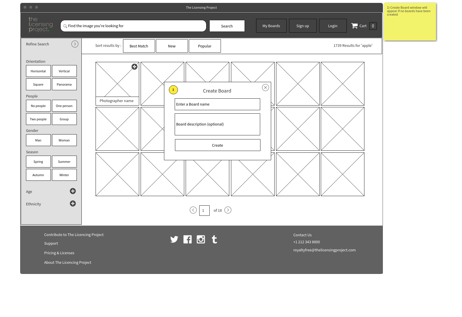
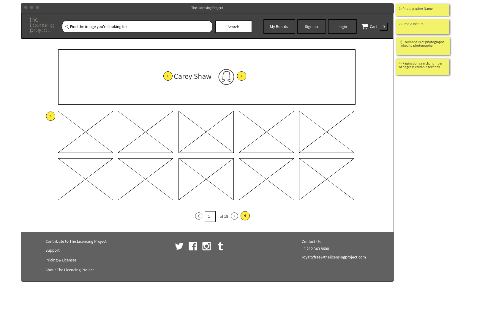
- I designed a search filter with only the most common criteria available on the first view and the rest able to expand out and added an arrow to the search bar so that the user could expand or minimise the filters as they wish.
- During my benchmarking, I found that the most effortless controls to use were select buttons rather than traditional form controls. To ensure the user saw the most varied content, I added a sorting function to enable the user to sort by Best Match, New or Popular.
Product Page
- I added buttons showing the dimensions and DPI of an image on click, and the price controls would also change according to which options you selected.
- The user can see each selection's details at a glance without getting overwhelmed with cognitive overload.
- I decided that because the extended licence option was for edge cases, I would design them to appear within a popup, so they didn't clutter the default interface.
Checkout and payment flow
- I used chunking to ensure the payment form wasn't too long; I broke the flow up into two steps. Added clear headings and chunked the data groups, helping the user not get overwhelmed.
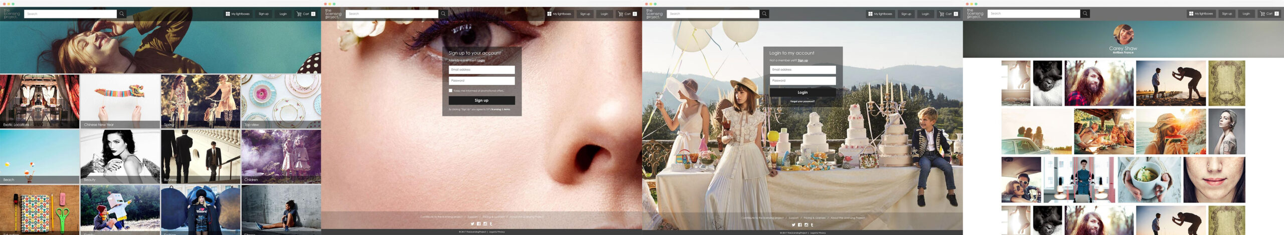
Hi-Fidelity Design
The brief was to keep the design contemporary, functional with a focus on making the photography the focal point.

Outcome & lessons
The business loved both the proof of concept and the high-fidelity designs.
The design challenge was that the stakeholders wanted a desktop prototype before we could go to mobile due to budget constraints.
So I made sure to keep this in mind during the design process.
Due to business reasons, the site has yet to launch.
Contact
Shoreham-By-Sea
LinkedIn: https://tinyurl.com/5dm8rejh
Email: celestedupreezdesign@outlook.com
Twitter: @celestedupreez
© Celeste du Preez 2023