Superior
Corporate website
Problem statement
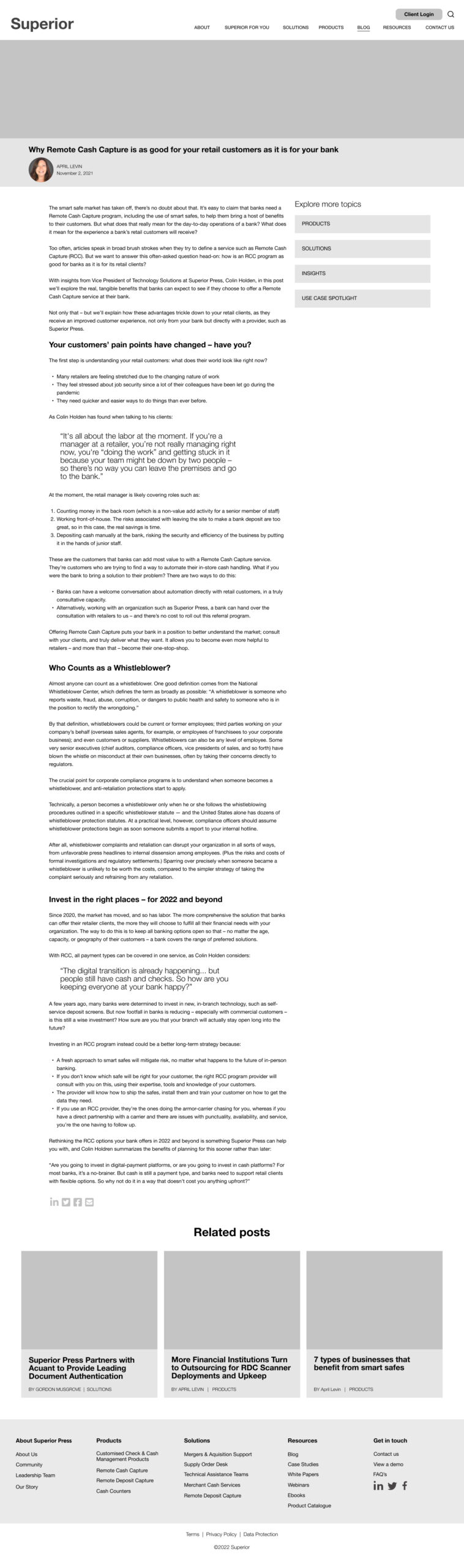
Superior Press rebranded to Superior. As a result, they needed a new website to reposition them as a solution provider to banks rather than a predominantly paper product-focused company. In addition, the new website needed to build trust and credibility in this new space.
Using my research results, I overhauled the website architecture taking the following journeys into account:
- Log into the customer portal to place orders
- Gather information on products
- Gain an understanding of the solutions offered
- Make contact or get quotes.
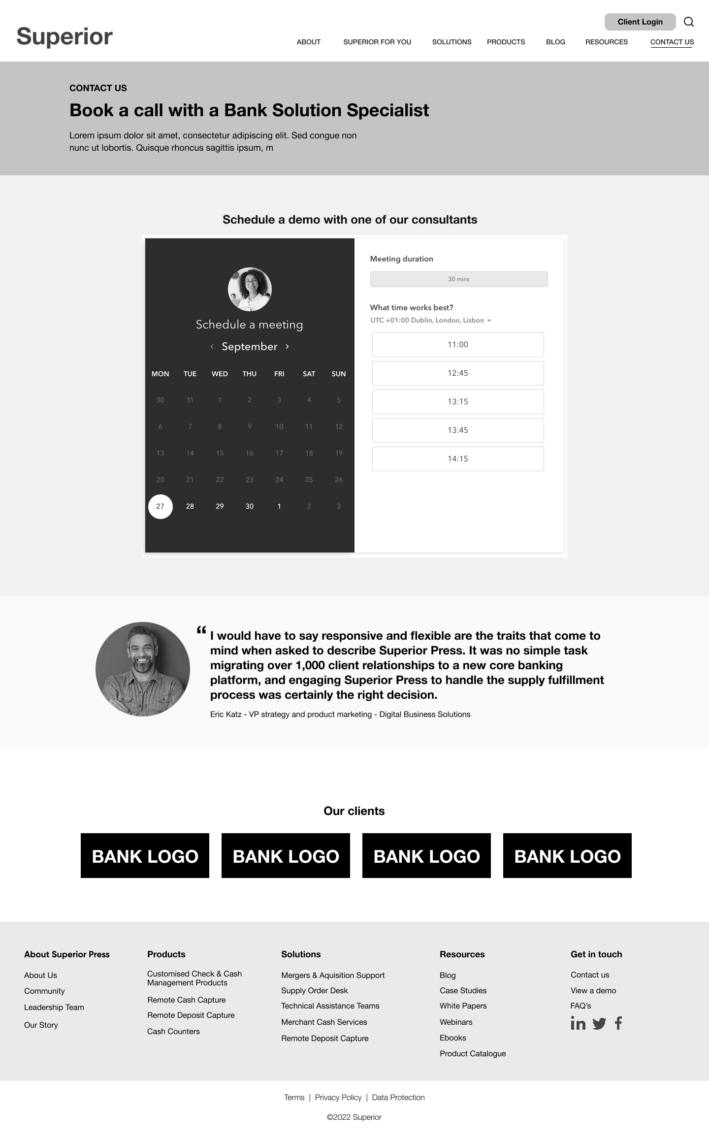
- Book an appointment with a consultant.
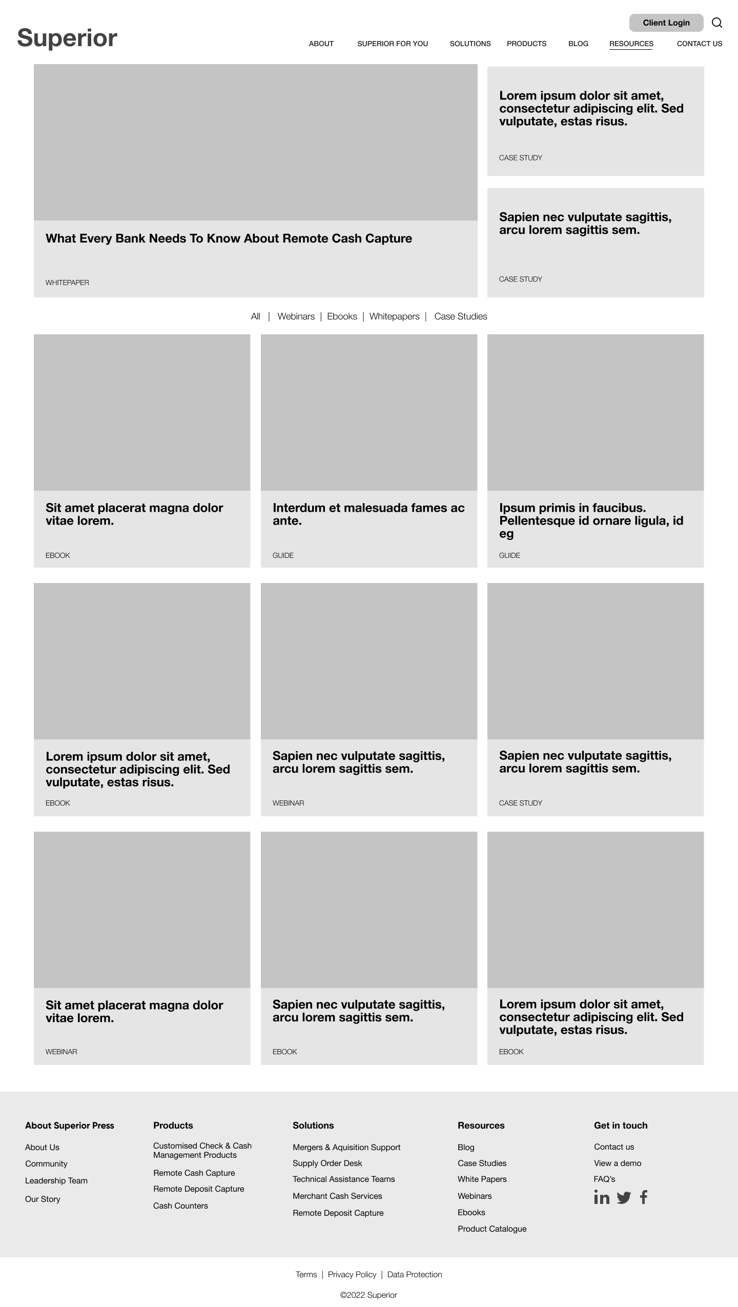
I also created a robust design system to translate the newly branded atomic-based components into functional modules of a custom-branded HubSpot theme.
I led the project and worked on research, analysis, prototyping and, finally, creating the visual design of the new design system. My developer colleagues applied their magic to help code the components. I was also responsible for delivery, so I was involved in Quality Assurance, final checks, and the product launch.
Users & audience
Primary users and journey = Bankers
Secondary users and Journey = Medium to large-sized Businesses, Franchisees, Franchisors
Scope & constraints
The second phase of the project will involve using hotjar and google analytics to optimise user journeys.
Step 1: Research
I used quantitative and qualitative data to understand the current system better. The following research methods were used:
- Stakeholder interviews
- Usability testing
- Website Statistics
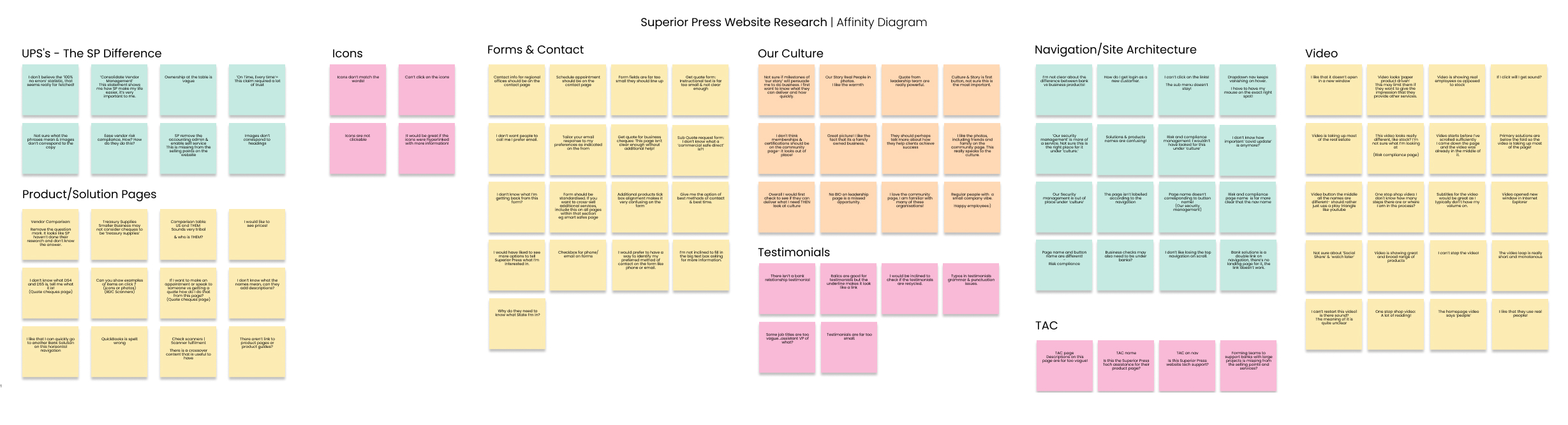
Step 2: Findings
Stakeholder interviews revealed
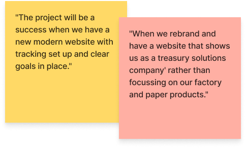
The stakeholder interviews defined the success of the project as follows:
"When we rebrand and have a website that shows us as a treasury solutions company' rather than focussing on our factory and paper products."
"The project will be a success when we have a new modern website with tracking set up and clear goals in place."
Usability tests revealed
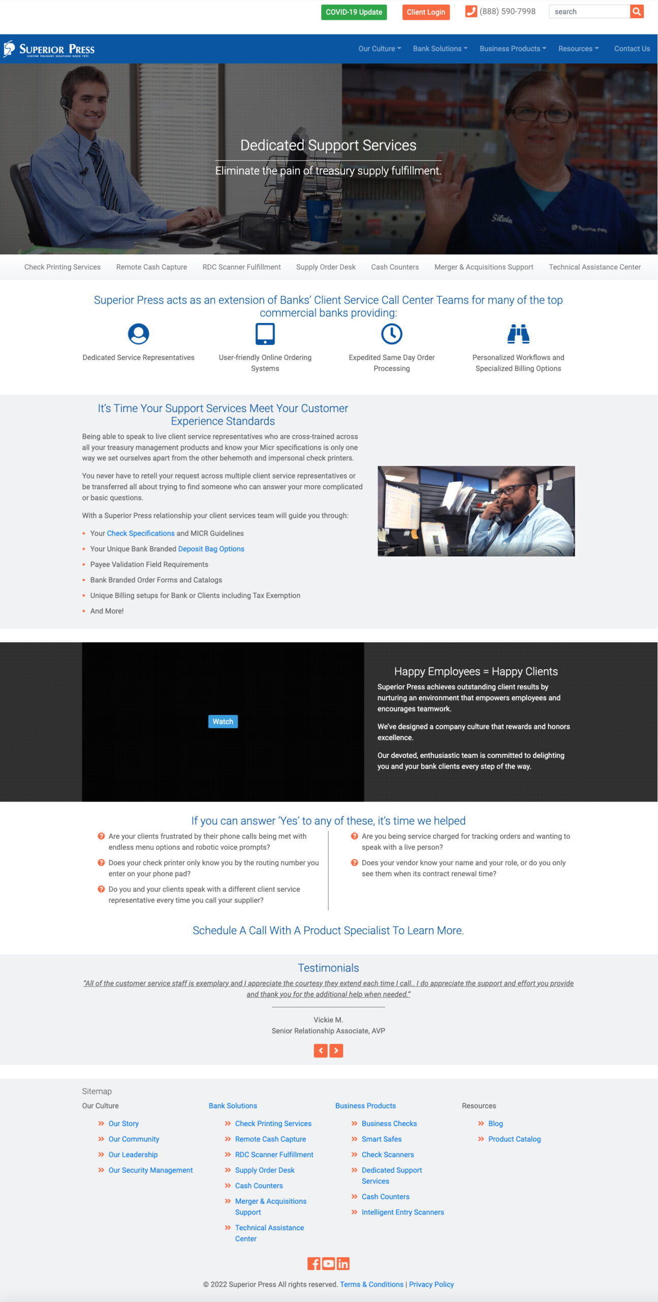
Home
Users needed clarification on what terms meant & images didn't correspond to the copy. In addition, they felt that the video hero section took up too much space, and they needed help to see a clear differentiation between solutions and products.
Product & Solution pages
Most users overlooked the horisontal sub-navigation on the secondary-level pages. In addition, users needed to be more clear on the terminology across the board.
Navigation
The user kept losing the sub-navigation on hover and was unsure if they clicked on the correct link, as page names and button names didn't correspond.
Video
The site used many video background embeds, which frustrated users. They couldn't restart the videos and were wondering about the sound and if they could control it. In addition, they were confused about the text link on the video instead of the play button.
Testimonials
Users only noticed testimonials once I pointed them out because they were so small. They also said that the job titles needed to be more specific and that there was an underline that made it look like a link but didn't go anywhere.
Our culture
Users felt that the security section within our culture was out of place in the site hierarchy. They were expecting to see more focus on how the company helps clients.
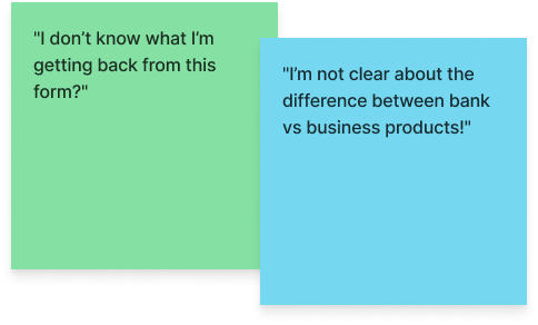
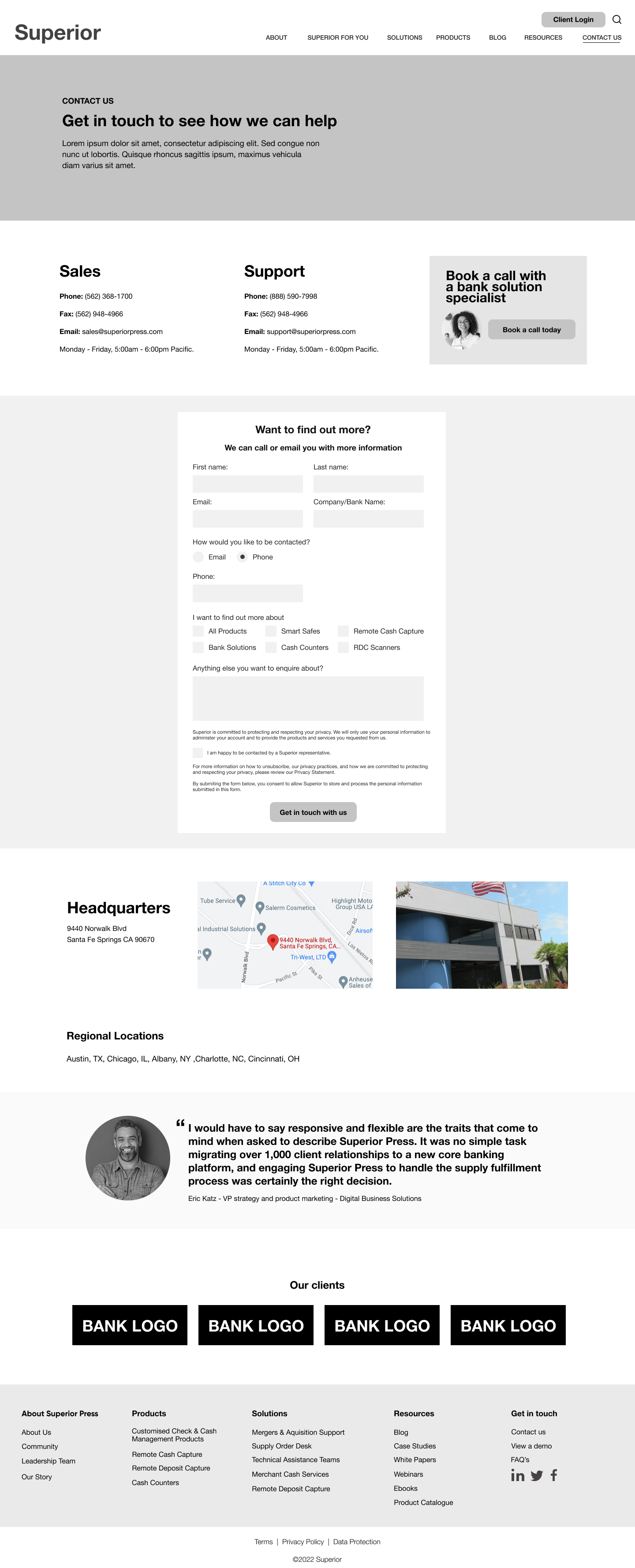
Forms & Contact
Forms were confusing, and users needed clarification about what was 1) being asked and 2) going to happen in return.
Impact of research on the product
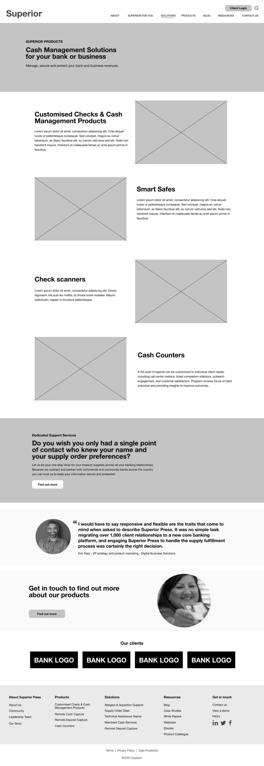
I changed Bank and Business category to Product & Solutions. I did this because the site structure duplicated a lot of content across Bank and Business pages. The duplicate content caused users to question the difference between the checks page underneath the businesses category vs checks in the banks' category, as the page looked the same.
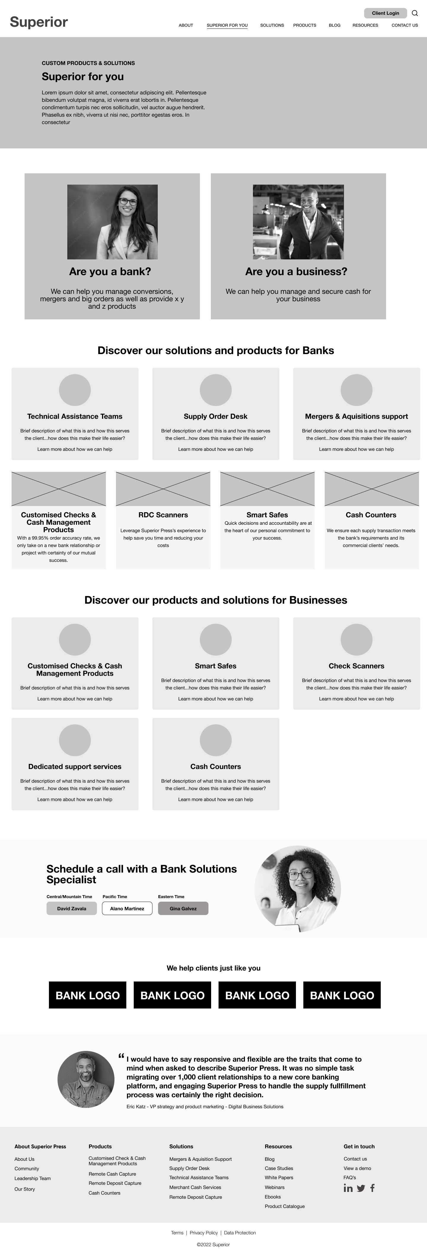
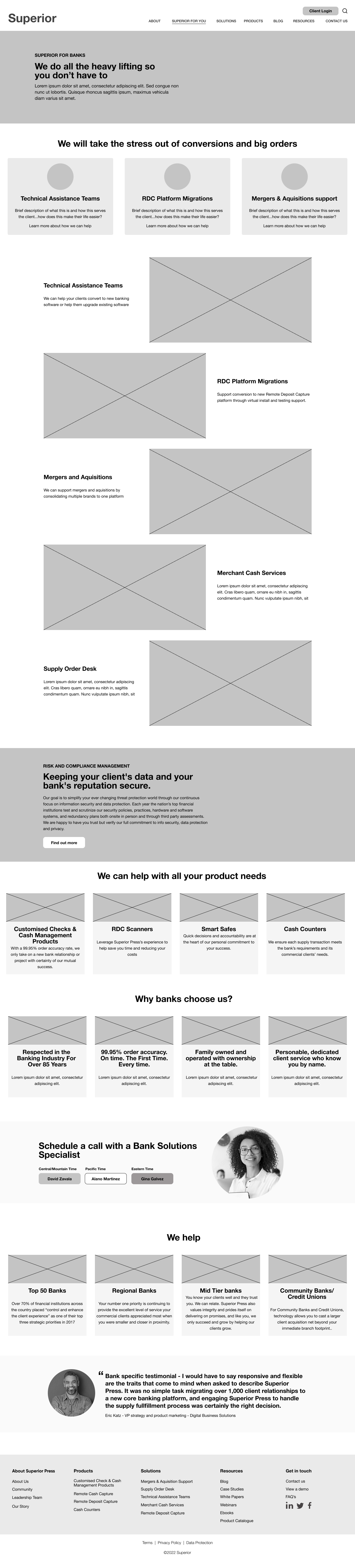
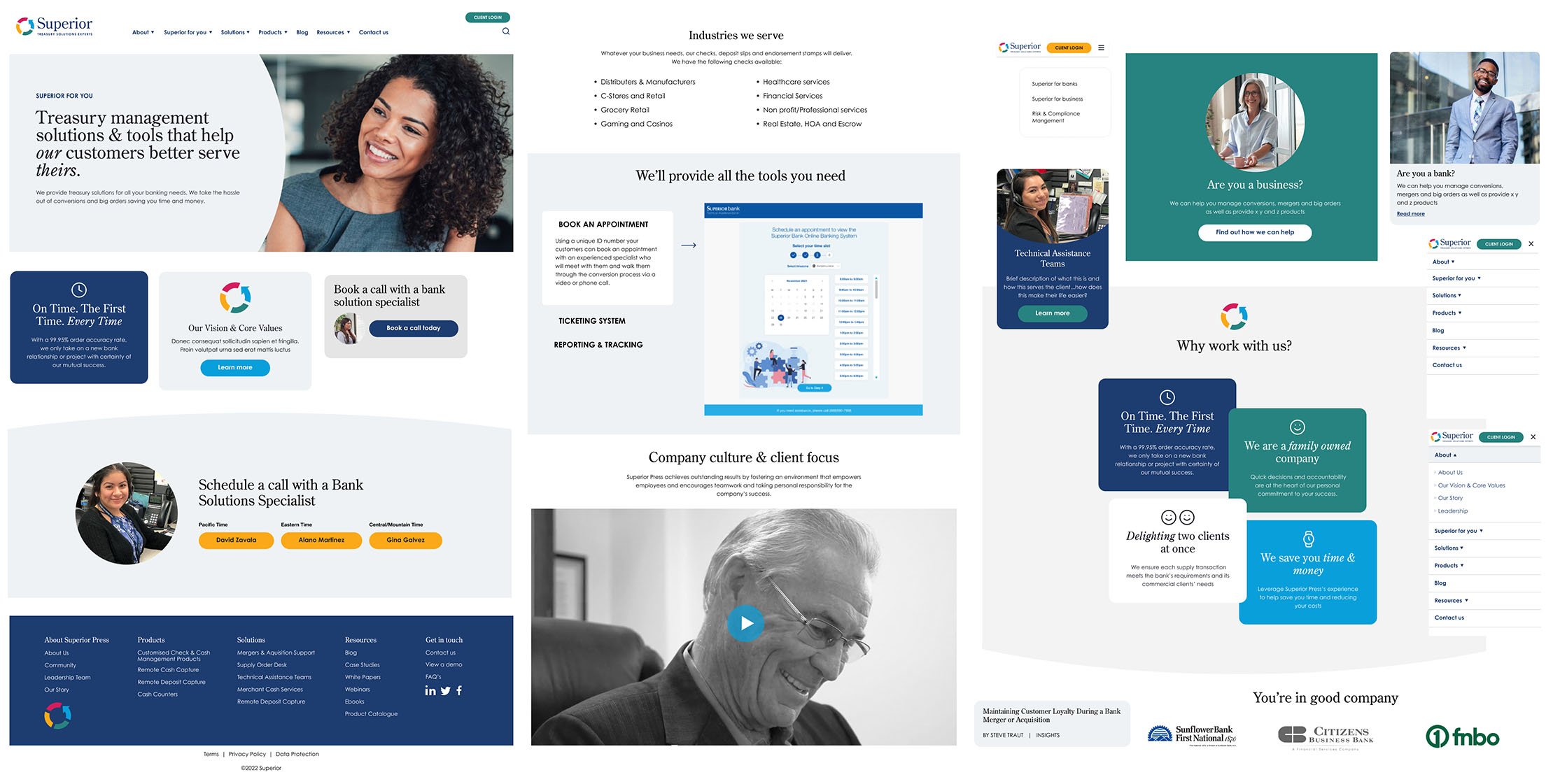
I added a page called Superior for you' - where banks and businesses can self-identify and access specific content for their needs. Still, equally, they can choose solutions or products, making accessing the right content for their needs easier.
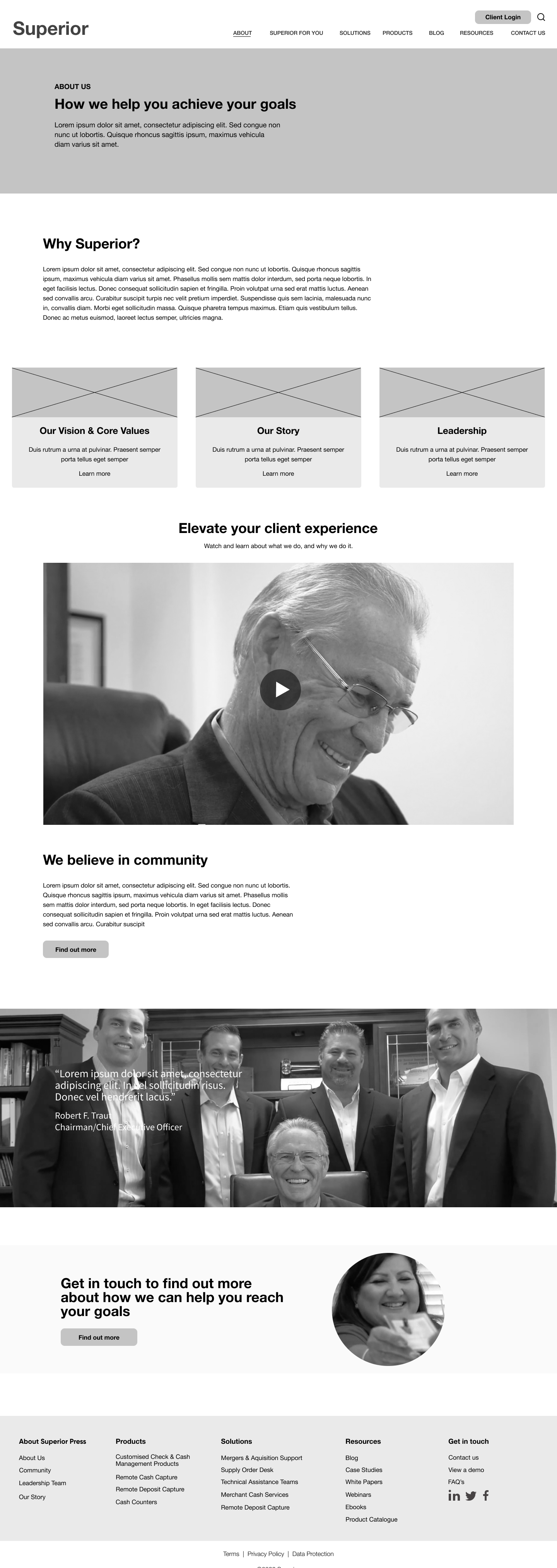
About' - I added 'Our Story' as a separate page as the business wanted to make more of its existing content and use this area to build trust. The new About page was more focused on top-level information.
- Risk & compliance management - I grouped this under solutions as research revealed felt out of place under 'about us'.
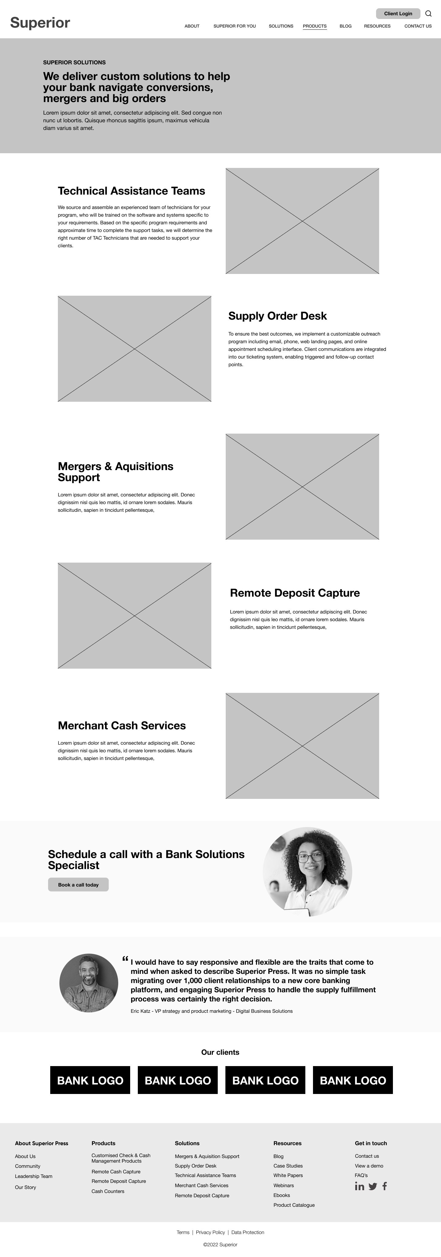
- I designed a clear difference between products and solutions by differentiation in navigation and on pages by adding content different coloured content blocks and using this throughout the website narrative.
- Enabled the primary users to self-identify as Business or Bank and explore which products/solutions are available via the navigation and homepage.
- I created a clear path to call to action relevant to each user journey, business or bank.
- Gave users complete control over video (start/stop/volume) and used video only when it offered them relevant information.
I steered clear of video backgrounds as the research findings indicated this frustrated users. - Decided on the terminology of products and solutions and used consistently throughout the website
Increased size of social proof modules to build trust & credibility - Reworked forms taking user research into account by adding a contact method and ensuring the form heading and thank you message was descriptive of the actions being taken and coming next.
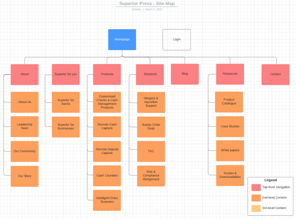
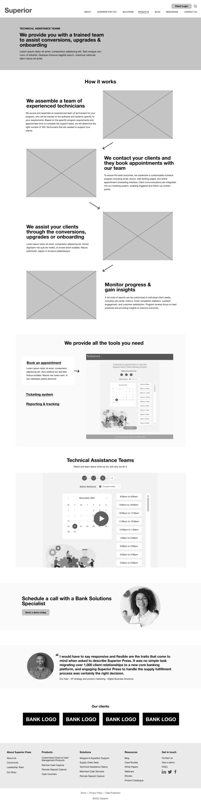
Wireframes & Sitemap
Brand refresh & design system
The brand refresh was designed by an external agancy. I translated the top level brand guidelines into a digital design system
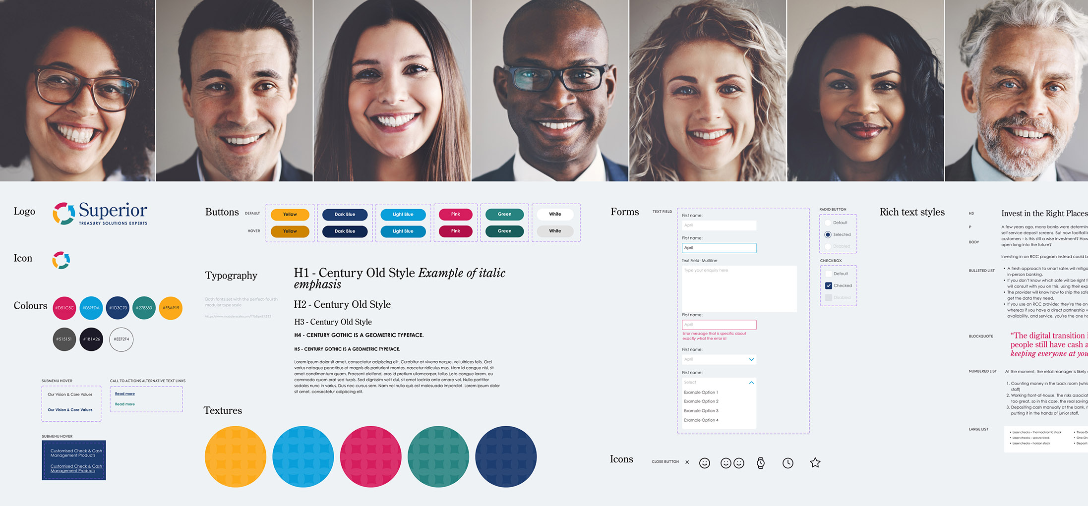
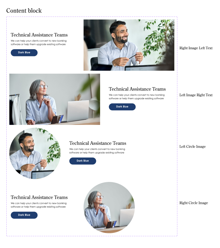
Components
- Further to the core styles I also created a library of resuable and customisable components.
- The coded modules were developed using components and variants of components as a guide
- Each module had customisable elements or variant layouts; complex modules had both. The functionality made it easy to create various layouts quickly.
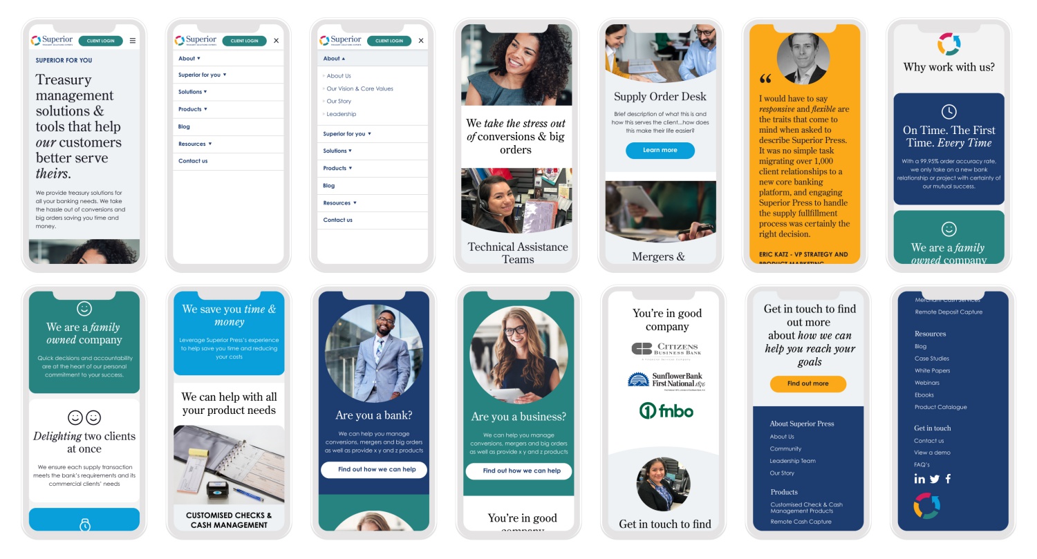
Mobile components
Outcome & lessons
The redesigned website reduced the bounce rate from direct traffic by 10.70 %. and increased increased contact to customer rate by 5.13%, it also increased the referral to contact rate by 50%.
The primary challenge was delivering a website that differentiates between paper products and solutions with a predilection to the solution offering.
This next stage is to improve and add more specific user journeys to the type of product or solution the user is looking for and to optimise the site.
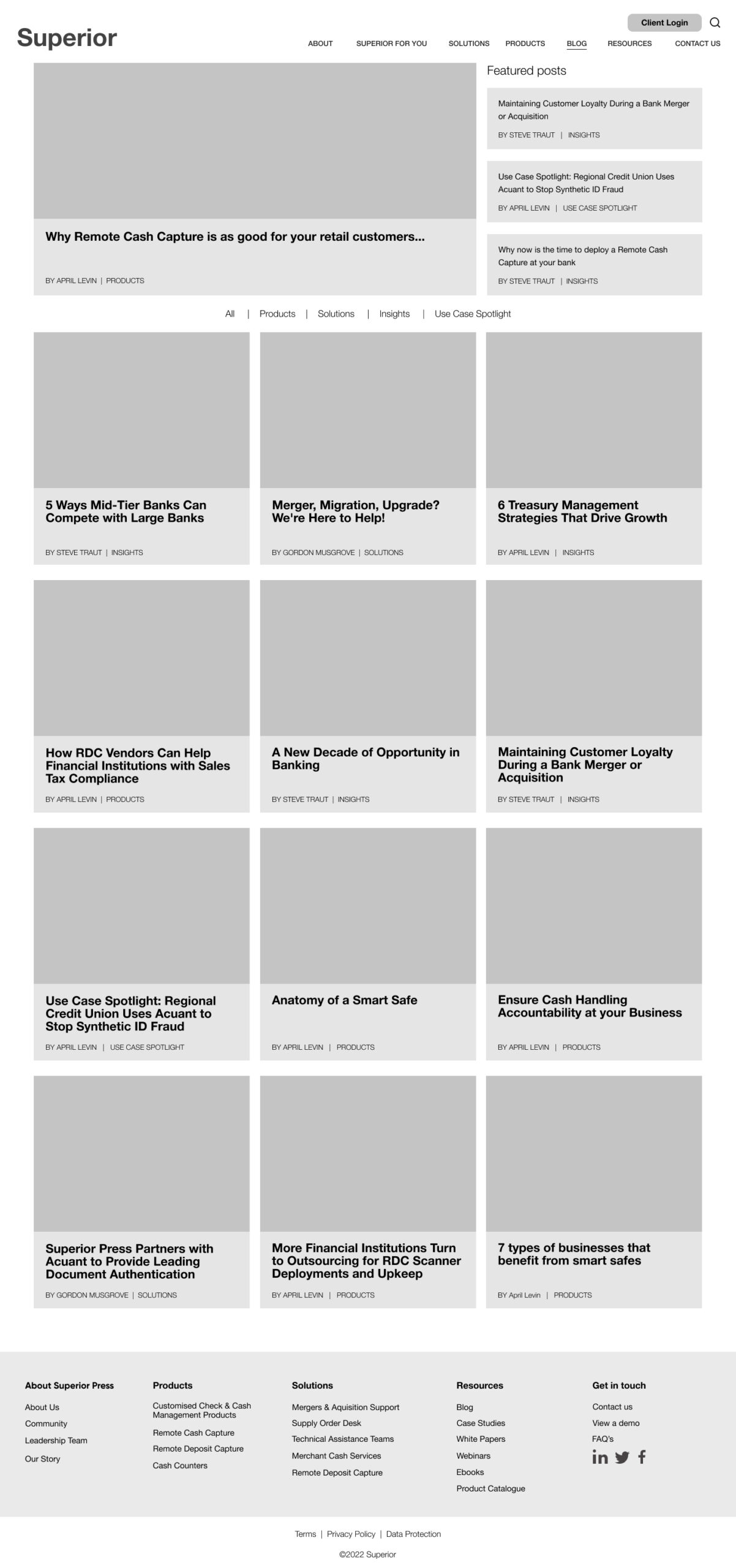
Hi-Fidelity prototype
"We've been able to expand our capabilities with your team's support and ingenuity through the design and implementation of both creative executions and technical platforms."
April Levin - VP of marketing - Superior
Contact
Shoreham-By-Sea
LinkedIn: https://tinyurl.com/5dm8rejh
Email: celestedupreezdesign@outlook.com
Twitter: @celestedupreez
© Celeste du Preez 2023