VantagePoint Consulting
Corporate website
Problem statement
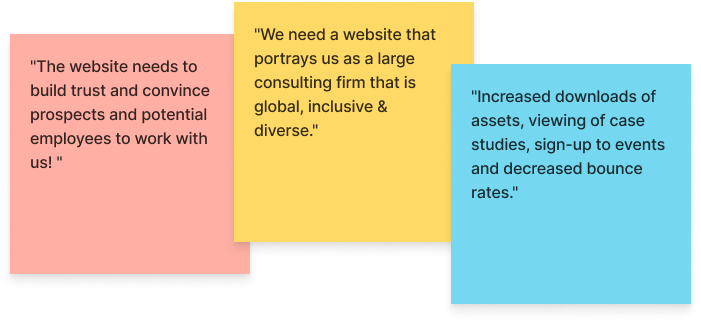
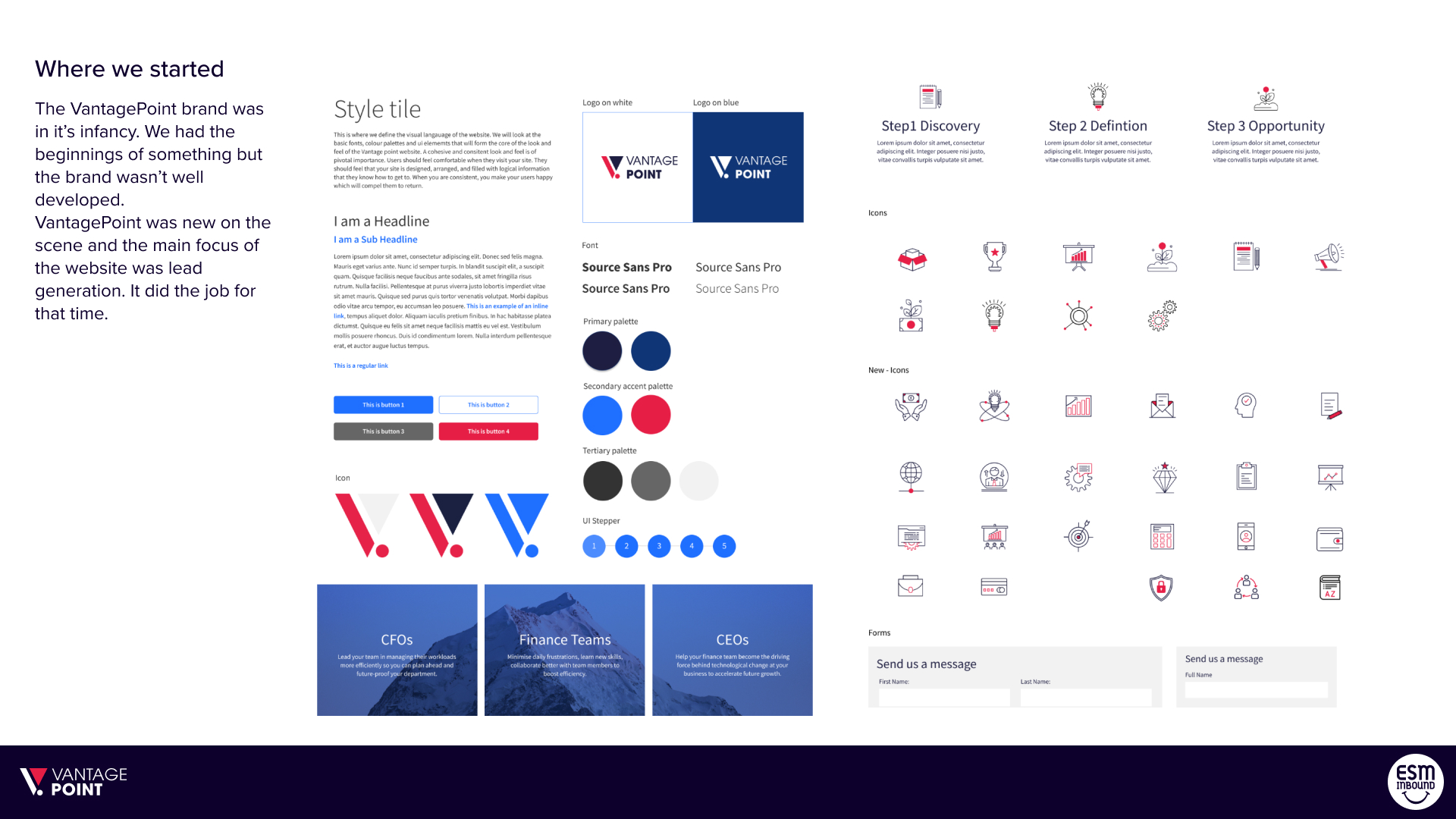
VantagePoint Consulting is a global financial consulting firm, but its website and brand design looked outdated compared to its competitors. As a result, a redesign was overdue and would ensure that VantagePoint remains competitive in the long run.
I created a brand refresh and new design system to ensure VantagePoint looks and feels like a large consulting firm that is global, inclusive & diverse. I also redesigned the user experience based on research to ensure best-in-class usability.
I led the project and worked on all aspects of the redesign, including UX research and design system creation, and I also overhauled the UX of all pages. At the same time, the development team helped implement my designs.
Users & audience
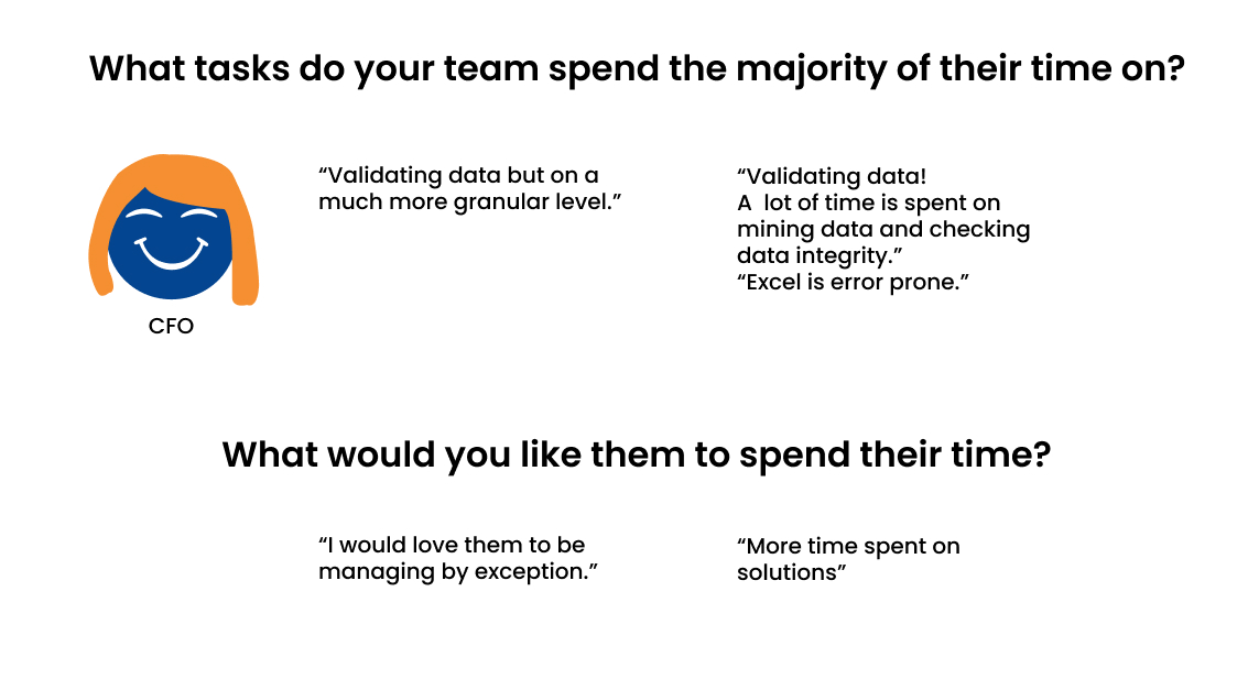
CFO and C-suite executives
Financial controllers or similar
Scope & constraints
Full implementation of lead gen flow had to wait till after launch. Due to time & budget constraints, we had to simplify the hero animations.
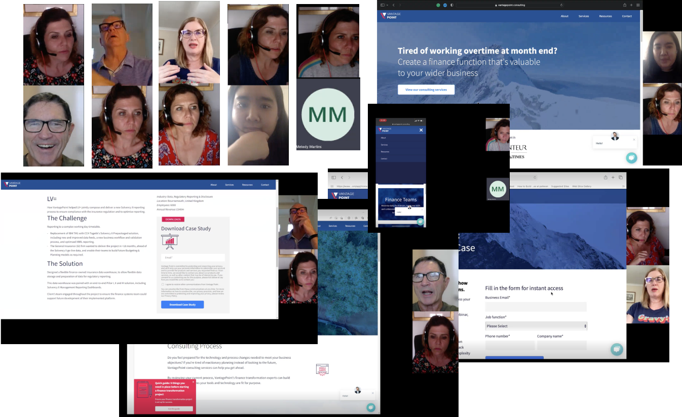
Step 1: Research
Research methods used:
- Stakeholder interviews
- User interviews
- Usability testing
- Website Statistics
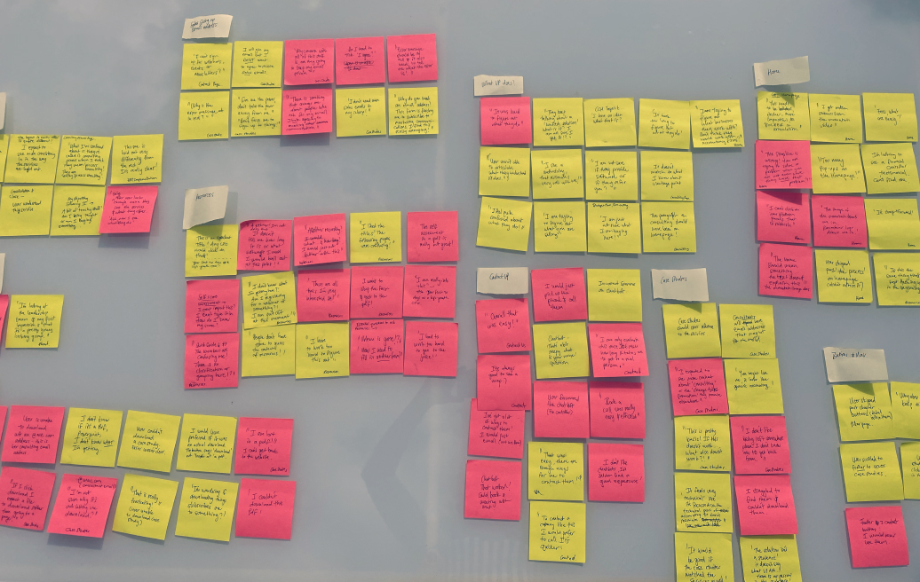
Step 2: Findings
Stakeholder interviews
VantagePoint had outgrown its website; it needed to reflect the current business. The lead time between a user becoming interested and converting can be very long due to the nature of the consulting industry. Therefore the website has to build trust and show them as experts.
User Interviews
User interviews showed that data was the primary pain point for the CFO and the financial controller. Access to the data they need, lack of governance around data, poor data quality, and lack of data standardisation. CFO and financial controller spent most of their time validating data on different levels. They needed someone to help them remove the grunt work so that they could focus on more strategic initiatives and solutions.
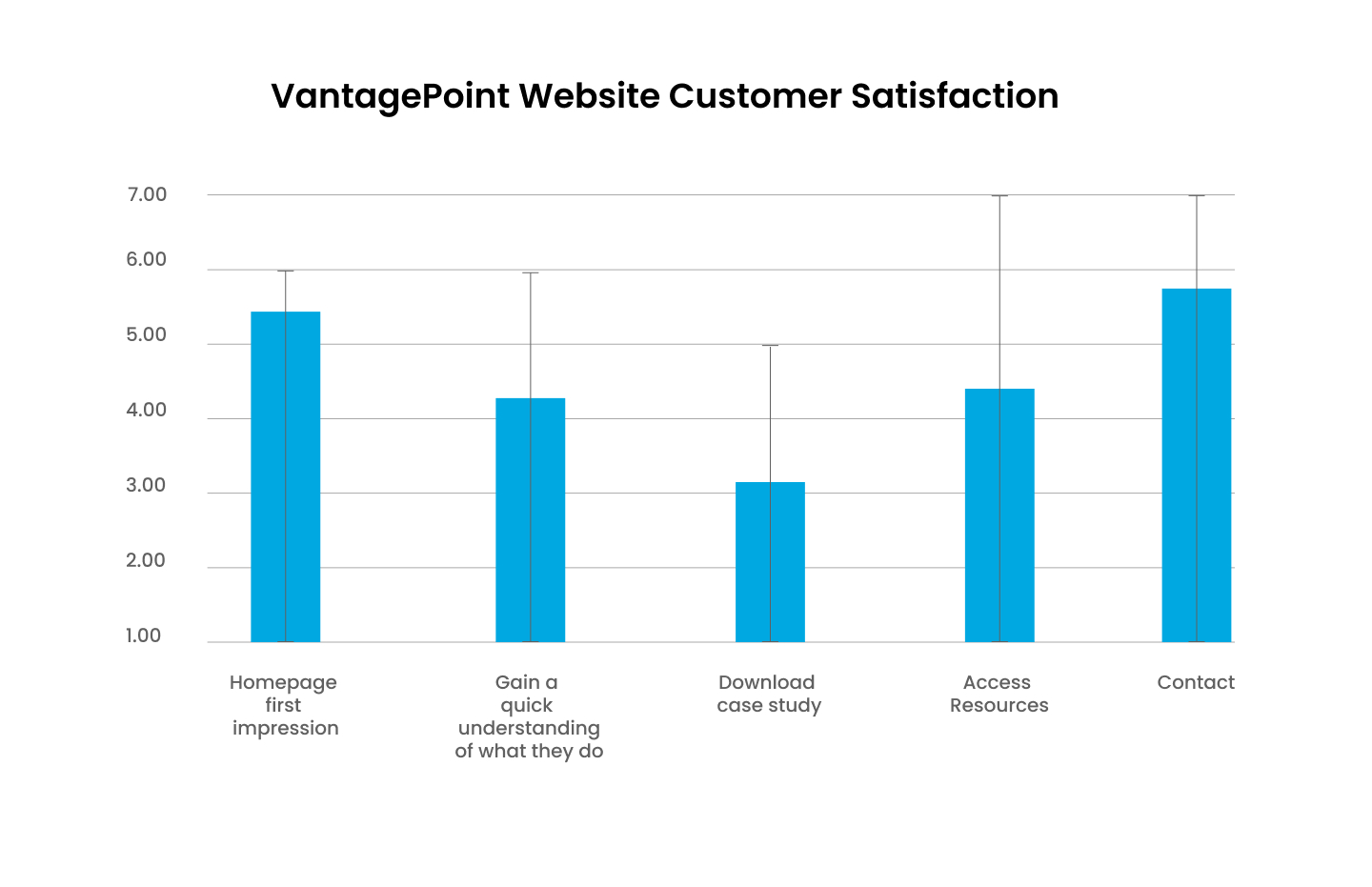
Customer Satisfaction Survey - Quanttive data from the user interviews
Customer satisfaction survey
The area in which the website had significant usability issues was on the resources and case study pages. The customer satisfaction survey scored 4.4 for resources and 3.2 for the case study page. Considering these are two areas where the company should build trust and increase reach, it was pivotal to focus on redesigning these.
Usability tests
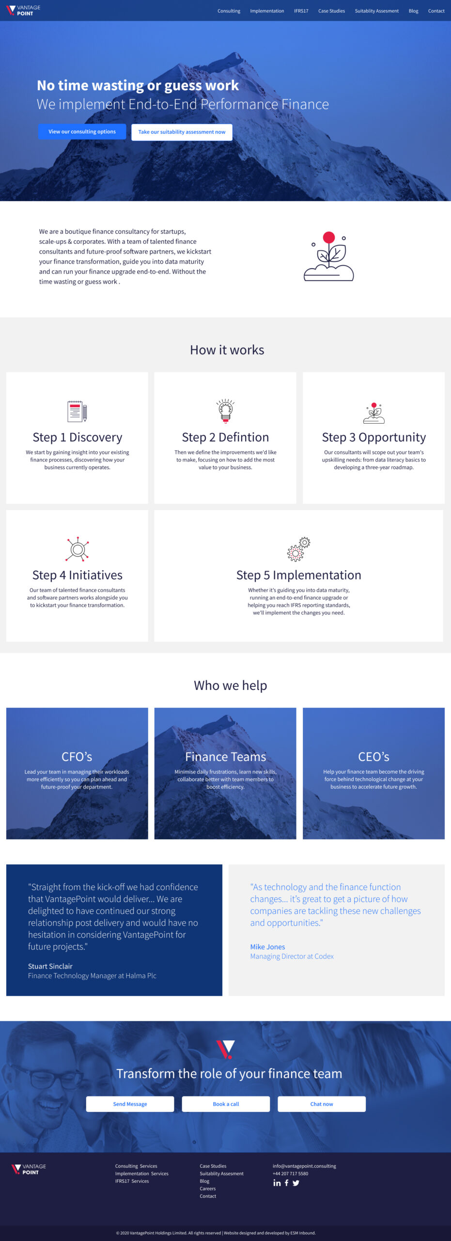
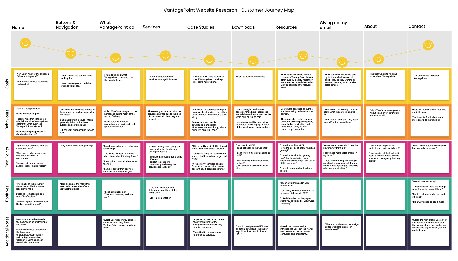
Home
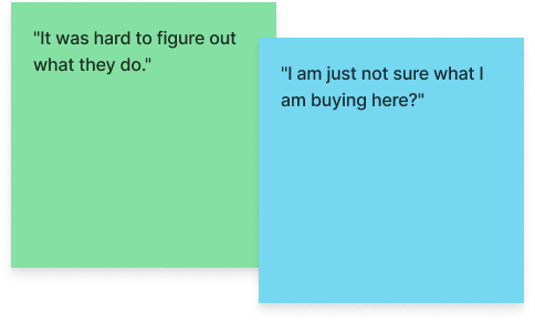
Most users referred to the homepage as professional and clear. One user said the moving mountain video made them feel motion sickness:) Overall, users were OK with the homepage but needed clarification about what VantagePoint does.
For example, 80% of users didn't notice the process design.
Navigation & services
Users couldn't find case studies in the primary navigation, so they had to scroll to the footer to access the page link. The navigation hover also kept disappearing.
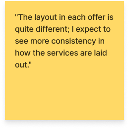
The users needed clarification with the services on offer due to the need for more consistency in how they were presented.
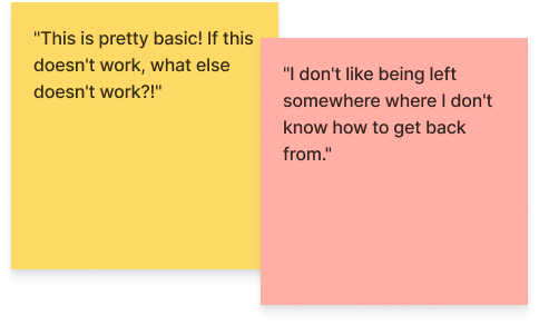
Case studies
Users were surprised and quite put out about giving their email addresses to download a case study. Some users had trouble downloading altogether. Most were unhappy about being left on a PDF page and expected the button to download the pdf rather than simply opening a pdf.
Resources & downloads
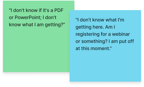
Users were confused about the webinars as it looked like they were registering to attend a webinar rather than viewing a video of a past webinar. In addition, they were unsure about the onward journey page; some pages had no navigation and doubled form entry, so this caused colossal frustration. Finally, they also needed clarification about the type of assets on the page.
Users needed help downloading or viewing assets overall. Even email addresses that are valid consultant addresses, like @me.com or @mac.com, were unable to submit the form and access the content.
Users also didn't like just being redirected to a PDF page instead of the asset simply downloading.
About & Contact
Only 10% of users navigated to 'About' to learn more about VantagePoint.
Overall the contact page was straightforward to understand and use.
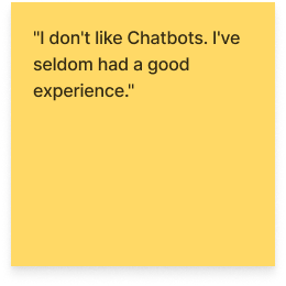
The financial controllers were more drawn to the chatbot, whereas the CFOs said they were more likely to call.
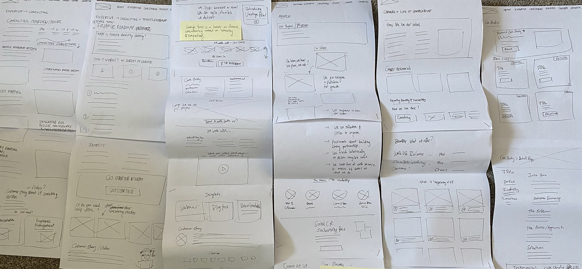
Early stage wireframe sketches
Impact of research on the product
Home
- Add 'who we work with' ( Industries & types of businesses) so the user can see themselves in the list.
- Added key differentiators and clarified the value proposition & reviewed the process design.
- I also added different testimonials from varied job roles.
Case studies
- Added case studies to the primary navigation.Removed forced email submissions - this was not the place to generate leads, as it immediately caused the user's reservoir of goodwill to run out. Case Studies are where the business wants to build trust and show what it can do. They want to seem generous and self-assured, and by forcing the user's email at this point in the journey, it achieved the opposite.
Resources on website
- Split out downloadable content from webinars- because the terminology and grouping caused frustration.
- On the downloadables listing page, added asset type to layout: PDF, slideshow, e-book and included reading time if appropriate
For webinar recordings - I added the video length on the listing page. - I got rid of the landing pages gating each resource and only have one lead gen form, which is intelligent enough to know if the user has already provided an email address. This way, the user can download any resource without continually re-entering their details as they had previously.
Services
- I standardised the layout of the services category page and subpage. All services follow this layout which will help the user understand the offering more quickly.
About
- Included the brand values and more information about the company and team to explain who they are as a company.
- Added pages like diversity and inclusion to help illustrate the company's culture.
Careers
- Added a 'life at VantagePoint page' to help prospective employees see what it's like working at the company and attract talented individuals.
- Added a careers page to show what jobs they have on offer.
Contact & Sign-up
- Added a unique phone number to the website to allow us to track conversions by phone. During the research, the phone contact method was favoured by CFOs.
- Added a way for users to register their email addresses voluntarily to a mailing list for webinars/events and newsletters.
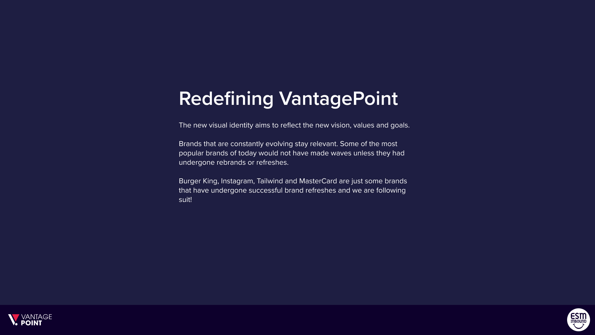
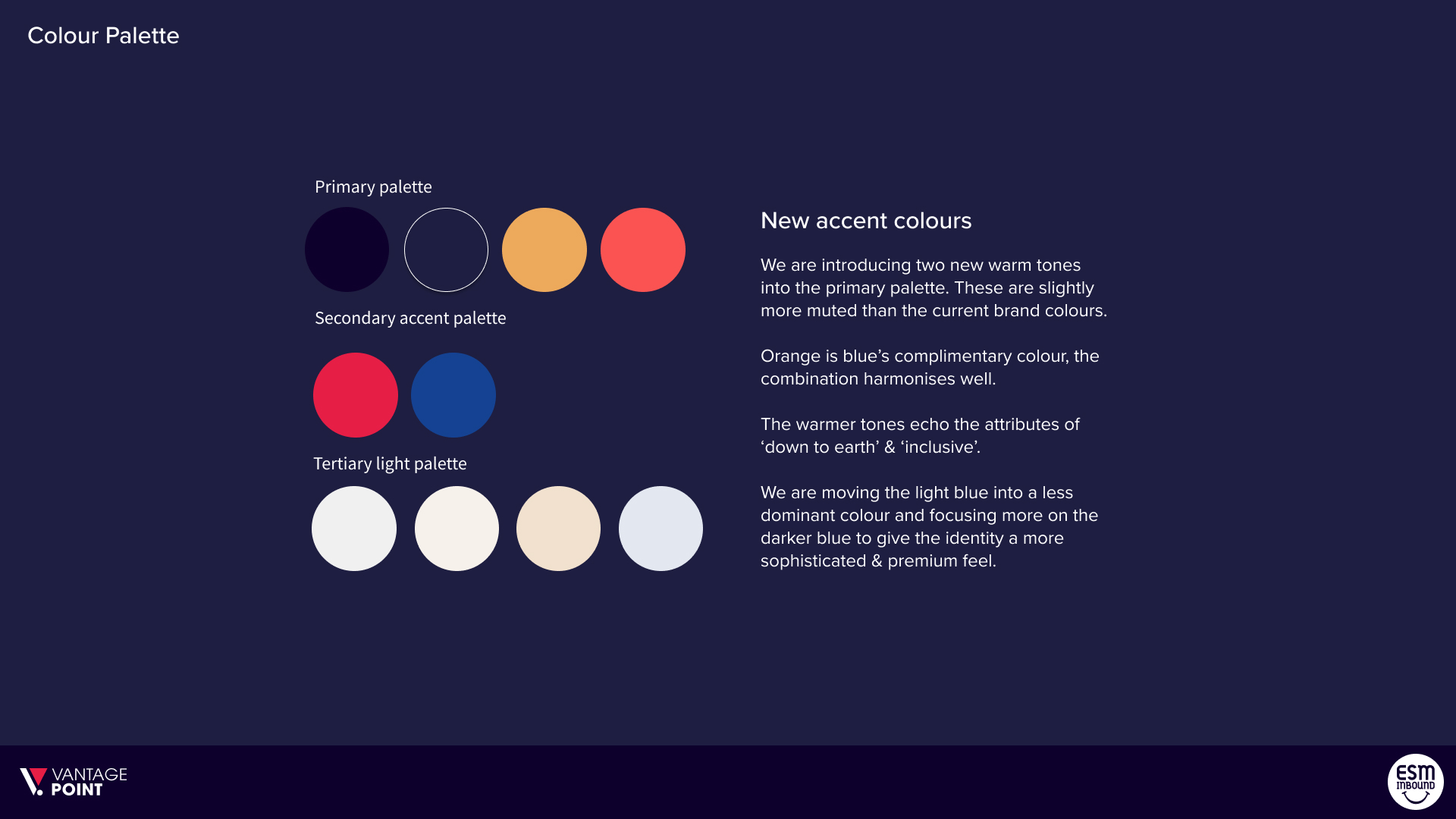
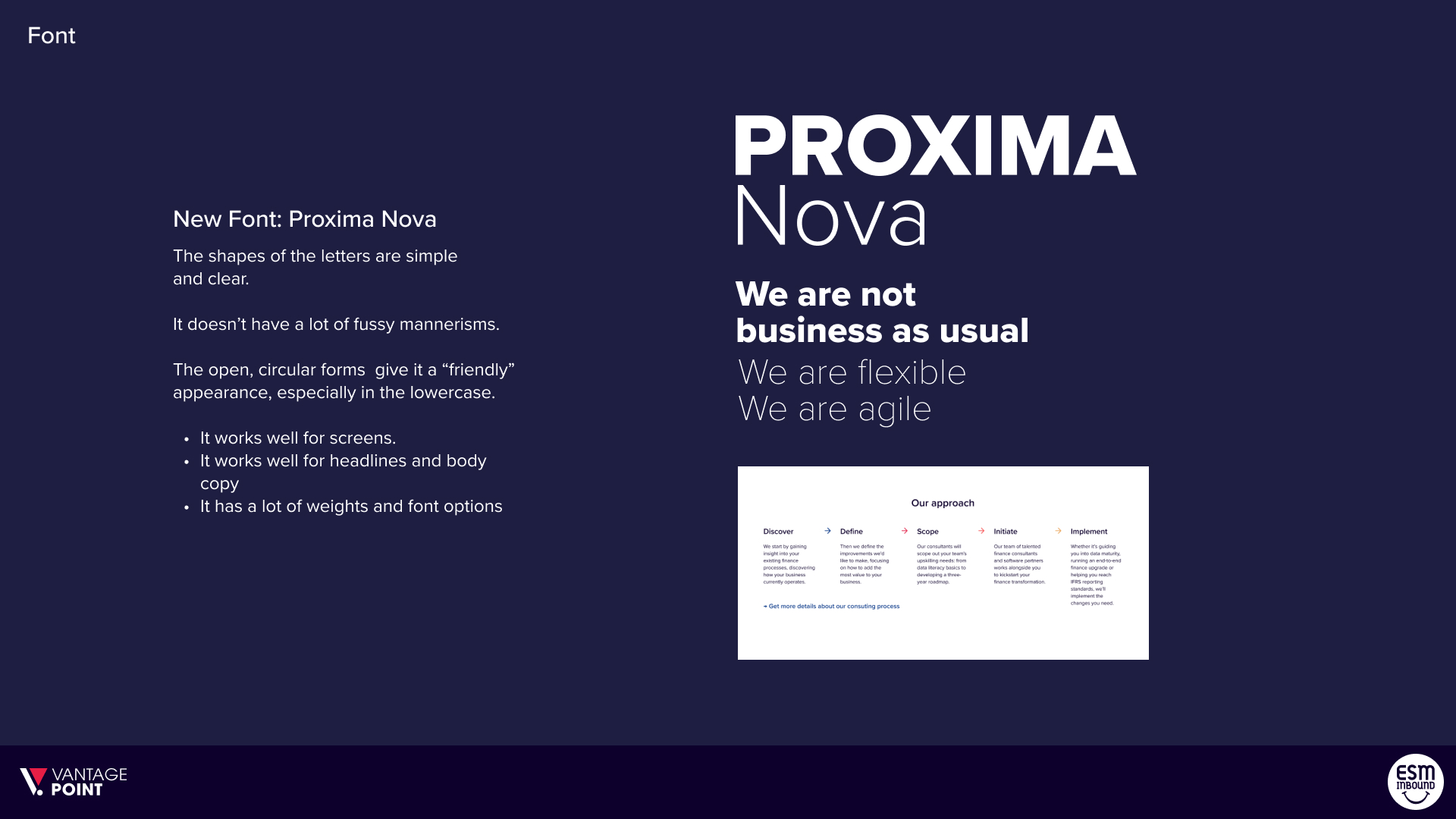
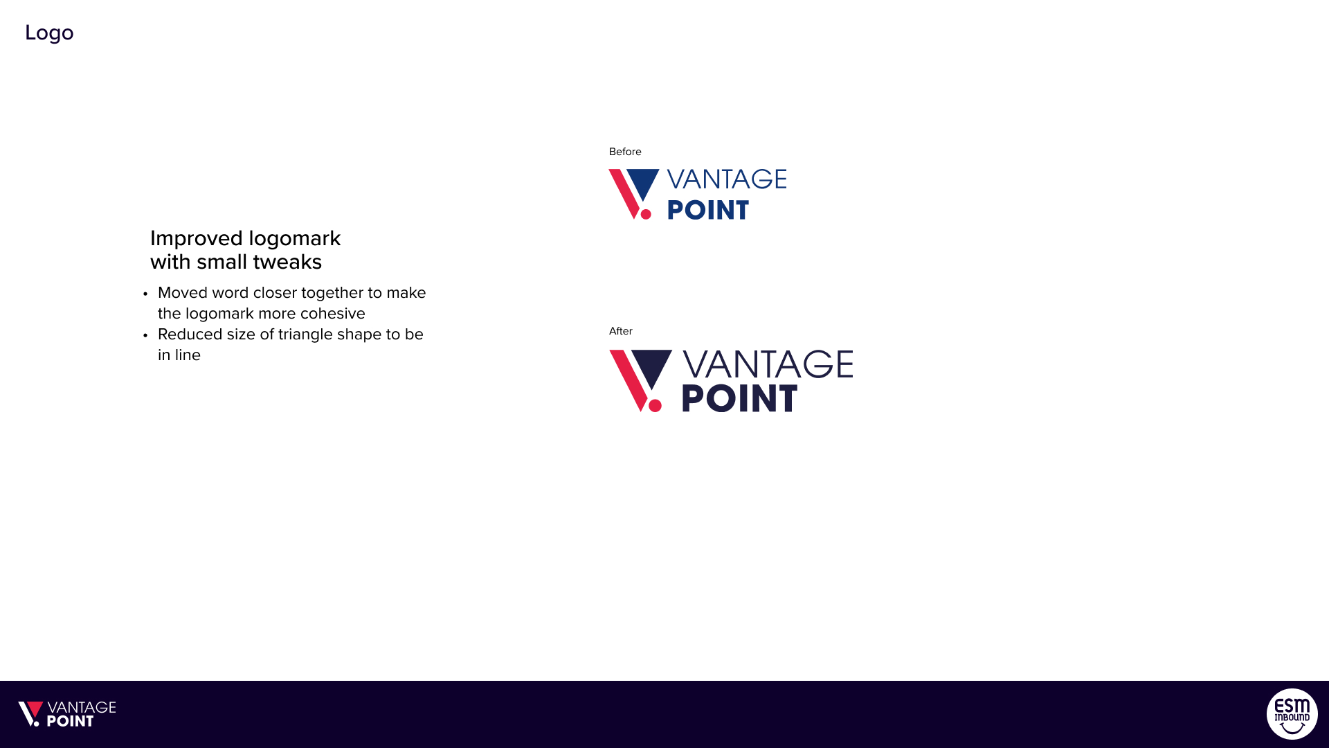
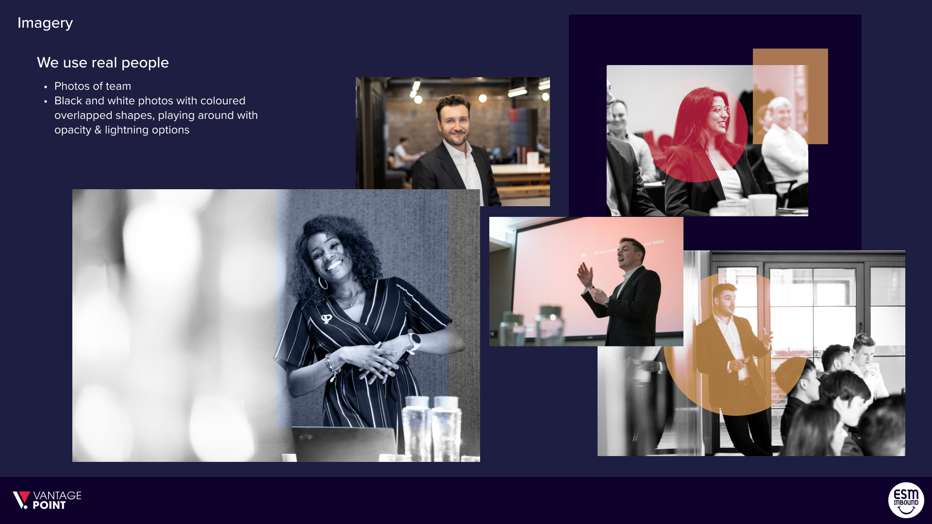
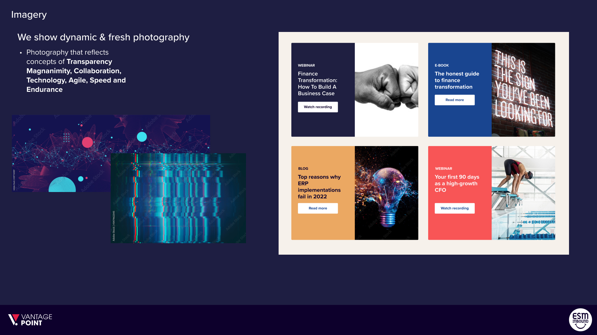
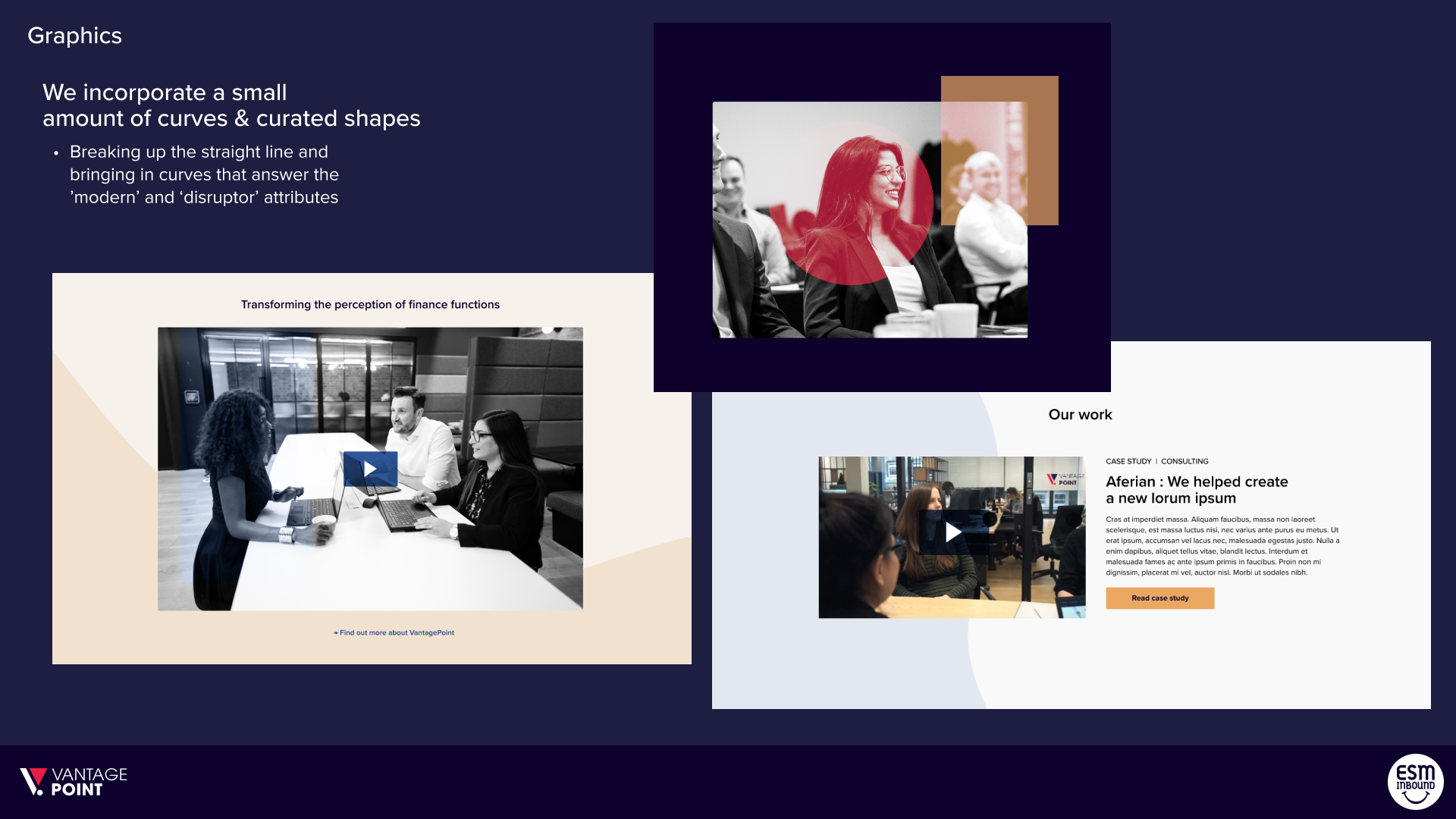
Brand refresh
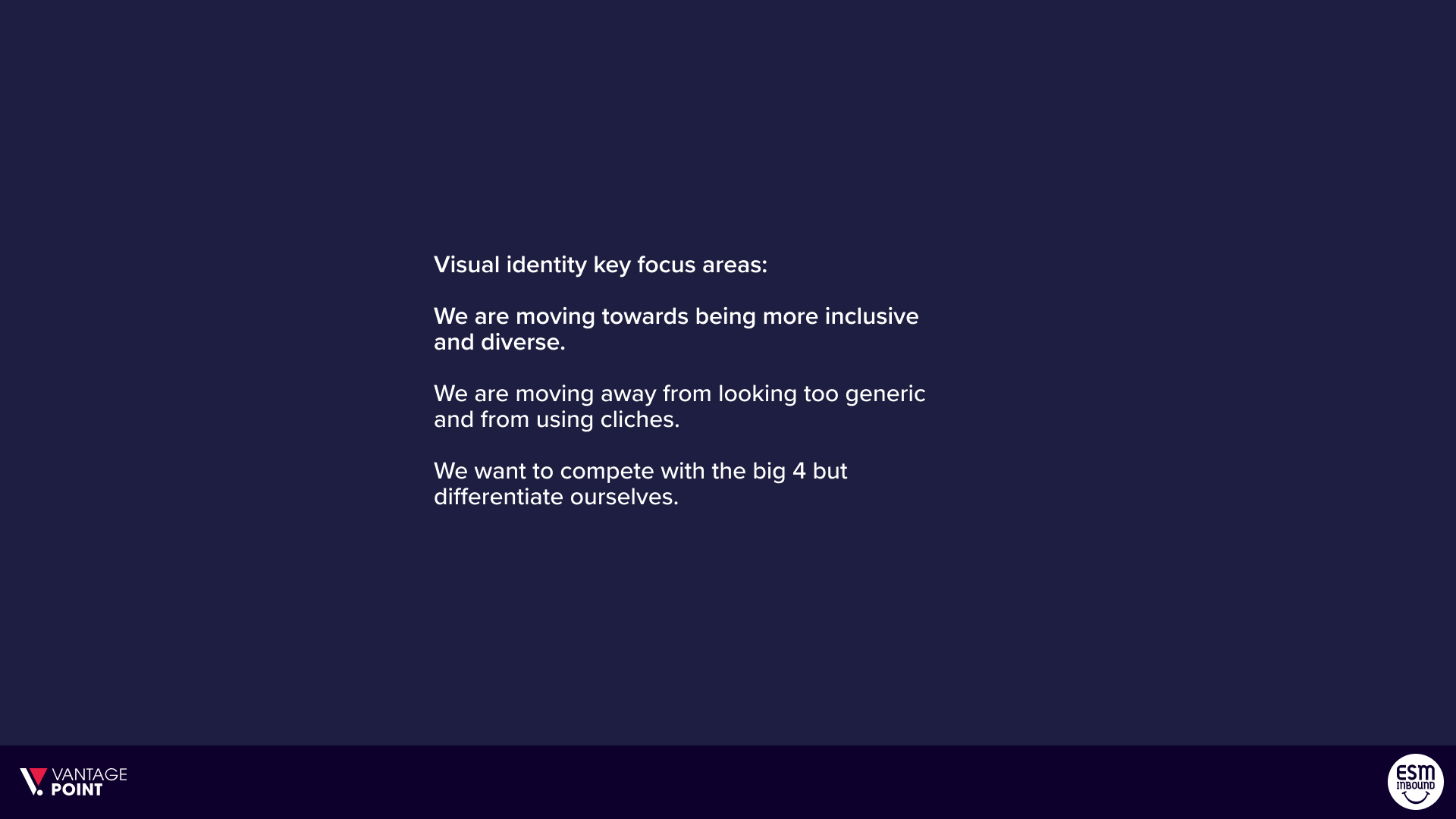
Visual identity key focus areas:
- We are moving towards being more inclusive and diverse.
- We are moving away from looking too generic and from using cliches.
- We want to compete with the big 4 but differentiate ourselves.
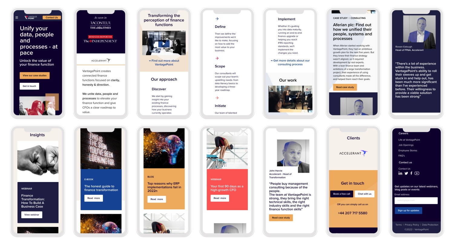
Mobile Components
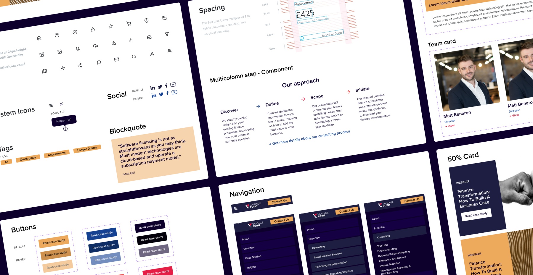
VantagePoint Design System
Outcome & lessons
Our newly designed website increased page views per session by 50% compared with the previous website. The bounce rate dropped by 9.11%, and the session length increased from 31 seconds to 90 seconds. Most importantly, we increased views of case studies by 153%.
I would have increased the scoping for the brand refresh and added more time for this at the outset, as this was an unknown and took a more time than I estimated.
The next step is to measure key conversion points and optimise the site where needed.
High-Fidelity Prototype
"I found the research stage of the project especially useful as it gave us valuable insight into how our target audience felt when using our website (something we’d overlooked in the rush to put together our first website!). I also liked that the research was used to clearly define each design decision that was made."
Ife Akintoye - Marketing and Communications Lead
VantagePoint Consulting
Contact
Shoreham-By-Sea
LinkedIn: https://tinyurl.com/5dm8rejh
Email: celestedupreezdesign@outlook.com
Twitter: @celestedupreez
© Celeste du Preez 2023